You are browsing the archive for gephi.

The Data Journalism Bootcamp at AUB Lebanon

- January 29, 2015 in Data Journalism, Events, Fellowship, Блог, Интернационален

Data love is spreading like never before. Unlike previous workshops we did in the MENA region, on the 18th of January 2015, we gave an intensive data journalism workshop at the American University of Beirut for four consecutive days in collaboration with Dr. Jad Melki, Director of media studiesilovedata program at AUB. The Data team at Data Aurora were really happy sharing this experience with students from different academic backgrounds, including media studies, engineering or business.

The workshop was mainly led by Ali Rebaie, a Senior School of Data fellow, and Bahia Halawi, a data scientist at Data Aurora, along with the data community team assistants; Zayna Ayyad, Noor Latif and Hsein Kassab. The aim of the workshop was to give the students an introduction to the world of open data and data journalism, in particular, through tutorials on open source tools and methods used in this field. Moreover, we wanted to put students on track regarding the use of data.AUBworkshop

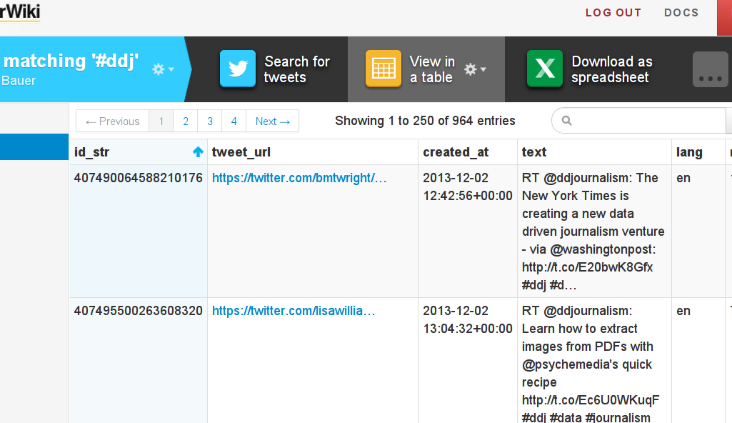
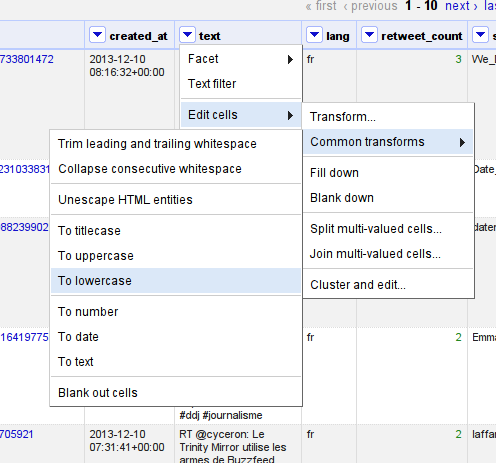
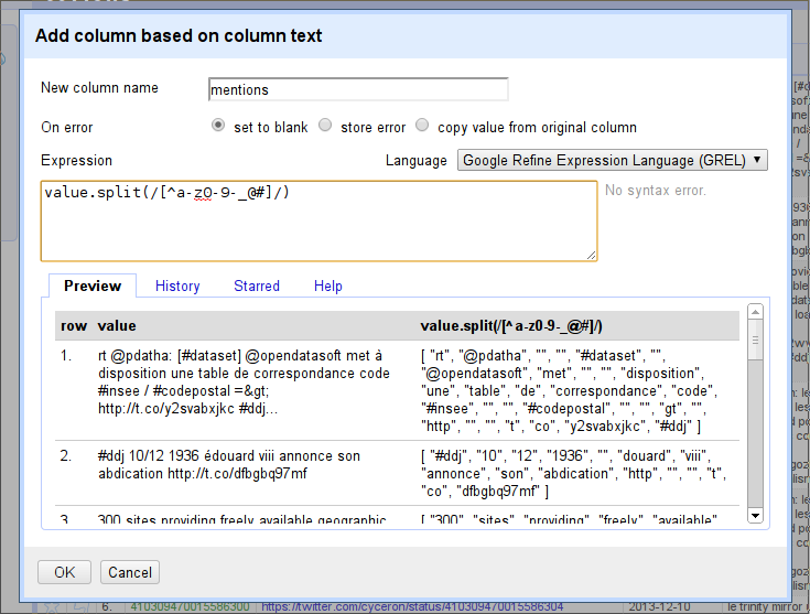
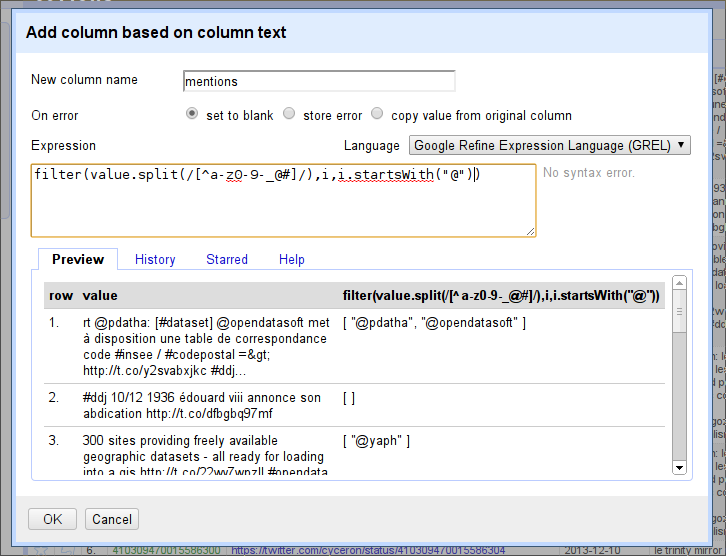
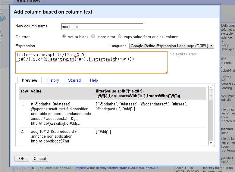
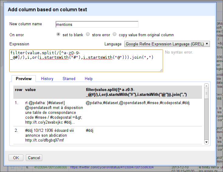
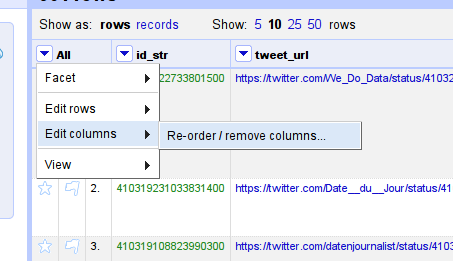
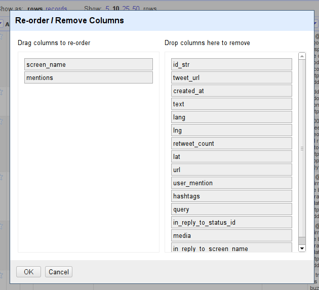
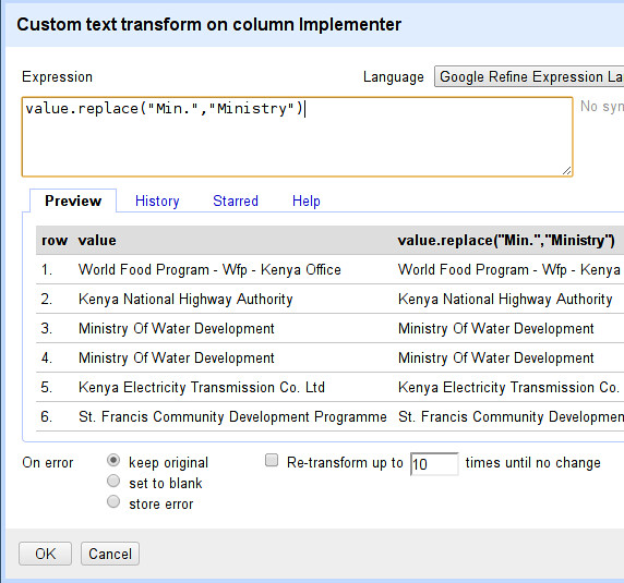
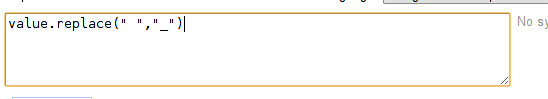
On the first day, the students were introduced to data journalism, from a theoretical approach, in particular, the data pipeline which outlined the different phases in any data visualization project: find, get, verify, clean, analyze and present. After that, students were being technically involved in scraping and cleaning data using tools such as open refine and Tabula.

Day two was all about mapping, from mapping best practices to mapping formats and shapes. Students were first exposed to different types of maps and design styles that served the purpose of each map. Moreover, best mappings techniques and visualizations were emphasized to explain their relative serving purpose. Eventually, participants became able to differentiate between the dot maps and the choropleth maps as well as many others. Then they used twitter data that contained geolocations to contrast varying tweeting zones by placing these tweets at their origins on cartodb. Similarly, they created other maps using QGIS and Tilemill. The mapping exercises were really fun and students were very happy to create their own maps without a single line of code.

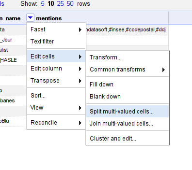
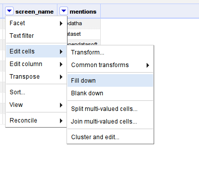
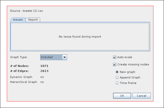
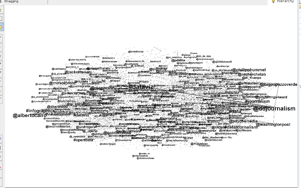
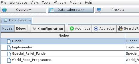
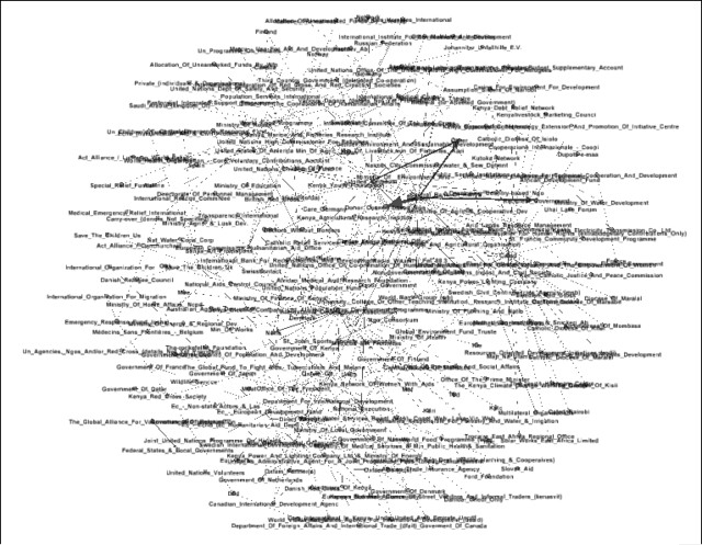
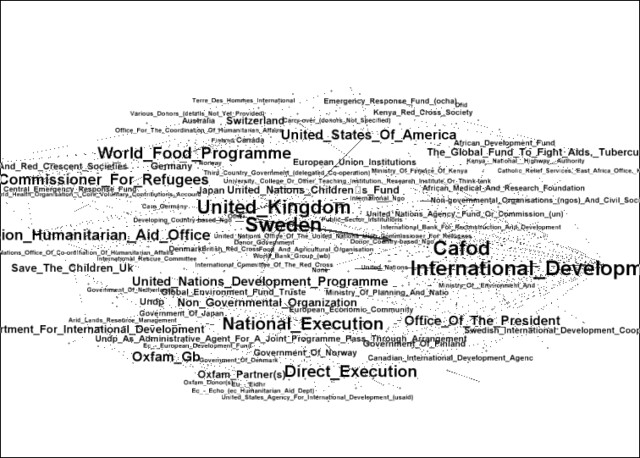
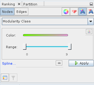
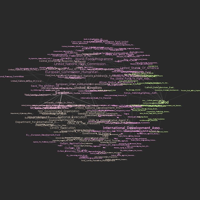
On the third day, Bahia gave a lecture on network analysis, some important mathematical notions needed for working with graphs as well as possible uses and case studies related to this field. Meanwhile, Ali was unveiling different open data portals to provide the students with more resources and data sets. After these topics were emphasized, a technical demonstration on the use of network analysis tool to analyze two topics wasworkshopaub performed. Students were analyzing climate change and later, the AUB media group on Facebook was also analyzed and we had its graph drawn. It was very cool to find out that one of the top influencers in that network was among the students taking the training. Students were also taught to do the same analysis for their own friends’ lists. Facebook data was being collected and the visualizations were being drawn in a network visualization tool.

After completing the interactive types of visualizations, the fourth day was about static ones, mainly, infographics. Each student had the chance to extract the information needed for an interesting topic to transform it into a visual piece.  Bahia was working around with students, teaching them how to refine the data so that it becomes simple and short, thus usable for building the infographic design. Later, Yousif, a senior creative designer at Data Aurora, trained the students on the use of Photoshop and illustrator, two of the tools commonly used by infographic designers. At the end of the session, each student submitted a well done infographic of which some are posted below.

After the workshop Zayna had small talks with the students to get their feedback and here she quoted some of their opinions:

“It should be a full course, the performance and content was good but at some point, some data journalism tools need to be more mature andStatic Infographics developed by the students at the workshop. user-friendly to reduce the time needed to create a story,” said Jad Melki, Director of media studies program at AUB, “it was great overall.”

“It’s really good but the technical parts need a lot of time. We learned about new apps. Mapping, definitely I will try to learn more about it,” said Carla Sertin, a media student.

“It was great we got introduced to new stuff. Mapping, I loved it and found it very useful for me,” said Ellen Francis, civil engineering student. “The workshop was a motivation for me to work more on this,” she added, “it would work as a one semester long course.”

Azza El Masri, a media student, is interested in doing MA in data journalism. “I like it I expected it to be a bit harder, I would prefer more advanced stuff in scraping,” she added.


Flattr this!

Harvesting and Analyzing Tweets

- December 10, 2013 in

Twitter is a fabulous source for information. Whenever something is happening, people around the world start tweeting away. Often they include hashtags, allowing us to selectively search for tweets about a certain event or thing. Many twitter users also engage in conversations, and looking at these conversations allows us to identify leaders and frequent actors.

In this lesson, we will look how to harvest tweets from Twitter using ScraperWiki and how to analyse them using social network analysis and software called Gephi.

What you will need

Harvesting Tweets using ScraperWiki

The first thing we need to do is to get tweets out of Twitter. Getting full access to everything that is posted to Twitter is hard and mainly used by academics and companies building on top of it. Nevertheless, everyone can get a selection of tweets using the Twitter API and searching for specific keywords or users.

There are various tools to get tweets out of Twitter. By far the easiest to use seems to be ScraperWiki.

Walkthrough: Harvesting tweets with ScraperWiki

  1. Sign in to ScraperWiki.

  2. In your “data hub” (the page you get to after signing in), click the big “create a new dataset” field.

    Create a new dataset

    Create a new dataset

  3. You will be presented with multiple options. Select “Search for Tweets”.

    Search for tweets

    Search for tweets

  4. Now Scraperwiki will start up a simple search interface. Enter a search term and go ahead. I’ll search for #ddj:

    Search for #ddj

    Search for #ddj

    You will need to authorize the app that comes up with Twitter, and ScraperWiki will start downloading all tweets it can find.

  5. Check the Also monitor for future tweets checkbox to create a continuous dataset.

    Create a continuous dataset

    Create a continuous dataset

  6. Now you can see the tweets ScraperWiki grabbed via “View in a Table”.

    View in a table

    View in a table

  7. To effectively work with it, download it as a spreadsheet.

Well done—now you’ve downloaded a dataset full of tweets!

Analyzing Languages

Once we have our dataset, let’s do some analysis with it.

First let’s look at what we can find out. Twitter gives us a wide range of information: the date, who’s tweeting, the language the tweet is in, and so on. Doing a quick pivot table on the downloaded dataset allows us to see which languages are the most frequent. We can also find out whether or not a link was included.

You’ll also notice the mention and hashtag columns. These are quite handy, but you’ll soon realize they only include the first mention and hashtag. If we want to do a full analysis, we’ll have to extract more.

Analyzing social networks from tweets

Let’s do a network analysis based on people tweeting and on people and hashtags mentioned in tweets.

This is going to be a two-step approach. Since the Twitter API only gives us the first mention or hashtag, we have to get the full information out and into the right format. For this we’ll use Refine, since it’s great at bringing data into the shape we need.

Walkthrough: Extracting mentions and hashtags using Refine

  1. Load the dataset you just downloaded into Refine using “create project”.

    We’re interested in getting the data into a format that has two columns. The first column is the screen name, and the second is any hashtag or account that is mentioned in a tweet by that user. Gephi understands that format easily.

    First, let’s extract mentions and hashtags from the tweets. Mentions start with @, and hashtags start with #.

  2. Let’s start by lowercasing all the tweets. This helps to unify hashtags and mentions.

    We’ll do so by selecting “edit cells – common transforms – to lowercase” from the column options menu of the text column (the arrow next to the column name).

    To lowercase

    To lowercase

  3. Great! To get all mentions out, we have to do several steps at once.

    First we need to split all the words. Twitter delineates words by anything that is not a letter, number, dash (-), or underscore (_).

    Select “edit columns – add column based on this column” and choose the column mentions. The expression that will split the column’s text into words is value.split(/[^[email protected]#]/).

    Add column based on column text

    Add column based on column text

  4. Next we need to filter the list that comes out. We want everything that starts with a @ or #.

    To filter the list, we use the function filter(). The filter() function wants your list first, then the name of a variable to assign to each column, and then something that checks whether or not it should be included.

    If we want to filter for each person mention, for example, we can use the expression:

    filter(value.split(...),i,i.startsWith("@"))
    
    filter expression

    filter expression

  5. To get any hashtags, we could use i.startsWith("#") instead. But since we want either mentions or hashtags, we’ll use another formula to connect them: or. We’ll write or(i.startsWith(“#”),i.startsWith(“@”)) as a condition.

    filter expression: or

    filter expression: or

  6. One thing remains to be done, and then we’ll have our giant expression written. We’ll need to join the list (so that Refine can handle it) by appending the .join(",") function. This joins the list into a single string of text by inserting commas.

    .join()

    .join()

  7. Great—now let’s add this column.

    Let’s remove everything we don’t need anymore and bring the two columns “screen name” and “mentions” into position.

    Re-order columns

    Re-order columns

    Re-order screen_name and mentions

    Re-order *screen_name* and *mentions*

  8. Great, now you’ll have two columns left. For Gephi, we’ll need to have each user-mention pair in a row. Let’s split the column into several rows.

    Do so with “edit cells – split multi-valued cells”, and split by comma (,).

    Split by comma

    Split by comma

  9. Fantastic. Notice how only the first row has the users tweeting. This is not a problem. Use “edit cells – fill down” to add them to all the empty rows.

    Fill down

    Fill down

  10. There is a difference between the screen_names and the mentions: mentions start with @ (for users) and are in lowercase.

    Let’s lowercase the letters using “edit cells – common transforms – to lowercase”, as above.

  11. Then use “edit cells – Transform” to add the @ in front of the name using "@"+value.

  12. Fantastic! You have now formatted the file for Gephi. Download it as CSV using the “Export” button.

Walkthrough: Social network analysis using Gephi

  1. Start Gephi and choose “new project”.

  2. Open the CSV with “file – open”.

    Open the CSV

    Open the CSV

  3. Select “directed” and leave the defaults.

    Choose "Directed"

    Choose “Directed”

  4. Click “OK” to create a graph.

  5. Since Gephi takes all the rows and columns into account, we’ll have to remove the header.

    Change the view to the “data laboratory” view.

    Data Laboratory

    Data Laboratory

  6. Remove the first two nodes (screen_name and mentions): mark them, then right click and select “delete all”.

  7. Change back to the “overview”.

  8. At first, this graph doesn’t look very special, simply because we haven’t applied any layout yet.

    Let’s do so. In the layout window on the left, select “ForceAtlas 2”. This will apply a force-directed layout.

    ForceAtlas 2

    ForceAtlas 2

  9. ForceAtlas is a very simple algorithm. It groups connected nodes closer together.

    Let it run for a while. Note how many nodes stay in the middle. This is because we searched for #ddj and all the tweets contain it. Let’s remove it from our nodes.

    Doing so results in a much nicer layout. (Press “play” and “stop” as you like.)

  10. But how do we know which dot is which? Let’s enable the labels.

    Enable labels

    Enable labels

  11. The labels right now are not clear to read, and we don’t know which labels are important. We can scale the labels by how many connections (mentions, tweets) a label has.

    In the top right, select label size. Then choose “degree” as a parameter.

    Choose a rank parameter

    Choose a rank parameter

  12. Click on “apply” and play with the parameters (minimum and maximum size) as you see fit.

  13. Okay, we still can’t read a thing! Luckily there is a layout called “label adjust”. This layout will move nodes so the labels don’t overlap. Try this for a while.

  14. Now if you use the zoom (hidden in a menu below the graph), you can get a pretty clear picture of who’s important.

    Zoom

    Zoom

  15. But this is not the only thing we can do. We can check for clusters: people and hashtags that belong together.

    Do so by switching to “statistics” on the tab on the right.

    Statistics

    Statistics

  16. Choose Modularity. Now we can color the labels by modularity class. Select the label color on the left.

    Modularity Class

    Modularity Class

  17. Now you can see which hashtags and people are closer together and which are farther apart.

    Other interesting parameters are “centrality” (who is more central in the network, who is less connected, etc.).

  18. When you’re done, you can either export the data or format the graph for exporting in the “preview” tab. This works slightly differently from the “overview”, so you’ll need to play around for a while to create a nice-looking graph.

Further Analysis

Of course, social network analysis is only one of the analyses possible. I’ve outlined some others below.

Wordcloud

Using a service like Wordle, remove all the mentions and hashtags and create a wordcloud. I’d use a spreadsheet and a formula like =Concatenate(text column) to create one giant string from all the tweets.

Keyword analysis

Sometimes you know that certain keywords will be present and you just want to check for them. You could, for example, check for occurrences of certain hashtags together (e.g. how often do #ddj tweets mention “dataviz”?).

Mapping

The spreadsheet contains latitude and longitude for tweets which have a location. You could easily map them using an online service such as CartoDB.

Time-based analysis

Can you find out how keywords and or hashtags change over time? How does the discussion shift?

Sentiment

A more sophisticated analysis is sentiment analysis. For this, you would either specify keywords for which you say “this means happy” or “this means sad”—or employ machine learning and a training set to determine the mood of the tweets. While this is out of range for a simple tutorial, it is a quite powerful form of analysis.

An Introduction to Mapping Company Networks Using Gephi and OpenCorporates, via OpenRefine

- November 15, 2013 in Infoskills, OpenRefine, recipe

As more and more information about beneficial company ownership is made public under open license terms, we are likely to see an increase in the investigative use of this sort of data.

But how do we even start to work with such data? One way is to try to start making sense of it by visualising the networks that reveal themselves as we start to learn that company A has subsidiaries B and C, and major shareholdings in companies D, E and F, and that those companies in turn have ownership relationships with other companies or each other.

But how can we go about visualising such networks?!

This walkthrough shows one way, using company network data downloaded from OpenCorporates using OpenRefine, and then visualised using Gephi, a cross-platform desktop application for visualising large network data sets: Mapping Corporate Networks – Intro (slide deck version).

The walkthrough also serves as a quick intro to the following data wrangling activities, and can be used as a quick tutorial to cover each of them.

  • how to hack a web address/URL to get data-as-data from a web page (doesn’t work everywhere, unfortunately;
  • how to get company ownerships network data out of OpenCorporates;
  • how to download JSON data and get it into a nice spreadsheet/tabular data format using OpenRefine;
  • how to filter a tabular data file to save just the columns you want;
  • a quick intro to using the Gephi netwrok visualisation tool;
  • how to visualise a simple date file containing a list of how companies connect using Gephi;

Download it here: Mapping Corporate Networks – Intro.

So if you’ve ever wondered how to download JSON data so you can load it into a spreadsheet, or how to visualise how two lists of things relate to each other using Gephi, give it a go… We’d love to hear any comments you have on the walkthrough too, (what you liked, what you didn’t, what’s missing, what’s superfluous, what worked well for you, what didn’t and most of all – what use you put to anything you learned from the tutorial!:-)

If you would like to learn more about working with company network data, see the School of Data blogpost Working With Company Data which links to additional resources.

Flattr this!

Data Roundup, 25 October

- October 25, 2013 in Data Roundup

The English Silicon Valley map, Little Data economics for the news industry, the New York Data Week and Strata Conference, an infographic on movies’ supercars, workshops and new databases.

Mike Leeorg – New York City Skyline Sunset

Tools, Events, Courses

Interested in joining and developing a data journalism project? Medialab Prado is looking for collaborators for its “Workshop on Data Journalism: Transforming Data into Stories”. Participants will work in groups to produce selected projects ranging from “Globalization and health trends” to “Climate Finance Maps”. Workshops take place on two editions: 25-27 October and 13-15 December. Hurry up! The deadline for registration is October 24.

If you are curious about the dimension of your Facebook network you may want to have a look at the first DataJLab video tutorial on Gephi. Gephi is platform that helps you visualizing complex series of relations and, above all, is available for free to anyone!

Next week every New Yorker should not miss the appointment with two of the biggest events on the world of data. On Monday 27th starts the NYC Data Week and, right the day after, the Strata Conference opens the doors to the public. It’s going to be an intensive agenda of workshops, speeches and meetups for anyone interested in analyzing and visualizing numbers and statistics: journalists, information architects, designers, entrepreneurs, start-uppers and many more.

Data Stories

The legendary Guardian Data Blog recently published an interesting analysis of the diversity of languages spoken in England. In “What does the 2011 Census tell us about diversity of languages in England and Wales?” the University College London geographer Guy Lansley, author of the article, displays the distribution of idioms in the Country through a series of dot maps based on data released by Office for National Statistics.

If you are wondering what kind of role data analysis and data intelligence play in big news industries nowadays then you should absolutely read Ken Doctor’s point of view on the Nieman Journalism Lab where he describes and presents “The newsonomics of Little Data”.

Want to know which is the English Silicon Valley? Read and explore John Burn-Murdoch’s map of Britain’s technology sector hotspots on Financial Times.

For those with a true passion for cars and movies Cool Infographics posted “Car of the Silver Screen”, a long nice-looking graph showing all the most famous characters’ supercars: from the legendary Sean Connery’s Aston Martin DB5 in “007 Goldfinger” to the most recent Audi R8 e-tron driven by Robert Downey Jr. in “Iron Man 3”.

Data Sources

Data journalists from La Nacion just released the beta version of Declaraciones Juradas Abiertas, a huge database listing assets, holdings and properties of Argentinian public servants aimed at increasing public administration transparency towards citizenship.

Flattr this!

Exploring IATI funders in Kenya, Part II – cleaning & visualizing the data

- August 22, 2013 in Data Cleaning, Visualisation

Welcome back to a brief exploration of who funds whom in Kenya based on freely available data from IATI (International Aid Transparency Initiative).

In the last post, we extracted data from IATI data using Python. In this post, we’ll clean that data up and visualize it as a network graph to see what it can tell us about aid funding in Kenya.

If you couldn’t follow the code in the last post, don’t worry: we’ll use the GUI tools OpenRefine and Gephi from now on. You can download the result of last post’s data extraction here.

Data cleaning: OpenRefine

First, let’s clean up the data using Refine. Start Refine and then create a new project with the data file. The first things we’ll do are to clean up both columns and to bring the entries to a common case – I prefer titlecase. We do this with the “Edit cells -> Common transforms” functions “To titlecase” and “Trim leading and trailing whitespaces”:

titlecase

We do this for both columns. Next we want to make sure that the Ministry of Finance is cited consistently in the data. For this, we first expand all mentions of “Min.” to “Ministry” using a transform (“Edit cells -> Transform…”):

min

We’ll also do the same for “Off.” and “Office”. Now let’s use the Refine cluster feature to try to automatically cluster entries that belong together.

We create a text facet using the “Facet -> Text” facet option on the Implementers Column. Next, click on the “cluster” button in the upper right. We do this for both columns. (If you’re not sure how to use this feature, check out our Cleaning Data with Refine recipe.)

As a last step, we’ll need to get rid of whitespace, as it tends to confuse Gephi when we import. We do this by replacing all spaces with underlines:

replace-underline

Perfect. Now we can export the data to CSV and load it into Gephi.

Network exploration: Gephi

Start Gephi and select “New Project”, then Open the CSV file. For some reason, Gephi doesn’t handle captions very well, so you’ll have to switch to “Data Laboratory” and remove the “Funder” and “Implementer” nodes.

remove-funder

Now switch back to “Overview”. Time to do some analysis!

Let’s first turn the labels on. Do this by clicking the “T” icon on the bottom:

labels-on

Whoa – now it’s hard to read anything. Let’s do some layouting. Two layouts I’ve found work great in combination are ForceAtlas 2 and Fuchterman Reingold. Let’s apply them both. (Don’t forget to click “Stop” when the layout starts looking good.)

fatlas

Great! After applying both algorithms, your graph should look similar to the picture below:

graph

OK, now let’s highlight the bigger funders and implementers. We can do this with the text-size adjustment up top:

label-size

Great – but the difference seems to be too stark. We can change this with the “Spline…” setting:

spline

OK, now let’s get the labels apart. There is a label-adjust layout we’ll use. Run this for a while. Now our graph looks like this:

graph2

Let’s get some color in. I like the “Modularity” statistic – this will colour nodes that are close to each other similarly.

modularity

Next, colour the text by “Modularity Class”.

mcolor

Finally, we change the background colour to make the colours visible nicely.

bgcolor

Now that we’ve done this, let’s export the graph. Go to the “Preview” settings. You’ll quickly note that the graph looks very different. To fix this, try different settings and strategies, switching between “overview” and “preview” until you find a result you’re happy with. Here’s an example of what you can come up with:

Kenya-Funders

What we can clearly see is that some of the funders tend to operate in very different spaces. Look at CAFOD (a Catholic development organization) on the right, or the cluster of USA and UN, WFP and European Commission at the top.

Now you’re equipped with the basics of how to use Gephi for exploring networks – go ahead! Is there something interesting you find? Let us know!

Flattr this!