You are browsing the archive for data journalism.

The Data Journalism Bootcamp at AUB Lebanon

- January 29, 2015 in Data Journalism, Events, Fellowship, Блог, Интернационален

Data love is spreading like never before. Unlike previous workshops we did in the MENA region, on the 18th of January 2015, we gave an intensive data journalism workshop at the American University of Beirut for four consecutive days in collaboration with Dr. Jad Melki, Director of media studiesilovedata program at AUB. The Data team at Data Aurora were really happy sharing this experience with students from different academic backgrounds, including media studies, engineering or business.

The workshop was mainly led by Ali Rebaie, a Senior School of Data fellow, and Bahia Halawi, a data scientist at Data Aurora, along with the data community team assistants; Zayna Ayyad, Noor Latif and Hsein Kassab. The aim of the workshop was to give the students an introduction to the world of open data and data journalism, in particular, through tutorials on open source tools and methods used in this field. Moreover, we wanted to put students on track regarding the use of data.AUBworkshop

On the first day, the students were introduced to data journalism, from a theoretical approach, in particular, the data pipeline which outlined the different phases in any data visualization project: find, get, verify, clean, analyze and present. After that, students were being technically involved in scraping and cleaning data using tools such as open refine and Tabula.

Day two was all about mapping, from mapping best practices to mapping formats and shapes. Students were first exposed to different types of maps and design styles that served the purpose of each map. Moreover, best mappings techniques and visualizations were emphasized to explain their relative serving purpose. Eventually, participants became able to differentiate between the dot maps and the choropleth maps as well as many others. Then they used twitter data that contained geolocations to contrast varying tweeting zones by placing these tweets at their origins on cartodb. Similarly, they created other maps using QGIS and Tilemill. The mapping exercises were really fun and students were very happy to create their own maps without a single line of code.

On the third day, Bahia gave a lecture on network analysis, some important mathematical notions needed for working with graphs as well as possible uses and case studies related to this field. Meanwhile, Ali was unveiling different open data portals to provide the students with more resources and data sets. After these topics were emphasized, a technical demonstration on the use of network analysis tool to analyze two topics wasworkshopaub performed. Students were analyzing climate change and later, the AUB media group on Facebook was also analyzed and we had its graph drawn. It was very cool to find out that one of the top influencers in that network was among the students taking the training. Students were also taught to do the same analysis for their own friends’ lists. Facebook data was being collected and the visualizations were being drawn in a network visualization tool.

After completing the interactive types of visualizations, the fourth day was about static ones, mainly, infographics. Each student had the chance to extract the information needed for an interesting topic to transform it into a visual piece.  Bahia was working around with students, teaching them how to refine the data so that it becomes simple and short, thus usable for building the infographic design. Later, Yousif, a senior creative designer at Data Aurora, trained the students on the use of Photoshop and illustrator, two of the tools commonly used by infographic designers. At the end of the session, each student submitted a well done infographic of which some are posted below.

After the workshop Zayna had small talks with the students to get their feedback and here she quoted some of their opinions:

“It should be a full course, the performance and content was good but at some point, some data journalism tools need to be more mature andStatic Infographics developed by the students at the workshop. user-friendly to reduce the time needed to create a story,” said Jad Melki, Director of media studies program at AUB, “it was great overall.”

“It’s really good but the technical parts need a lot of time. We learned about new apps. Mapping, definitely I will try to learn more about it,” said Carla Sertin, a media student.

“It was great we got introduced to new stuff. Mapping, I loved it and found it very useful for me,” said Ellen Francis, civil engineering student. “The workshop was a motivation for me to work more on this,” she added, “it would work as a one semester long course.”

Azza El Masri, a media student, is interested in doing MA in data journalism. “I like it I expected it to be a bit harder, I would prefer more advanced stuff in scraping,” she added.


Flattr this!

Dispatch from India: Intro to Data Journalism Workshop in Bangalore

- September 12, 2014 in Data Journalism, School_Of_Data, Uncategorized

This post is crossposted from DataMeet.org, an organization that promotes open data in India.

Sunday, August 31st, DataMeet worked with an Economic Times Journalist Jayadevan PK with support from School of Data, to design an intro to data journalism workshop. For a while now there has been quite a bit of interest and discussion of data journalism in India. Currently there are a few courses and events around promoting data journalism, we thought there was definitely room to start to build a few modules on working with data for storytelling. Given that we have not done too many of these we decided to do an introduction and leave it limited to a few people.

Datameet1

You can see the agenda with notes here and the resources we shared on the data journalism resource wiki page, as well as refer to the data catalog that DataMeet has been putting together.

Thanks to Knolby Media for hosting us and for School of Data for the support. Thank you to Vikras Mishra for volunteering and taking notes, pictures, and video.

We had four story tellers with us, from various backgrounds. We spent the morning doing introduction and what was their experience with data, what their definition of data journalism is and why they wanted to take this workshop. Then we had them put up some expectations so we can gauge what the afternoon should focus on.

20140831_155101

We then had Jaya go through the context of data journalism in terms of the world scale and the new digital journalism era.

Then we spent some time going over examples of good data journalism and bad.

After we went through resources people can use to get data. We touched upon the legal issues around using data and copyright issues. Then we discussed accuracy and how to properly attribute sources.

Then we demonstrated a few tools

Datameet 5

Tableau
CartoDB
Scraping tools
– Scraper wiki
– IMACROS
MapBox
QGIS

Visualization Roadmap
The participants thought understanding how to visualize would be helpful.  So we went through a sort of visualization roadmap.  Then went through stories they were working on to see how we would create a visualization and also how to examine the data and come up with a data strategy for each story.

Datameet 6 20140831_155126

Then showed some more tools to address the suggestions from the exercise.
– BHUVAN
– Timelines
– Odyssey
– Fusion Tables
– BUMP

Feedback session

Datameet2

People wanted another day to let the lessons be absorbed and some more time to actually have hands on time with the tools.  Also even at the intro level it is important to make people come prepared with stories, so they have something to apply the ideas to.

To say we learned a lot is an understatement. We will definitely be planning more intro workshops and hopefully more advanced workshops in the future, we hope to continue to learn what people think is important and will keep track and see what kinds of stories come out of these learning session.


Flattr this!

Data Roundup, 28 May

- May 28, 2014 in Data Roundup

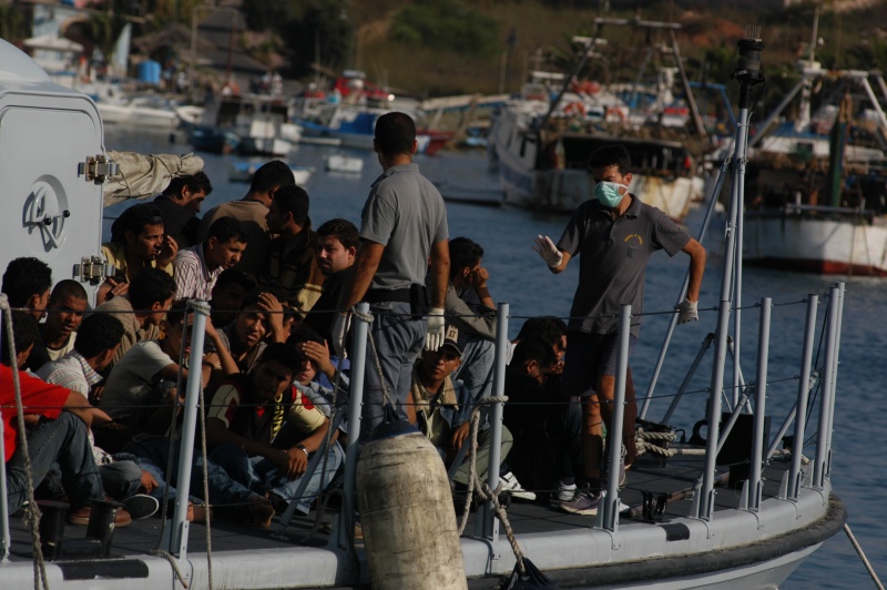
Noborder Network – Lampedusa

Welcome to this week’s Data Roundup. We collect articles and snippets all about Data (Learning, using and theorizing.). You can help us collecting news using the hashtag #dataroundup or by adding your ideas to the School of Data Roundup Etherpad.

Tools

On Journalism.co.uk Alastair Raid wrote about the launch on next summer of Trooclick an automatic fact-checking Firefox plug-in which will be able to verify the foundation of an article when a user reads it.

Data Stories

Few days before the European elections day Simon Rogers published a map of the United Kingdom with geotagged tweets mentioning the political groups represented in the parliament. Now that elections are passed it might be interesting to compare the results with the geographical distributions of the tweets.

Migration has always been a constant in human history but how did it change in the last twenty years? Discover the new routes of the migrants on the interactive chord graph “The Global Flow of People” by Nikola Sander, Guy J. Abel and Ramon Bauer.

In some countries getting a university degree might mean falling into debts of thousand of dollars. In this short article on Vox Danielle Kurtzleben underlines the increasing gap between student incomes and debts.

Alberto Cairo has recently accused websites (Vox and 538 among the others) of doing “datum journalism” and not data-journalism. The Niemanlab collected opinions from many different influential experts and academics on Cairo’s point of view.

How many satellites are there in space? Who owns or controls them? What’s their main activity? Skies are populated of these rotating objects since the launch of the Sputnik in 1957. But what happened next? The answer in this data visualization: “A visual history of Satellites”.

Rating a Healt Law’s Success” is a great piece of data-journalism from the New York Times which shows the existing gap between nations on the number of deaths that could have been prevented with access to health care.

Data Sources

Milena Marin, Project Coordinator at the School of Data, collected, organized a released a list of all the interesting resources that were mentioned or used during the International Journalism Festival. You may find tutorials, readings, slides, videos and much more here.

What’s the beauty of creating data visualizations? Listen to the answer that David McCandless gave to this question at a TED talk conference.

The first week of the European Journalism Centre MOOC “Doing journalism with data” has already gone but Simon Rogers gently published the text of the first part of his module for all of those who might have missed it.

Every once in a while It is always recommendable to update your list of people to follow on Twitter. Travis Korte from the Center for Data Innovation suggests 15 woman data-lovers accounts which it might be useful to monitor.

Another useful list of resources is the one suggested by the managing editor of the International Journalists’ Network Maite Fernandez: if you are looking for guides, articles, videos or data hubs take a look here.

Working with data requires a methodology. If you are a novice you should take a look at this guide from Ictworks.org.

Open data may increase a government efficiency. If you have good idea on how to use data to improve public administration’s services then we suggest you to partecipate to the If Gov Then That initiative.

Credits

Thanks to Zara Rahman (@zararah) and Lucy Chambers (@lucyfedia) for their contributions to this edition of the Data Roundup.

Flattr this!