Harvesting and Analyzing Tweets
Neil Ashton - December 10, 2013 in
Twitter is a fabulous source for information. Whenever something is happening, people around the world start tweeting away. Often they include hashtags, allowing us to selectively search for tweets about a certain event or thing. Many twitter users also engage in conversations, and looking at these conversations allows us to identify leaders and frequent actors.
In this lesson, we will look how to harvest tweets from Twitter using ScraperWiki and how to analyse them using social network analysis and software called Gephi.
What you will need
- An account on ScraperWiki
-
A Twitter account
Harvesting Tweets using ScraperWiki
The first thing we need to do is to get tweets out of Twitter. Getting full access to everything that is posted to Twitter is hard and mainly used by academics and companies building on top of it. Nevertheless, everyone can get a selection of tweets using the Twitter API and searching for specific keywords or users.
There are various tools to get tweets out of Twitter. By far the easiest to use seems to be ScraperWiki.
Walkthrough: Harvesting tweets with ScraperWiki
- Sign in to ScraperWiki.
-
In your “data hub” (the page you get to after signing in), click the big “create a new dataset” field.
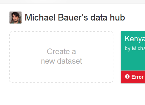
Create a new dataset
-
You will be presented with multiple options. Select “Search for Tweets”.
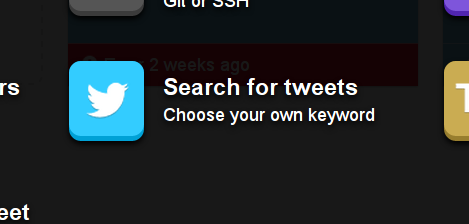
Search for tweets
-
Now Scraperwiki will start up a simple search interface. Enter a search term and go ahead. I’ll search for #ddj:
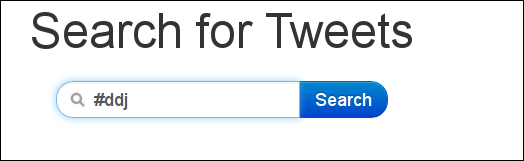
Search for #ddj
You will need to authorize the app that comes up with Twitter, and ScraperWiki will start downloading all tweets it can find.
-
Check the Also monitor for future tweets checkbox to create a continuous dataset.
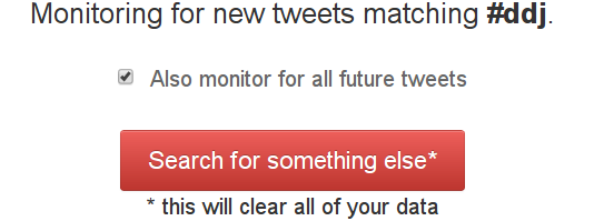
Create a continuous dataset
-
Now you can see the tweets ScraperWiki grabbed via “View in a Table”.
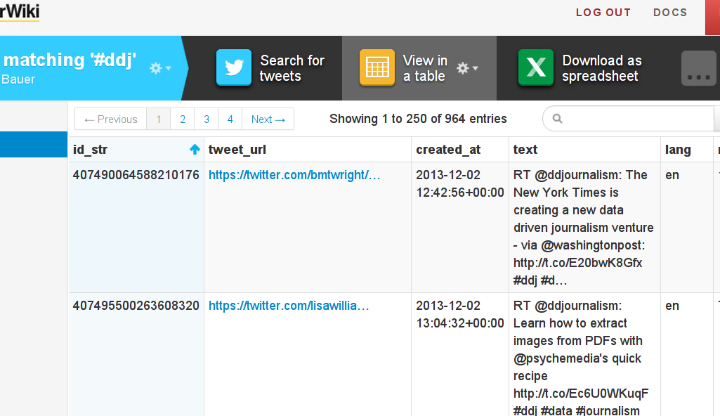
View in a table
-
To effectively work with it, download it as a spreadsheet.
Well done—now you’ve downloaded a dataset full of tweets!
Analyzing Languages
Once we have our dataset, let’s do some analysis with it.
First let’s look at what we can find out. Twitter gives us a wide range of information: the date, who’s tweeting, the language the tweet is in, and so on. Doing a quick pivot table on the downloaded dataset allows us to see which languages are the most frequent. We can also find out whether or not a link was included.
You’ll also notice the mention and hashtag columns. These are quite handy, but you’ll soon realize they only include the first mention and hashtag. If we want to do a full analysis, we’ll have to extract more.
Analyzing social networks from tweets
Let’s do a network analysis based on people tweeting and on people and hashtags mentioned in tweets.
This is going to be a two-step approach. Since the Twitter API only gives us the first mention or hashtag, we have to get the full information out and into the right format. For this we’ll use Refine, since it’s great at bringing data into the shape we need.
Walkthrough: Extracting mentions and hashtags using Refine
- Load the dataset you just downloaded into Refine using “create project”.
We’re interested in getting the data into a format that has two columns. The first column is the screen name, and the second is any hashtag or account that is mentioned in a tweet by that user. Gephi understands that format easily.
First, let’s extract mentions and hashtags from the tweets. Mentions start with
@, and hashtags start with#. -
Let’s start by lowercasing all the tweets. This helps to unify hashtags and mentions.
We’ll do so by selecting “edit cells – common transforms – to lowercase” from the column options menu of the text column (the arrow next to the column name).
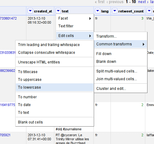
To lowercase
-
Great! To get all mentions out, we have to do several steps at once.
First we need to split all the words. Twitter delineates words by anything that is not a letter, number, dash (
-), or underscore (_).Select “edit columns – add column based on this column” and choose the column mentions. The expression that will split the column’s text into words is
value.split(/[^[email protected]#]/).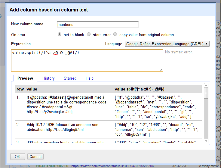
Add column based on column text
-
Next we need to filter the list that comes out. We want everything that starts with a
@or#.To filter the list, we use the function
filter(). Thefilter()function wants your list first, then the name of a variable to assign to each column, and then something that checks whether or not it should be included.If we want to filter for each person mention, for example, we can use the expression:
filter(value.split(...),i,i.startsWith("@"))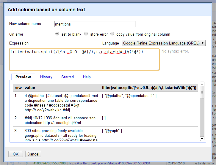
filter expression
-
To get any hashtags, we could use
i.startsWith("#")instead. But since we want either mentions or hashtags, we’ll use another formula to connect them:or. We’ll writeor(i.startsWith(“#”),i.startsWith(“@”))as a condition.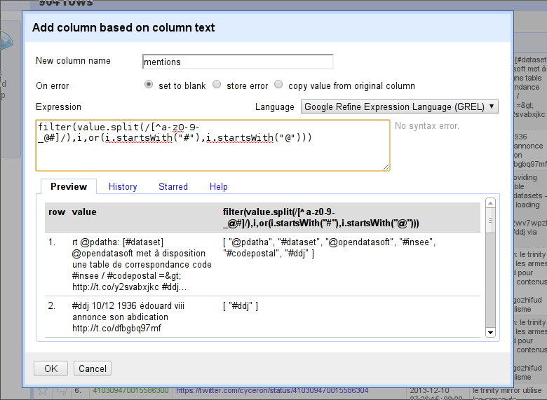
filter expression: or
-
One thing remains to be done, and then we’ll have our giant expression written. We’ll need to join the list (so that Refine can handle it) by appending the
.join(",")function. This joins the list into a single string of text by inserting commas.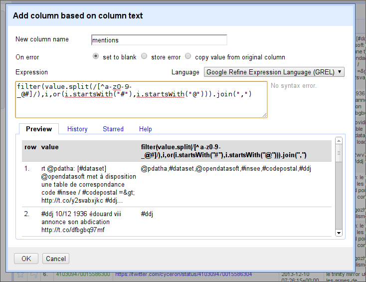
.join()
-
Great—now let’s add this column.
Let’s remove everything we don’t need anymore and bring the two columns “screen name” and “mentions” into position.
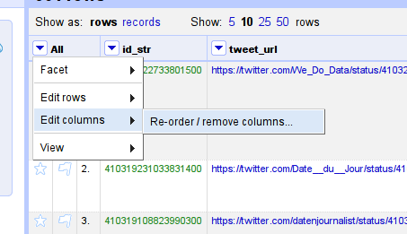
Re-order columns
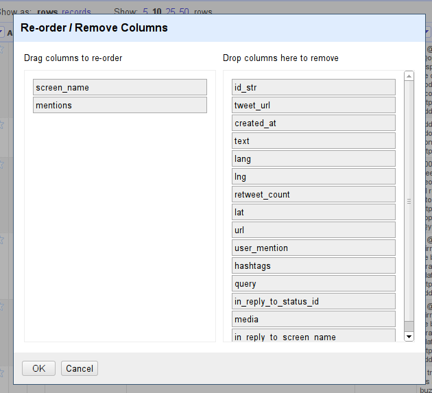
Re-order *screen_name* and *mentions*
-
Great, now you’ll have two columns left. For Gephi, we’ll need to have each user-mention pair in a row. Let’s split the column into several rows.
Do so with “edit cells – split multi-valued cells”, and split by comma (
,).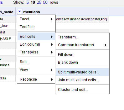
Split by comma
-
Fantastic. Notice how only the first row has the users tweeting. This is not a problem. Use “edit cells – fill down” to add them to all the empty rows.
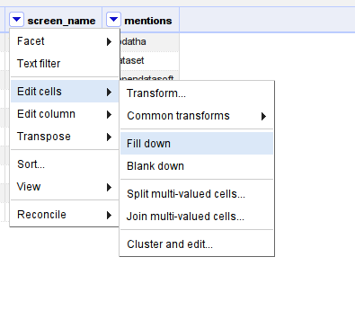
Fill down
-
There is a difference between the screen_names and the mentions: mentions start with
@(for users) and are in lowercase.Let’s lowercase the letters using “edit cells – common transforms – to lowercase”, as above.
-
Then use “edit cells – Transform” to add the
@in front of the name using"@"+value. -
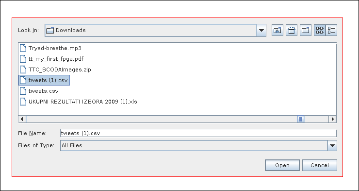
Fantastic! You have now formatted the file for Gephi. Download it as CSV using the “Export” button.
Walkthrough: Social network analysis using Gephi
-
Start Gephi and choose “new project”.
-
Open the CSV with “file – open”.
Open the CSV
-
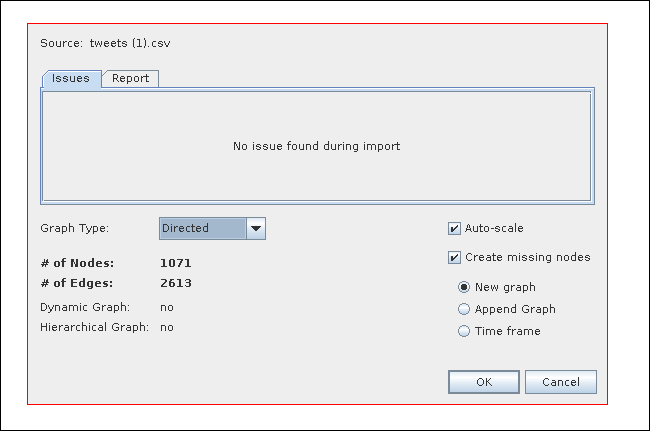
Select “directed” and leave the defaults.
Choose “Directed”
-
Click “OK” to create a graph.
-
Since Gephi takes all the rows and columns into account, we’ll have to remove the header.
Change the view to the “data laboratory” view.
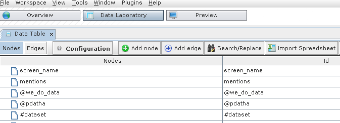
Data Laboratory
-
Remove the first two nodes (screen_name and mentions): mark them, then right click and select “delete all”.
-
Change back to the “overview”.
-
At first, this graph doesn’t look very special, simply because we haven’t applied any layout yet.
Let’s do so. In the layout window on the left, select “ForceAtlas 2”. This will apply a force-directed layout.
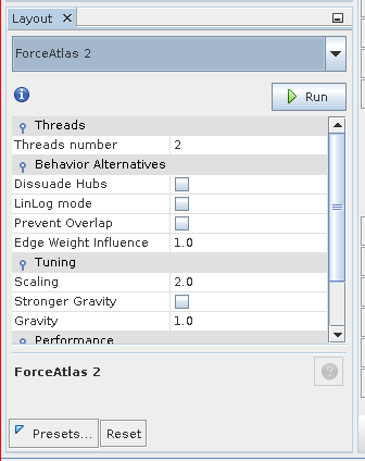
ForceAtlas 2
-
ForceAtlas is a very simple algorithm. It groups connected nodes closer together.
Let it run for a while. Note how many nodes stay in the middle. This is because we searched for #ddj and all the tweets contain it. Let’s remove it from our nodes.
Doing so results in a much nicer layout. (Press “play” and “stop” as you like.)
-
But how do we know which dot is which? Let’s enable the labels.
Enable labels
-
The labels right now are not clear to read, and we don’t know which labels are important. We can scale the labels by how many connections (mentions, tweets) a label has.
In the top right, select label size. Then choose “degree” as a parameter.
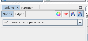
Choose a rank parameter
-
Click on “apply” and play with the parameters (minimum and maximum size) as you see fit.
-
Okay, we still can’t read a thing! Luckily there is a layout called “label adjust”. This layout will move nodes so the labels don’t overlap. Try this for a while.
-
Now if you use the zoom (hidden in a menu below the graph), you can get a pretty clear picture of who’s important.
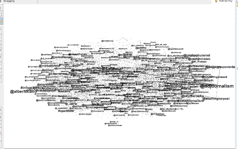
Zoom
-
But this is not the only thing we can do. We can check for clusters: people and hashtags that belong together.
Do so by switching to “statistics” on the tab on the right.
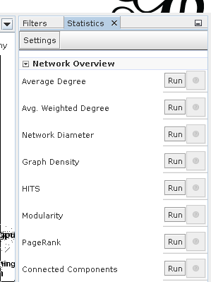
Statistics
-
Choose Modularity. Now we can color the labels by modularity class. Select the label color on the left.
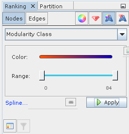
Modularity Class
-
Now you can see which hashtags and people are closer together and which are farther apart.
Other interesting parameters are “centrality” (who is more central in the network, who is less connected, etc.).
-
When you’re done, you can either export the data or format the graph for exporting in the “preview” tab. This works slightly differently from the “overview”, so you’ll need to play around for a while to create a nice-looking graph.
Further Analysis
Of course, social network analysis is only one of the analyses possible. I’ve outlined some others below.
Wordcloud
Using a service like Wordle, remove all the mentions and hashtags and create a wordcloud. I’d use a spreadsheet and a formula like =Concatenate(text column) to create one giant string from all the tweets.
Keyword analysis
Sometimes you know that certain keywords will be present and you just want to check for them. You could, for example, check for occurrences of certain hashtags together (e.g. how often do #ddj tweets mention “dataviz”?).
Mapping
The spreadsheet contains latitude and longitude for tweets which have a location. You could easily map them using an online service such as CartoDB.
Time-based analysis
Can you find out how keywords and or hashtags change over time? How does the discussion shift?
Sentiment
A more sophisticated analysis is sentiment analysis. For this, you would either specify keywords for which you say “this means happy” or “this means sad”—or employ machine learning and a training set to determine the mood of the tweets. While this is out of range for a simple tutorial, it is a quite powerful form of analysis.