You are browsing the archive for Data Cleaning.

Data expedition tutorial: UK and US video game magazines

- February 3, 2015 in Data Cleaning, HowTo, Spreadsheets, Storytelling, Workshop Methods, Блог, Интернационален

Data Pipeline

This article is part tutorial, part demonstration of the process I go through to complete a data expedition alone, or as a participant during a School of Data event. Each of the following steps will be detailed: Find, Get, Verify, Clean, Explore, Analyze, Visualize, Publish

Depending on your data, your source or your tools, the order in which you will be going through these steps might be different. But the process is globally the same.


FIND

A data expedition can start from a question (e.g. how polluted are european cities?) or a data set that you want to explore. In this case, I had a question: Has the dynamic of the physical video game magazine market been declining in the past few years ? I have been studying the video game industry for the past few weeks and this is one the many questions that I set myself to answer. Obviously, I thought about many more questions, but it’s generally better to start focused and expand your scope at a later stage of the data expedition.

A search returned Wikipedia as the most comprehensive resource about video game magazines. They even have some contextual info, which will be useful later (context is essential in data analysis).

Screenshot of the Wikipedia table about video game magazines
https://en.wikipedia.org/wiki/List_of_video_game_magazines

GET

The wikipedia data is formatted as a table. Great! Scraping it is as simple as using the importHTML function in Google spreadsheet. I could copy/paste the table, but that would be cumbersome with a big table and the result would have some minor formatting issues. LibreOffice and Excel have similar (but less seamless) web import features.

importHTML asks for 3 variables: the link to the page, the formatting of the data (table or list), and the rank of the table (or the list) in the page. If no rank is indicated, as seen below, it will grab the first one.

Once I got the table, I do two things to help me work quicker:

  • I change the font and cell size to the minimum so I can see more at once
  • I copy everything, then go to Edit→Paste Special→Paste values only. This way, the table is not linked to importHTML anymore, and I can edit it at will.

VERIFY

So, will this data really answer my question completely? I do have the basic data (name, founding data, closure date), but is it comprehensive? A double check with the French wikipedia page about video game magazines reveals that many French magazines are missing from the English list. Most of the magazines represented are from the US and the UK, and probably only the most famous. I will have to take this into account going forward.

CLEAN

Editing your raw data directly is never a good idea. A good practice is to work on a copy or in a nondestructive way – that way, if you make a mistake and you’re not sure where, or want to go back and compare to the original later, it’s much easier. Because I want to keep only the US and UK magazines, I’m going to:

  • rename the original sheet as “Raw Data”
  • make a copy of the sheet and name it “Clean Data”
  • order alphabetically the Clean Data sheet according to the “Country” column
  • delete all the lines corresponding to non-UK or US countries.

Making a copy of your data is important

Tip: to avoid moving your column headers when ordering the data, go to Display→Freeze lines→Freeze 1 line.

Ordering the data to clean it

Some other minor adjustments have to be made, but they’re light enough that I don’t need to use a specialized cleaning tool like Open Refine. Those include:

  • Splitting the lines where 2 countries are listed (e.g. PC Gamer becomes PC Gamer UK and PC Gamer US)
  • Delete the ref column, which adds no information
  • Delete one line where the founding data is missing

EXPLORE

I call “explore” the phase where I start thinking about all the different ways my cleaned data could answer my initial question[1]. Your data story will become much more interesting if you attack the question from several angles.

There are several things that you could look for in your data:

  • Interesting Factoids
  • Changes over time
  • Personal experiences
  • Surprising interactions
  • Revealing comparisons

So what can I do? I can:

  • display the number of magazines in existence for each year, which will show me if there is a decline or not (changes over time)
  • look at the number of magazines created per year, to see if the market is still dynamic (changes over time)

For the purpose of this tutorial, I will focus on the second one, looking at the number of magazines created per year Another tutorial will be dedicated to the first, because it requires a more complex approach due to the formatting of our data.

At this point, I have a lot of other ideas: Can I determine which year produced the most enduring magazines (surprising interactions)? Will there be anything to see if I bring in video game website data for comparison (revealing comparisons)? Which magazines have lasted the longest (interesting factoid)? This is outside of the scope of this tutorial, but those are definitely questions worth exploring. It’s still important to stay focused, but writing them down for later analysis is a good idea.

ANALYSE

Analysing is about applying statistical techniques to the data and question the (usually visual) results.

The quickest way to answer our question “How many magazines have been created each year?” is by using a pivot table.

  1. Select the part of the data that answers the question (columns name and founded)
  2. Go to Data->Pivot Table
  3. In the pivot table sheet, I select the field “Founded” as the column. The founding years are ordered and grouped, allowing us to count the number of magazines for each year starting from the earliest.
  4. I then select the field “Name” as the values. Because the pivot tables expects numbers by default (it tries to apply a SUM operation), nothing shows. To count the number of names associated with each year, the correct operation is COUNTA. I click on SUM and select COUNT A from the drop down menu.

This data can then be visualized with a bar graph.

Video game magazine creation every year since 1981

The trendline seems to show a decline in the dynamic of the market, but it’s not clear enough. Let’s group the years by half-decade and see what happens:

The resulting bar chart is much clearer:

The number of magazines created every half-decade decreases a lot in the lead up to the 2000s. The slump of the 1986-1990 years is perhaps due to a lagging effect of the North american video game crash of 1982-1984

Unlike what we could have assumed, the market is still dynamic, with one magazine founded every year for the last 5 years. That makes for an interesting, nuanced story.

VISUALISE

In this tutorial the initial graphs created during the analysis are enough to tell my story. But if the results of my investigations required a more complex, unusual or interactive visualisation to be clear for my public, or if I wanted to tell the whole story, context included, with one big infographic, it would fall into the “visualise” phase.

PUBLISH

Where to publish is an important question that you have to answer at least once. Maybe the question is already answered for you because you’re part of an organisation. But if you’re not, and you don’t already have a website, the answer can be more complex. Medium, a trendy publishing platform, only allows images at this point. WordPress might be too much for your need. It’s possible to customize the Javascript of tumblr posts, so it’s a solution. Using a combination of Github Pages and Jekyll, for the more technically inclined, is another. If a light database is needed, take a look at tabletop.js, which allows you to use a google spreadsheet as a quasi-database.


Any data expedition, of any size or complexity, can be approached with this process. Following it helps avoiding getting lost in the data. More often than not, there will be a need to get and analyze more data to make sense of the initial data, but it’s just a matter of looping the process.

[1] I formalized the “explore” part of my process after reading the excellent blog from MIT alumni Rahoul Bhargava http://datatherapy.wordpress.com

Flattr this!

A Weekend of Data, Hacks and Maps in Nigeria

- September 16, 2014 in charity data, Data Cleaning, Data Expeditions, event, Mapping, maps, School_Of_Data, Spreadsheets, Visualisation

It was another weekend of hacking for good all around the world, and Abuja, Nigeria was not left out of the weekend of good, as 30 participants gathered at the Indigo Trust funded space of Connected Development [CODE] on 12 – 14 September, scraping datasets, brainstorming creating technology for good, and not leaving one thing out – talking soccer (because it was a weekend, and Nigeria “techies” love soccer especially the English premiership).

Participants at the Hack4Good 2014 in Nigeria

Participants at the Hack4Good 2014 in Nigeria

Leading the team, was Dimgba Kalu (Software Architect with Integrated Business Network and founder TechNigeria), who kick started the 3 day event that was built around 12 coders with other 18 participants that worked on the Climate Change adaptation stream of this year #Hack4Good. So what data did we explore and what was hacked over the weekend in Nigeria? Three streams were worked :

  1. Creating a satellite imagery tagging/tasking system that can help the National Space Research Development Agency deploy micromappers to tag satellite imageries from the NigeriaSat1 and NigeriaSat2
  2. Creating an i-reporting system that allows citizen reporting during disasters to Nigeria Emergency Management Agency
  3. Creating an application that allows citizens know the next water point and its quality within their community and using the newly released dataset from the Nigeria Millennium Development Goal Information System on water points in the country.

Looking at the three systems that was proposed to be developed by the 12 coders, one thing stands out, that in Nigeria application developers still find it difficult to produce apps that can engage citizens – a particular reason being that Nigerians communicate easily through the radio, followed by SMS as it was confirmed while I did a survey during the data exploration session.

Coders Hackspace

Coders Hackspace

Going forward, all participants agreed that incorporating the above medium (Radio and SMS) and making games out of these application could arouse the interest of users in Nigeria.  “It doesn’t mean that Nigerian users are not interested in mobile apps, what we as developers need is to make our apps more interesting” confirmed Jeremiah Ageni, a participant.

The three days event started with the cleaning of the water points data, while going through the data pipelines, allowing the participants to understand how these pipelines relates to mapping and hacking. While the 12 hackers were drawn into groups, the second day saw thorough hacking – into datasets and maps! Some hours into the second day, it became clear that the first task wouldn’t be achievable; so much energy should be channelled towards the second and third task.

SchoolofData Fellow - Oludotun Babayemi taking on the Data Exploration session

SchoolofData Fellow – Oludotun Babayemi taking on the Data Exploration session

Hacking could be fun at times, when some other side attractions and talks come up – Manchester United winning big (there was a coder, that was checking every minutes and announcing scores)  , old laptops breaking (seems coders in Abuja have old  ones), coffee and tea running out (seems we ran out of coffee, like it was a sprint), failing operating systems (interestingly, no coders in the house had a Mac operating system), fear of power outage (all thanks to the power authority – we had 70 hours of uninterrupted power supply) , and no encouragement from the opposite sex (there was only two ladies that strolled into the hack space).

Bring on the energy to the hackspace

Bring on the energy to the hackspace

As the weekend drew to a close, coders were finalizing and preparing to show their great works.  A demo and prototype of streams 2 and 3 were produced. The first team (working on stream 2), that won the hackathon developed EMERGY, an application that allows citizens to send geo-referenced reports disasters such as floods, oil spills, deforestation to the National Emergency Management Agency of Nigeria, and also create a situation awareness on disaster tagged/prone communities, while the second team, working on stream 3, developed KNOW YOUR WATER POINT an application that gives a geo-referenced position of water points in the country. It allows communities; emergency managers and international aid organizations know the next community where there is a water source, the type, and the condition of the water source.

(The winning team of the Hack4Good Nigeria) From Left -Ben; Manga; SchoolofData Fellow -Oludotun Babayemi; Habib; Chief Executive, CODE - Hamzat

(The winning team of the Hack4Good Nigeria) From Left -Ben; Manga; SchoolofData Fellow -Oludotun Babayemi; Habib; Chief Executive, CODE – Hamzat

Living with coders all through the weekend, was mind blowing, and these results and outputs would not be scaled without its challenges. “Bringing our EMERGY application live as an application that cuts across several platforms such as java that allows it to work on feature phones can be time consuming and needs financial and ideology support” said Manga, leader of the first team. Perhaps, if you want to code, do endeavour to code for good!


Flattr this!

WhatDoTheyKnow Team Urge Caution When Using Excel to Depersonalise Data

- June 17, 2014 in Community, Data Cleaning, HowTo, Spreadsheets

[Guest Cross-post: from Myfanway Nixon of mySociety. You can learn more about her on her blog. The original post can be found here. Thanks for sharing!]

mySociety’s Freedom of Information website WhatDoTheyKnow is used to make around 15 to 20% of FOI requests to central government departments and in total over 160,000 FOI requests have been made via the site. wdtklogo

Occasionally, in a very small fraction of cases, public bodies accidentally release information in response to a FOI request which they intended to withhold. This has been happening for some time and there have been various ways in which public bodies have made errors. We have recently, though, come across a type of mistake public bodies have been making which we find particularly concerning as it has been leading to large accidental releases of personal information.

What we believe happens is that when officers within public bodies attempt to prepare information for release using Microsoft Excel, they import personally identifiable information and an attempt is made to summarise it in anonymous form, often using pivot tables or charts.

What those working in public bodies have been failing to appreciate is that while they may have hidden the original source data from their view, once they have produced a summary it is often still present in the Excel workbook and can easily be accessed. When pivot tables are used, a cached copy of the data will remain, even when the source data appears to have been deleted from the workbook.

When we say the information can easily be accessed, we don’t mean by a computing genius but that it can be accessed by a regular user of Excel.

We have seen a variety of public bodies, including councils, the police, and parts of the NHS, accidentally release personal information in this way. While the problem is clearly the responsibility of the public bodies, it does concern us because some of the material ends up on our website (it often ends up on public bodies’ own FOI disclosure logs too).

We strive to run the WhatDoTheyKnow.com website in a responsible manner and promptly take down inappropriately released personal information from our website when our attention is drawn to it. There’s a button on every request thread for reporting it to the site’s administrators.

As well as publishing this blog post in an effort to alert public bodies to the problem, and encourage them to tighten up their procedures, we’ve previously drawn attention to the issue of data in “hidden” tabs on Excel spreadsheets in our statement following an accidental release by Islington council; one of our volunteers has raised the issue at a training event for police FOI officers, and we’ve also been in direct contact with the Information Commissioner’s office both in relation to specific cases, and trying to help them understand the extent of the problem more generally.

Advice

Some of our suggestions:

  • Don’t release Excel pivot tables created from spreadsheets containing personal information, as the source data is likely to be still present in the Excel file.
  • Ensure those within an organisation who are responsible for anonymising data for release have the technical competence to fulfil their roles.
  • Check the file sizes. If a file is a lot bigger than it ought to be, it could be that there are thousands of rows of data still present in it that you don’t want to release.
  • Consider preparing information in a plain text format, eg. CSV, so you can review the contents of the file before release.

Flattr this!

Putting Points on Maps Using GeoJSON Created by Open Refine

- May 19, 2014 in Data Cleaning, Data for CSOs, HowTo, Mapping

Having access to geo-data is one thing, quickly sketching it on to a map is another. In this post, we look at how you can use OpenRefine to take some tabular data and export it in a format that can be quickly visualised on an interactive map.

At the School of Data, we try to promote an open standards based approach: if you put your data into a standard format, you can plug it directly into an application that someone else has built around that standard, confident in the knowledge that it should “just work”. That’s not always true of course, but we live in hope.

In the world of geo-data – geographical data – the geojson standard defines a format that provides a relatively lightweight way of representing data associated with points (single markers on a map), lines (lines on a map) and polygons (shapes or regions on a map).

Many applications can read and write data in this format. In particular, Github’s gist service allows you to paste a geojson data file into a gist, whereupon it will render it for you (Gist meets GeoJSON).

Gists_and_test

So how can we get from some tabular data that looks something like this:

simple_geo_points-tab_-_OpenRefine

Into the geojson data, which looks something like this?

{"features": [   {"geometry": 
        {   "coordinates": [  0.124862,
                 52.2033051
            ],
            "type": "Point"},
         "id": "Cambridge,UK",
         "properties": {}, "type": "Feature"
    },
   {"geometry": 
        {   "coordinates": [ 151.2164539,
                 -33.8548157
            ],
            "type": "Point"},
         "id": "Sydney, Australia",
         "properties": {}, "type": "Feature"
    }], "type": "FeatureCollection"}

[We’re assuming we have already geocoded the location to get latitude and longitude co-ordinates for it. To learn how to geocode your own data, see the School of Data lessons on geocoding or this tutorial on Geocoding Using the Google Maps Geocoder via OpenRefine].

One approach is to use OpenRefine [openrefine.org]. OpenRefine allows you to create your own custom export formats, so if we know what the geojson is supposed to look like (and the standard tells us that) we can create a template to export the data in that format.

Steps to use Open Refine:

Locate the template export tool is in the OpenRefine Export drop-down menu:

export-_OpenRefine

Define the template for our templated export format. The way the template is applied is to create a standard header (the prefix), apply the template to each row, separating the templated output for each row by a specified delimiter, and then adding a standard footer (the suffix).

simple_geo_points_-_OpenRefine

Once one person has worked out the template definition and shared it under an open license, the rest of us can copy it, reuse it, build on it, improve it, and if necessary, correct it…:-) The template definitions I’ve used here are a first attempt and represent a proof-of-concept demonstration: let us know if the approach looks like it could be useful and we can try to work it up some more.

It would be useful if OpenRefine supported the ability to save and import different template export configuration files, perhaps even allowing them to be imported from and save to a gist. Ideally, a menu selector would allow column names to be selected from the current data file and then used in template.

Here are the template settings for template that will take a column labelled “Place”, a column named “Lat” containing a numerical latitude value and a column named “Long” containing a numerical longitude and generate a geojson file that allows the points to be rendered on a map.

Prefix:

{"features": [

Row template:

 {"geometry": 
        {   "coordinates": [ {{cells["Long"].value}},
                {{cells["Lat"].value}}
            ],
            "type": "Point"},
         "id": {{jsonize(cells["Place"].value)}},
         "properties": {}, "type": "Feature"
    }

Row separator:

,

Suffix:

], "type": "FeatureCollection"}

This template information is also available as a gist: OpenRefine – geojson points export format template.

Another type of data that we might want to render onto a map is a set of markers that are connected to each other by lines.

For example, here is some data that could be seen as describing connections between two places that are mentioned on the same data row:

point_to_point_demo_tab_-_OpenRefine

The following template generates a place marker for each place name, and also a line feature that connects the two places.

Prefix:

{"features": [

Row template:

 {"geometry": 
        {   "coordinates": [ {{cells["from_lon"].value}},
                {{cells["from_lat"].value}}
            ],
            "type": "Point"},
         "id": {{jsonize(cells["from"].value)}},
         "properties": {}, "type": "Feature"
    },
{"geometry": 
        {   "coordinates": [ {{cells["to_lon"].value}},
                {{cells["to_lat"].value}}
            ],
            "type": "Point"},
         "id": {{jsonize(cells["to"].value)}},
         "properties": {}, "type": "Feature"
    },
{"geometry": {"coordinates": 
[[{{cells["from_lon"].value}}, {{cells["from_lat"].value}}], 
[{{cells["to_lon"].value}}, {{cells["to_lat"].value}}]], 
"type": "LineString"}, 
"id": null, "properties": {}, "type": "Feature"}

Row separator:

,

Suffix:

], "type": "FeatureCollection"}

If we copy the geojson output from the preview window, we can paste it onto a gist to generate a map preview that way, or test it out in a geojson format checker such as GeoJSONLint:

GeoJSONLint_-_Validate_your_GeoJSON

I have pasted a copy of the OpenRefine template I used to generate the “lines connecting points” geojson here: OpenRefine export template: connected places geojson.

Finally, it’s worth noting that if we can define a standardised way of describing template generated outputs from tabular datasets, libraries can be written for other programming tools or languages, such as R or Python. These libraries could read in a template definition file (such as the gists based on the OpenRefine export template definitions that are linked to above) and then as a direct consequence support “table2format” export data format conversions.

Which makes me wonder: is there perhaps already a standard for defining custom templated export formats from a tabular data set?

Flattr this!

Avoiding mistakes when cleaning your data

- November 14, 2013 in Data Cleaning, HowTo

World Cleanup 2012 - Slovenia

Photo credit: Earth Day Pictures

School of Data is re-publishing Noah Veltman‘s Learning Lunches, a series of tutorials that demystify technical subjects relevant to the data journalism newsroom.

This Learning Lunch is about cleaning up data: what to do and, more importantly, what not to do.

One of the most important and oft-neglected steps in any data journalism project is cleaning up raw data. Almost always, when you first get the data you want (or the data you’ve settled for), it’s not yet usable. It’s riddled with inconsistencies and doesn’t express the relationships you want to analyze. You don’t fully understand its parameters yet. Before you can make it interesting, you need to field strip it and put it back together.

This process is dangerous; there are lots of ways to go wrong and make mistakes without even realizing it. When you screw up your data in the process of cleaning it, the best-case scenario is that you waste a lot of time, but the worst-case scenario is that your ultimate analysis will be wrong because you’ve unknowingly changed the data.

Here are some guiding principles to consider whenever you’re about to start cleaning up and reshaping raw data for analysis.

Don’t change your original files/tables

If you have a big Excel file or a MySQL table that needs cleaning, don’t just go in there and start drilling holes in the wall. Make a copy and work on that instead. It will make it easier to start over if you screwed up, and, more importantly, you can compare what you’ve got at different stages of cleaning and mutation to make sure it matches up not just with the previous step in your cleaning but with the starting data.

As a corollary to this, you shouldn’t throw away data just because you think you don’t need it. Be a bit of a digital packrat. Keep things around, but also keep them clearly labeled so you don’t mistake one file for another.

Spot check everything

As soon as your dataset is large enough that you can’t read it all line-by-line (which is to say, just about every dataset), you have to start spot checking. Any assumptions you have about the nature and consistency of the data are just a guess, and they’re probably wrong. SELECT * FROM \`TABLE\` ORDER BY 1 LIMIT 5 is one my most frequent SQL statements (for non-SQL people: “show me 5 random rows from the table”). Use it, love it. Get a few random records at a time and read them closely. See if anything seems off. Do this early and often. It will prevent dumb mistakes, but there’s also a bonus: it will give you much better insight into your data.

Check for weird values

Look out for empty values, and especially for pseudo-empty values. Excel files from government agencies are unendingly creative when it comes to weird placeholder characters, and you’ll get data that uses - or * or ~ to fill a blank space. For bonus points, check for extreme value lengths too. If most of the street addresses in your data are about 75 characters long and one of them is 450 characters long, strange things are afoot at the Circle K.

For every categorical column, check the list of values that exist in the data. Make sure everything that should be there is, and anything that shouldn’t be isn’t. GROUP BY (or its twin SELECT DISTINCT) should become your new best friend. For every numerical column, at least sanity check mins and maxes. Check the ranges of every special data type (e.g. ZIP codes). Don’t assume that all dates will be formatted the same, or even be dates.

When you’re GROUPing things, use COUNT() to see how many items there are in each category. See if all the numbers pass your basic smell test. If they don’t, you probably screwed something up, but if you’re lucky it means there’s a story there. Either way, you want to know.

Text data sucks. Be careful about whitespace, capitalization, and character collation in text columns. There could be random whitespace in your cells that breaks your ability to compare or group them. You know that “Paris” and “Paris ” are the same, but your database doesn’t. Use TRIM() where it’s reasonable to do so. And remember Veltman’s Law of Character Sets:

Veltman’s Law of Character Sets: there will be exactly one é somewhere in your data and you won’t find it until it ruins everything.

Worry about your column types

Whether you’re using Excel, a relational database, or something else, make sure that your columns/fields are the type you want, and all of the data going in matches those types. If you don’t, your data is going to get squeezed through a special decorative mold when you import it and all your candy cane integers will become snowflake text and you won’t even know it’s happening. This is especially important if your data is going to pulled out the other side later to power some sort of cool app, where it’s going to go through the variable type wringer again.

Pop quiz: which of the following things evaluate as false in whatever language your developers use?
0, “0”, 0.0, “0.0”, [], {}, [{}], null, undefined

Answer: don’t let this question come up.

Do dry runs before you change things

Are you changing all 50,000 rows in a table with a complicated UPDATE statement? Try updating a few of them first and inspecting the results. Make sure your clever operation with five nested REPLACE()s and an inscrutable WHERE clause does what you think it does. Or maybe you’re auto-generating a thousand database queries with a nifty script you wrote. Run a version that prints the queries without executing them first and read the output. SELECT liberally, INSERT and UPDATE conservatively.

Clear is better than clever

There’s no prize for writing the world’s most beautiful JOIN or most deeply-nested Excel formula, so don’t try. If you’re a journalist trying to whip some data into shape, it doesn’t matter if you take a few extra computing cycles. You are not working with Big Data. Processing power is cheap. Storage is cheap. Your time is not. Trying to be clever will make things harder to understand for you and for others, and it increases the chances that you’ll do something really stupid. When clever things fail, they tend to fail insidiously (I’m looking at you, crazy regexes). Keep your operations simple. Work stepwise. Break complicated operations into multiple simple ones. It creates a better trail so that when the results are all screwed up (they will be), you can figure out why.

Keep track of what you’re doing

Out of any piece of advice on this list, this is the one I’ve most consistently failed to heed. Don’t be like me. Keep a log of what you’re doing to the data. It can be a paper notebook or a slick automatic query logger or file version control with commit messages or a friendly parrot. It doesn’t matter. Knowing what exactly you’ve done to your data is important for troubleshooting and undoing mistakes, but it’s essential for quality journalism.

Flattr this!

In Support of the Bangladeshi Garment Industries Data Expedition

- October 18, 2013 in Data Cleaning, Data Expeditions, OpenRefine

<magazine.image =”http://farm4.staticflickr.com/3726/10346029396_8cd32e8d1f_z.jpg”>

A couple of quick things that may be of use in the current data expedition around the Bangladeshi garment industry…

Matching company names

One possible route for the expedition to take is to look to see whether a company referred to in one list (for example, a particular suppliers list) is also mentioned in another list (for example, the accord on fire safety, or a another supplier’s factory list or factory blacklist). It is quite possible that names won’t match exactly… Some clues for how to address this are described in the School of Data blog post Finding Matching Items on Separate Lists – Bangladeshi Garment Factories.

Other things you can try:

  • use a tool such as OpenRefine to fix the capitalisation, for example by converting names to titlecase (Edit Cells->Common Transforms->To titlecase);
  • a lossy approach (and so not ideal), though one that can help with exact string matching, is to get to the “core” of the company name, for example by stripping out mentions to words like “Limited”, or variants thereof:

example of pruning a company name

Here’s the command used in OpenRefine in that example:

value.toUppercase().replace(/[.;:’()`-]/,”).replace(‘LIMITED’,’LTD’).replace(/(LTD$)/,”).replace(‘\s+’,’ ‘).strip()

A better approach might be to “normalise” mentions to “Ltd”, etc, using something like this:

value.toUppercase().replace(/[.;:’()`-]/,”).replace(‘ LTD’,’ LIMITED’).replace(‘\s+’,’ ‘).strip()

normalising a company name

Corporate Identifiers

As described in the post On the Need for Corporate Identifiers , it’s often more convenient if we can represent companies using unique and unambiguous corporate identifiers.

OpenCorporates have recently uploaded details of Bangladeshi registered companies to their databases; using the OpenCorporates reconciliation API, mapping “messy” names to company identifiers can be handled by OpenCorporates automatically, with a confidence score describing the likelihood of a match being a “true” match.

The OpenCorporates reconciliation API can be used to match company names to just Bangladeshi registered companies using the reconciliation endpoint http://opencorporates.com/reconcile/bd

For convenience, I quickly ran the names of the company on the fire safety accord through the reconciliation process (results here). Not all the company names are matched, but a good proportion are. To match the rest, filter out the unmatched items, run the reconciliation search on what’s left and see if you can improve the matches.) Note that inspecting that data, I see that it needs cleaning a little! Also, the scraper used to get the data from the accord PDF is slightly broken.

Reconciliation is most easily achieved using OpenRefine. From the header of the company name column, select Reconcile -> Start reconciling...

openrefine add reconciliation service

Accept the defaults, and click on Start Reconciling to begin the matching process.

You can then set about accepting – or not – the matches… I tend to filter to just display the confident matches and accept them:

reconciliation - confident matching

Then I look at the middling matches and accept those by hand:

openrefine reconciliation

Then I’m often tempted to filter down to the results I’m not confident about and discard the reconciliation judgements:

reconciliation - filter and dsicard

You can generate new columns based on the data pulled down from the reconciliation API:

openrefine - get ready to add a column

For example:

  • to get the reconciled company name, create a new column based on the reconciled column with the pattern cell.recon.match.name.

reconciliation name match

  • to get the reconciled company identifier, create a new column based on the reconciled column with the pattern cell.recon.match.id.

Opencorproates id reconciliation match

If you reconcile names appearing in different lists, your data will be enriched with unambiguous names and identifiers that you can use to support company matching across differnt data files.

Addresses

There may be some work to be done around the addresses associated with each company. For example, the Bangladeshi company descriptions on OpenCorporates seem to be lacking in address information. There may be some merit in treating OpenCorporates as the bast place to store this information, and then retrieve it through the various OpenCorporates APIs as required. At the current time, volunteer effort in terms of adding address information to OpenCorporates may be one way forward?

Expedition activity?

A major use for the addresses is to support mapping activities. Some geocoders may give spurious locations for some addresses – try to force the issue by adding , Bangladesh on to the end of every address you geocode.

It may be possible to augment addresses for geocoding using additional geographical region information. There is a list of Bangladesh postcodes by area published at http://www.bangladeshpost.gov.bd/postcode.asp which I have scraped and popped into a data file here:
https://github.com/psychemedia/ScoDa-GarmentsDataExpedition/tree/master/geocoding

It may be possible/appropriate to annotate addresses with additional information from this file, for example by matching on district and/or division and adding in more information to the geocoded address, where possible. (Phone city codes may also help identify additional address information – is there a mapping of these somewhere? Or could we construct one?)

If you do get latitude/longitude coordinates for an address, try to also associate the co-ordinates with an OpenCorporates company identifier to support unambiguous matching of co-ordinates/locations to names (although there may be multiple names/identifiers associated with a particular location).

Other hints and tips

If you have any other tricks that may be useful to support the current data expedition, please feel free to add a link to, or description of, them as a comment to this post.

Or if you discover or develop a useful technique during the data expedition that you think would have helped had you come across it before you started the expedition, again, please link to or describe it in the comments below.

Data resources: data resources to support the investigation are available here:
http://datahub.io/dataset/bangladesh-garment-industry-dataset
Global Garment Supply Chain Data

Flattr this!

Exploring IATI funders in Kenya, Part II – cleaning & visualizing the data

- August 22, 2013 in Data Cleaning, Visualisation

Welcome back to a brief exploration of who funds whom in Kenya based on freely available data from IATI (International Aid Transparency Initiative).

In the last post, we extracted data from IATI data using Python. In this post, we’ll clean that data up and visualize it as a network graph to see what it can tell us about aid funding in Kenya.

If you couldn’t follow the code in the last post, don’t worry: we’ll use the GUI tools OpenRefine and Gephi from now on. You can download the result of last post’s data extraction here.

Data cleaning: OpenRefine

First, let’s clean up the data using Refine. Start Refine and then create a new project with the data file. The first things we’ll do are to clean up both columns and to bring the entries to a common case – I prefer titlecase. We do this with the “Edit cells -> Common transforms” functions “To titlecase” and “Trim leading and trailing whitespaces”:

titlecase

We do this for both columns. Next we want to make sure that the Ministry of Finance is cited consistently in the data. For this, we first expand all mentions of “Min.” to “Ministry” using a transform (“Edit cells -> Transform…”):

min

We’ll also do the same for “Off.” and “Office”. Now let’s use the Refine cluster feature to try to automatically cluster entries that belong together.

We create a text facet using the “Facet -> Text” facet option on the Implementers Column. Next, click on the “cluster” button in the upper right. We do this for both columns. (If you’re not sure how to use this feature, check out our Cleaning Data with Refine recipe.)

As a last step, we’ll need to get rid of whitespace, as it tends to confuse Gephi when we import. We do this by replacing all spaces with underlines:

replace-underline

Perfect. Now we can export the data to CSV and load it into Gephi.

Network exploration: Gephi

Start Gephi and select “New Project”, then Open the CSV file. For some reason, Gephi doesn’t handle captions very well, so you’ll have to switch to “Data Laboratory” and remove the “Funder” and “Implementer” nodes.

remove-funder

Now switch back to “Overview”. Time to do some analysis!

Let’s first turn the labels on. Do this by clicking the “T” icon on the bottom:

labels-on

Whoa – now it’s hard to read anything. Let’s do some layouting. Two layouts I’ve found work great in combination are ForceAtlas 2 and Fuchterman Reingold. Let’s apply them both. (Don’t forget to click “Stop” when the layout starts looking good.)

fatlas

Great! After applying both algorithms, your graph should look similar to the picture below:

graph

OK, now let’s highlight the bigger funders and implementers. We can do this with the text-size adjustment up top:

label-size

Great – but the difference seems to be too stark. We can change this with the “Spline…” setting:

spline

OK, now let’s get the labels apart. There is a label-adjust layout we’ll use. Run this for a while. Now our graph looks like this:

graph2

Let’s get some color in. I like the “Modularity” statistic – this will colour nodes that are close to each other similarly.

modularity

Next, colour the text by “Modularity Class”.

mcolor

Finally, we change the background colour to make the colours visible nicely.

bgcolor

Now that we’ve done this, let’s export the graph. Go to the “Preview” settings. You’ll quickly note that the graph looks very different. To fix this, try different settings and strategies, switching between “overview” and “preview” until you find a result you’re happy with. Here’s an example of what you can come up with:

Kenya-Funders

What we can clearly see is that some of the funders tend to operate in very different spaces. Look at CAFOD (a Catholic development organization) on the right, or the cluster of USA and UN, WFP and European Commission at the top.

Now you’re equipped with the basics of how to use Gephi for exploring networks – go ahead! Is there something interesting you find? Let us know!

Flattr this!

OpenRefine/LODRefine – A Power Tool for Cleaning Data

- July 15, 2013 in Data Cleaning, HowTo

In Even the Simplest Data Needs Cleaning Sometimes… A (Slightly Broken?!) Example Using Google Spreadsheets, we saw how Google Spreadsheets could be used as a tool for cleaning a simple dataset, a table of literacy rates around the world grabbed from a Wikipedia page. WHilst spreadsheets can be used to tidy a dataset, they’re not necessarily the best tool for it. In this post, we’ll see how a more powerful tool – OpenRefine – can help us clean a data set in a more controlled way.

OpenRefine – formerly known as Google Refine – is a power tool for cleaning data. As an opensource project, the code can be reused in other projects. In this example, I’ll be using LODRefine, a version of OpenRefine that has several optional OpenRefine extensions for working with linked data built in to the application (though we won’t be using any of those features in this example; OpenRefine will work just as well).

The data set we’ll be using is the same as the dataset used in the aforementioned post, a data table copied from a Wikipedia page on literacy rates.

WIkipedia table grab copy

If we launch OpenRefine/LODRefine (which I’ll refer to as just “Refine” from now on), we can paste the data copied from the Wikipedia page in to an import form directly:

LOD refine paste from clipboard

If we now import the data, a wealth of configuration options are presented to us. In this case, by inspection of the data, we need to import the data as tab separated data, and also ignore the first line of data so that the correct column headings are used:

LODrefine - create project config

If we now create the project, the data is imported as a table:

LOD Refine data loaded

As we did in the earlier post, lets tidy the data by removing percentage signs from the numerical columns. To do this, we select the Transform tool from the drop down menu in the column we want to tidy:

LOD Refine transform

The operation we’re going to do is to replace the percentage sign with nothing (that is, and empty string). We use a simple text command to achieve this (value refers to the value of a cell in the selected column; the command is applied to each row in turn).

LODRefine value replace

Here’s the result when we apply the transformation:

Refine aftere the replace

We can improve the quality of this data a little more by telling Refine that the entries in the column are numbers, rather than strings of alphanumeric characters:

Refine convert to number

Colour coding shows us that Refine now recognises the numbers as numbers:

Refine as number

We can now start to apply a similar cleaning step to the other columns, reusing the transform we have just created:

Refine reuse trasnform

We can also build in the transformation to a number as an additional command, rather than having to do this step via the menu:

Refine replace and cast to number

You will notice that there appears to be at least one cell that has additional mess in the cell. Go with it anyway. Where there is an error in a step, the original cell value (the one with the % sign) will be returned. We don’t know if other cells might also have returned an error, so after applying the transform we can filter the column to show only those rows where the column value contains a % sign:

Filter on %

It seems as if there was just one rogue cell. Let’s fix it directly – edit the cell:

refine edit cell

Delete the rogue characters:

Refine cell edit detail

And set as a number type:

refine cell edit type cast

Let’s now do a bit of tidying around the Criteria column. To do this, we will keep the original column and generate a new column based on it:

LOD refine add column

In this case, I am going to use a regular expression (as we encountered in the earlier post), to edit a cell’s contents by deleting a particular pattern set of characters. Note that in the replace command we use slashes ( / .. / ), rather than quotes, to identify the pattern we want to replace:

LODRefine regex

What this expression does is look for the pattern can read and write followed by any number of characters, and if it finds that pattern it replaces it with an empty string (i.e. with nothing; it deletes the matched pattern).

LOD Refine not quite right..

Okay – so this has mostly worked… But there are some rows where there was no pattern match and the original value has been copied over. One way round this would be to filter the original Criteria column to show only the rows that do match the pattern, and then apply the transformation:

If we select the Filter option from the menu at the top of the Criteria column, we can then create a filter to just pull out the pattern matching rows:

LOD Refine filter before create column

If we now generate the new column on this filtered subset, then remove the filter, we see we have only processed the matched rows:

LOD REfine filtered column replace

We can process the Criteria column in other ways too. For example, we might want to create a new column that contains the date around which the data was collected:

LOD refine start to look at extracting date

Or we might want to create a column that contains just the age, as a number, derived from our newly created Age2 column. (Can you see how to do that? You need to clean the column to just leave the number, then cast it to a number type.)

As well as providing these powerful data cleaning options (as well as many more!), Refine also keeps tracks of the steps you have followed:

Refine history

If you make a mistake as you work through the dataset, you can always step back. When you save a Refine project, the original data and the history of changes will be available to you.

Of course, you also want to be able to get you cleaned data set out – the Export menu is the place to do that.

Refine export

It gives you a wealth of options for exporting the data, including save to file (in a variety of formats) and upload to Google Spreadsheets.

OpenRefine (and extended clones such as LODRefine) offers a powerful tool for cleaning messy datasets. Whilst it may appear complex to use at first, it offers far more control than more general purpose tools, such as spreadsheets or text editors.

Flattr this!

Even the Simplest Data Needs Cleaning Sometimes… A (Slightly Broken?!) Example Using Google Spreadsheets

- July 14, 2013 in Data Cleaning, HowTo

Once a week, Google’s search anthropologist Dan Russell posts a search related challenge to his SearchReSearch blog. This week’s challenge revolved around finding, and then visualising, literacy rates from around the world. In the answer to the question, Dan identified one source of the data as a Wikipedia page (List of countries by literacy rate), noting that “you can copy/paste the entire table into a text editor, and with a few passes, you can convert it into a nice CSV for importing into your favorite spreadsheet or visualization tool for analysis”.

WIkipedia table grab copy

Being able to see how to tidy a data set is something that can frustrate many data users. Looking at the data, we see several issues with the data set:

  • the percentages are listed as such, rather than as numbers in a column with units of per cent. Many tools will see this sort of representation as a character string rather than as a number-with-units, so we need to tidy it a little to remove the percentage sign in each cell;
  • some of the percentage cells contain “not available” or “not applicable” identifiers. In a spreadsheet, we might prefer to treat these as empty cells;
  • the column that describes what the literacy figure actually relates to. The way this information is phrased seems to have a standard form in many cases, which we might be able to use to create a column with new units (for example, age up to and over which population can read and write), or containing information about the year the data was sampled.

So how can we go about grabbing the data and cleaning it up a little?

One way is to use Google Spreadsheets. As Dan suggests, we can do this simply by highlighting the table cells, copying them, and then pasting them into a spreadsheet programme such as Excel or Google Spreadsheets. We can also automate the collection using a special Google Spreadsheets formula that can extract a table from a web page given the pages web address/URL, and the number of the table in the page (sometimes you have to guess at this!)

spreadsheet importHtml

Here’s what happens when we add the Wikipedia page URL and tell the formula to grab table number 1:

Google sheet import table from wikipedia

(This also represents a simple form of a datawrangling technique known as screenscraping.)

If we’d just copied and pasted the table directly into the spreadsheet, we would have been able to start tidying it straight away. However, because we used a formula, the cells don’t contain raw values, so we can’t start to edit them (just try it…). Instead, we have to take the cells values and paste them into a new sheet as values, whence we cans start to work on them. So highlight the cells, copy them:

Google spreadsheet copy

create and select a new sheet, and paste special using values only:

Google sheet paste values

The first bit of tidying we might do is get rid of the clunky line 2:

sheet - start tidying - delete row 2

Then we might start to tidy up the columns where the numerical cells contain percentage signs:

sheet - find and replace example

(We should probably also add the % units to the corresponding column header at this point.)

sheets - value replaced

That seems to have worked… (though as we shall see, it may have worked too well…).

We can also do more powerful search and replace operations, using a class of operators known as “regular expressions”. These operators allow you to use special symbols to define patterns in a piece of text that you can search on, and replace (or in more elaborate regular expression engines, extract into a result). One of the most commonly used regular expressions is the pattern .*, which we read as “any character” (the .) “any number of times” (the *):

sheets - find-replace regexp

Here’s what happens if we apply that operator as shown above to a copy of the Criteria column:

sheet not quite tidy

(Do you notice anything odd? I missed it at first…)

It seems to have worked in most cases (or has it?!), although for some cells the find and replace appears not to have worked (can you work out why?). Sometimes, we may need to tweak our regular expression, or run several search and replace operations using different regular expressions, to completely tidy a dataset so that it suits our purposes. Do you think you could tweak the expression to show just the age (and over) that the criteria applies to? Could you create a column that captures the year the data element was reported?

Sometimes spreadsheet menu operations don’t work quite as we might expect them to. For example, I assumed that if I highlighted a column and then applied the Search and Replace, it would only cover the highlighted cells. That’s what I assumed above, and once again here. Here’s what I tried – a regular expression that tries to find and replace with nothing cells that start with something that isn’t a digit:

sheet - tidy number col

This is quite cryptic, isn’t it?! Let’s unpack it: the first ^ says: “the cell value should start with”; if we immediately followed this with [0-9] it would then say “a digit 0-9”; the + says “at least one (or more) of the preceding thing” (that is, digits in the range 0 to 9); the .* then says “any number of any characters”. However, we’ve tweaked this a little to replace [0-9] with [^0-9], which reads “not a digit in the range 0-9″. So overall, ^[^0-9]+.* looks for a cell whose contents have a pattern that starts with at least one character that is not a digit in the range 0 to 9, followed by any number of arbitrary characters.

And the result?

sheet - search and replace too aggressive

Oops – it’s been applied to the whole sheet. (And if you check back you’ll see this also meant I replaced all the percentage signs, and did a replace operation on the original Criteria column as well as the copy of the column that I thought I’d limited the search and replace to by highlighting it!) Don’t worry though- we haven’t broken the web. And at least we can undo the changes:

sheet - search and replace too aggressive

(The undo operation is also available from the Edit menu, or the cmd-z/ctrl-z keyboard shortcut.)

To work around this sheet-wide search and replace, one approach we might take to focus the operation a little more might be as follows: copy the column we want to apply a search and replace to into a third sheet so that it’s all on it’s own, tidy it up there, then copy the result back into the current sheet.

So there we have it, some quick tricks (though with clunky workarounds required!) to get you started with obtaining and cleaning a data set so we can start to use it with other tools, such as visualisation tools. There are a few caveats to bear in mind though:

  • The =importHtml() formula is very powerful, but it can also be a little brittle (for example, it may choke when importing some tables).
  • If the table on the Wikipedia page we’re referencing changes and we open or refresh the sheet, the data will update accordingly in the spreadsheet. However, the data we copied by value into the second sheet will not be updated accordingly…
  • search and replace appears to operate sheet wide – which means if we want to treat just a particular column, we may need to copy it over to another sheet and work on it there before pasting it back into our “clean data” sheet.
  • If we apply lots of cleaning stages to the data, we may forget what we have done (and may even introduce errors if we are unwary). A best practice approach would be to make a copy of the original data (and preserve it in this case, where the import sheet may change if the original WIkipedia page changes); use a working copy of the data as the basis for cleaning; keep a record of all the cleaning steps you applied in the order you applied them; keep a copy of the final, cleaned data set.

Whilst cleaning data in this way is one way of tidying a dataset, it’s not necessarily the most efficient or reliable way, however. For that, you may choose to use a more powerful tool, such as OpenRefine.

For an example of how to clean this data set using the specialised data cleansing tool OpenRefine, see OpenRefine/LODRefine – A Power Tool for Cleaning Data. For more examples of data cleansing recipes in general, see the School of Data blog how to category on data cleaning.

Flattr this!

Analysing UK Lobbying Data Using OpenRefine

- June 4, 2013 in Data Cleaning, OpenRefine

Being able to spot when we might might be able to turn documents into datasets is a useful skill for any data journalist or watchdog to develop, In this (rather long!) practical walkthrough post, we’ll see how we can start to use OpenRefine to turn a set text based forms into data. Specifically, given a piece of text that details the benefits awarded to a political group from a set of possible lobbying interests, how can we pull out the names of some of the lobbiests involved, along with some of the financial amounts they have donated, and turn it into data we can start to work with?

For example, in a piece of text that has the form:

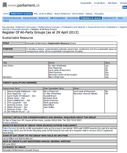
Lobby Group X (a not-for-profit organisation) acts as the group’s secretariat. Company A paid £3200 towards the cost of a seminar held in May 2012 and Another Company paid £1200 towards the cost of a reception held in January 2013 (registered April 2013).

how could we pull out the name of the organisation providing secretariat support, or the names of the financial benefactors, the amounts they provided and the reason for the donation? In this post, we’ll see how we can use OpenRefine to start pulling out some of this information and put it into a form we can use to start looking for connected or significant interests.

The screenshots used to illustrate this post can be found in this photo set: School of Data – Open Refine – All Party Groups

The context for this investigation is a minor political scandal that broke in the UK over the last few days (Patrick Mercer resignation puts spotlight on lobbying). In part, the event put the spotlight onto a set of political groupings known as All-Party Groups, informal cross-party or subject or topic specific interest groups made up from members of both houses of the UK parliament (see for example the list of All Party Groups).

Many All Party Groups are supported by lobby groups, or other organisations with a shared interest. Support may take the form of providing secretariat services, making financial donations to support the group’s activities, or covering the costs of associated travel and accommodation expenses. As such, there has always been the risk that the groups might play a role in lobbying scandal (for example, APPGs – the next Westminster scandal?).

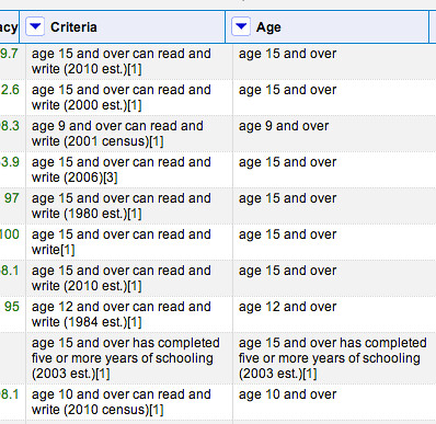
The UK Parliament website publishes transparency information that details the officers of the group and the names of twenty founding members (though the group may have many more members), along with disclosures about benefits received by the group.

The information is published as a set of web pages (one per group) as well as via a single PDF document.

example EPG page

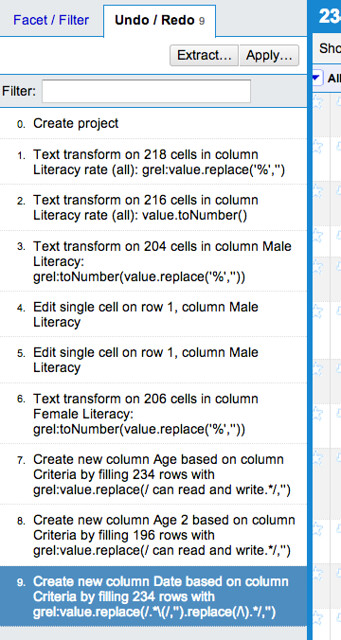
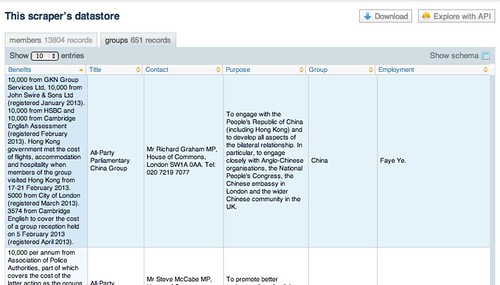
A newly formed website, Allparty, has started teasing out some of this data, including trying to break out some of the benefits information and organising groups according to meaningful subject tags, although as yet there is no API (that no, no programmable way) of accessing or querying their datasets. A scraper on scraperwiki – David Jones’ All Party Groups – makes the raw data for each group available, as well as detailing group membership for each MP or Lord.

APG scraper on scraperwiki

The Scraperwiki API allows us to interrogate this data using structured queries of the described in the School of Data post Asking Questions of Data – Some Simple One-Liners. However, it does not break down the benefits information into a more structured form.

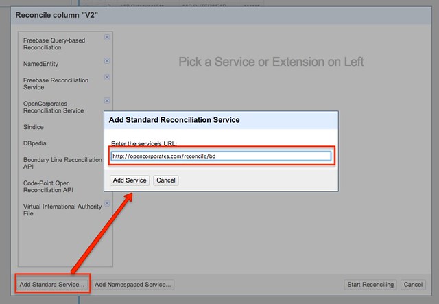
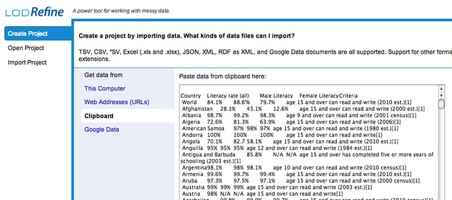
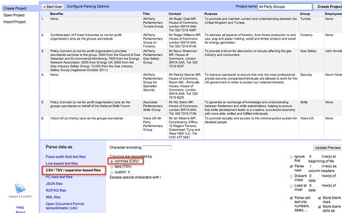
So how might we start to pull this data out? From the download link on the Scraperwiki scraper, we can get a link to a CSV file containing the data about the All Party Groups. We can use this link as a data source for a new OpenRefine project:

openrefine import data csv

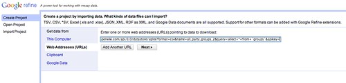
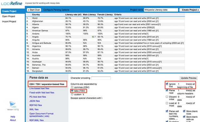
If the CSV format isn’t detected automatically, we can configure the import directly before we create the project.

openrefine csv import config

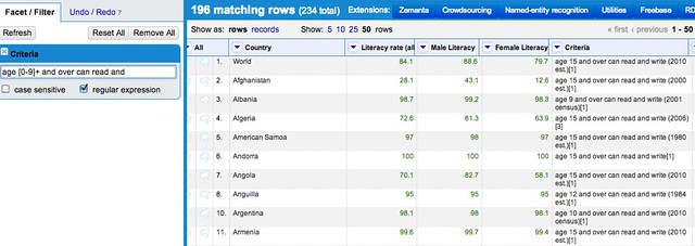
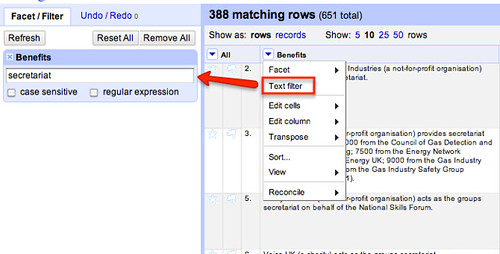
Having got the data in, let’s start by trying to identify the groups that provide secretariat support. If we don’t get them all, it doesn’t matter so much for now. The aim is to get enough data to let us start looking for patterns.

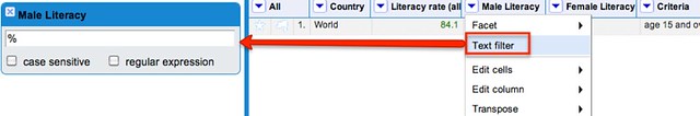
We can see which rows have a benefit relating to secretariat support by filtering the Benefits column.

open refine text filter

If we look at some of the descriptions, we see there is a whole host of variations on theme…

how many ways of providing secretariat

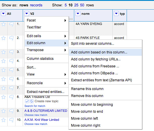
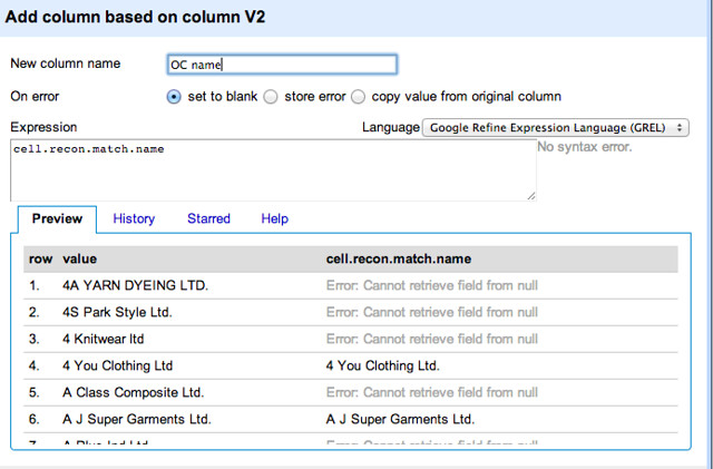
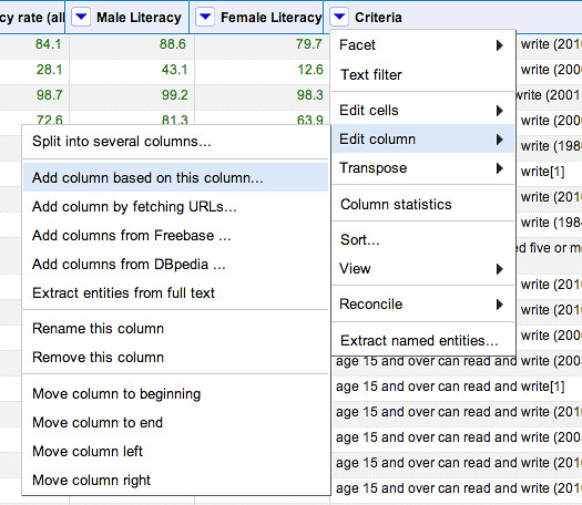
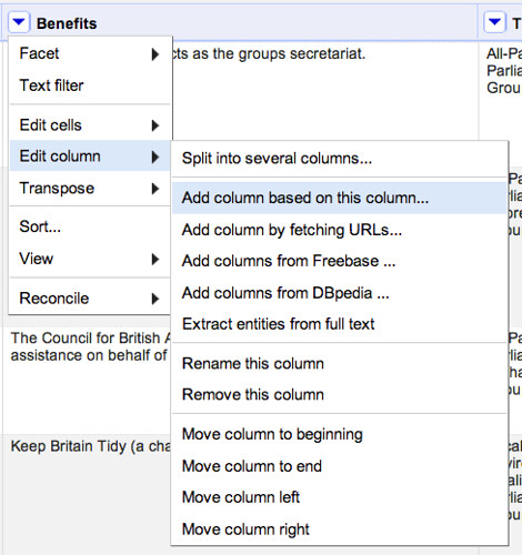
So how might we go about creating a column that contains the name of the organisation providing secretariat support?

open refine add column based on column

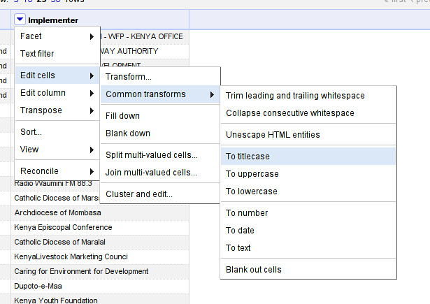
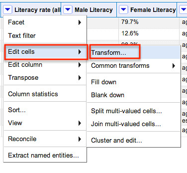
“Parsing” Data using GREL Replace Expressions

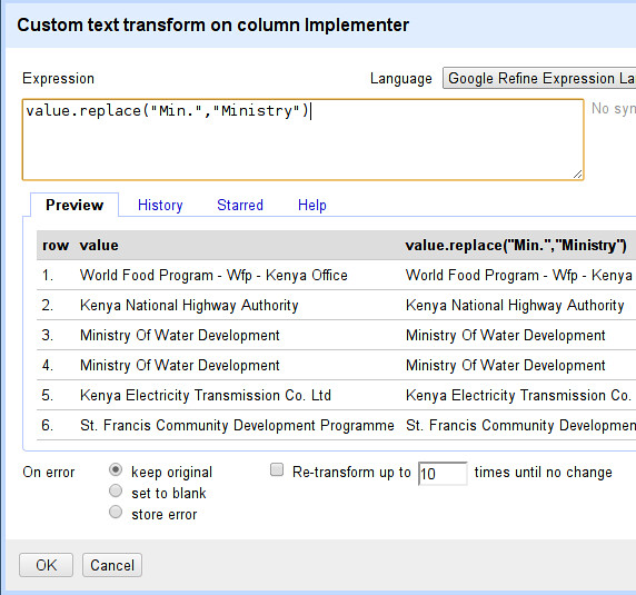
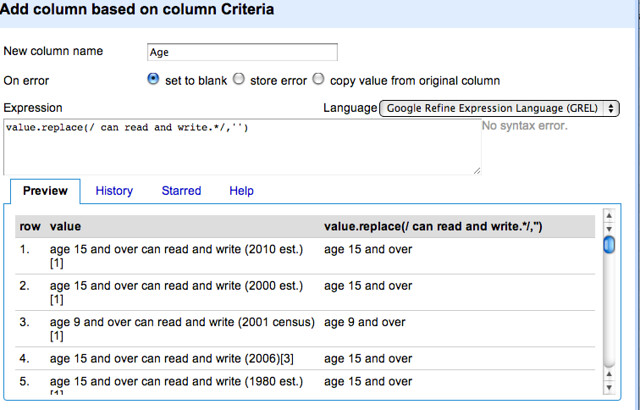
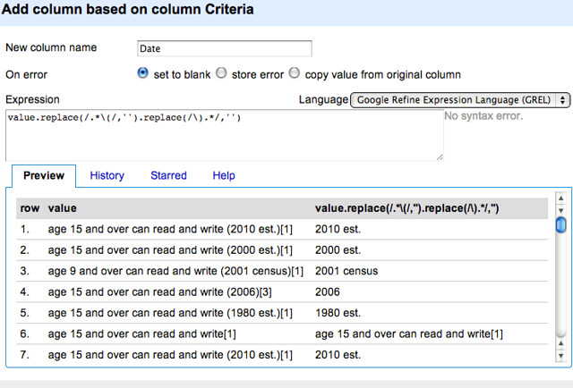
When it comes to defining the contents of the new column, we might notice that the Benefits descriptions often start with the name of the organisation providing secretariat services. We could use the GREL expression language to simplify the text by spotting certain key phrases and then deleting content from there on. For example, in the sentence:

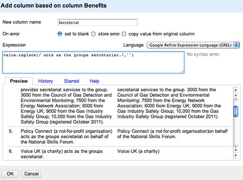
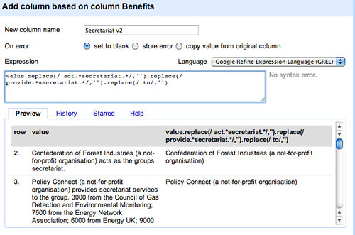
Confederation of Forest Industries (a not-for-profit organisation) acts as the groups secretariat.

we could just delete ” acts as the groups secretariat.”. The GREL expression value.replace(/ acts as the groups secretariat./,'') replaces the specified phrase with nothing (that is, an empty string). (Note that the “.” represents any single character, not just a full stop.) By recognising patterns in the way Benefits paragraphs are structured, we can start to come up with a crude way of parsing out who provides the secretariat.

openrefine secretariat

This leaves us with a bit of a mess if there is text following the deleted phrase, so we can instead delete any number of characters (.) following the phrase using value.replace(/ acts as the groups secretariat./,'').

openrefine secretariat 2

We also notice that there are other constructions that we need to account for… We can start to knock these out in a similar way by adding additional replace elements, as this construction shows:

openrefine secretariat 3

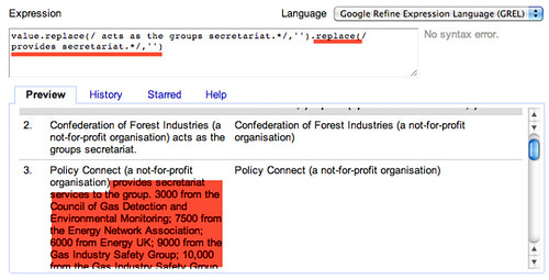
That is, value.replace(/ act as the groups secretariat./,'').replace(/ provides secretariat./,'')

If we look through some of the paragraphs that aren’t tidied up, we notice in some cases there are constructions that are almost, but don’t quite, match constructions we have already handled. For example, compare these two:

acts as the groups secretariat.
to act as the groups secretariat.

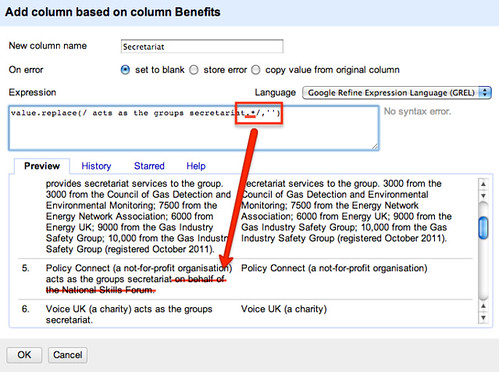
We can tweak the replace expression to at least identify either “act” or “acts” by telling it to look for the word “act” optionally followed by the character s (s?), that is, value.replace(/ acts? as the groups secretariat./,'').replace(/ provides secretariat./,'')

openrefine secretariat 4

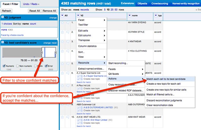
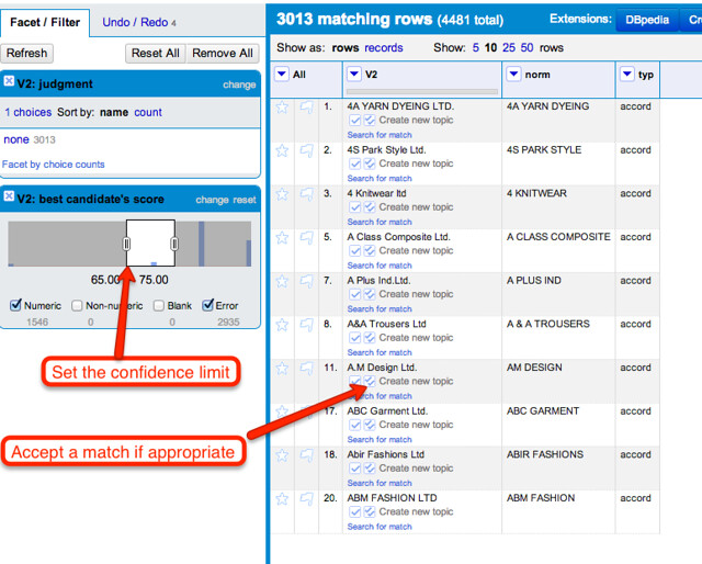
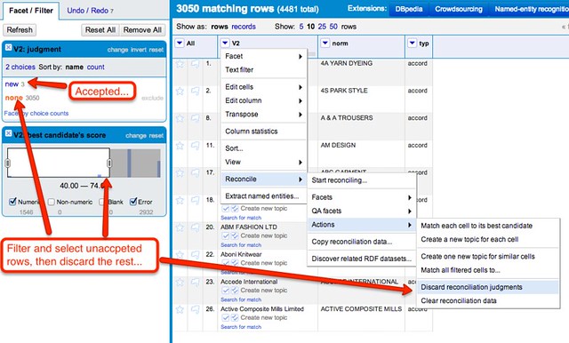
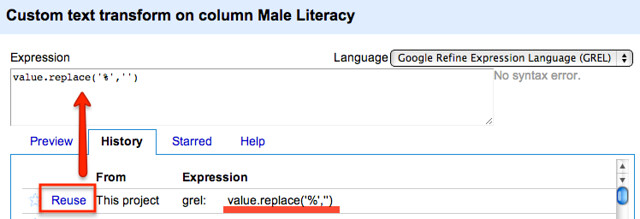
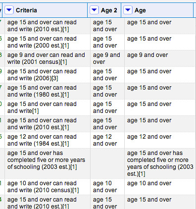
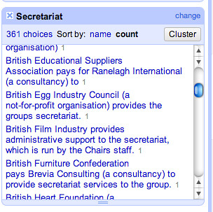
Let’s stick with this for now, and create the column, Secreatariat, looking at the unique values using a text facet. If we sort by count we see that we have already started to identify some groups that support several of the groups.

starting to explore the secretariat

If we look through the other values, we see there is still quite a bit of work to be done.

tidying work to be done

If we go back to the Benefits column and create another new column based on it, Secretariat v2, we can reuse the replace expression we started to build up previously and work on a new improved secretariat column.

openrefine grel reuse

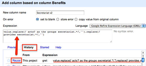
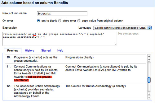
Alternatively, we can rethink our replace strategy by looking for key elements of the construction. There are various constructions based on “act” or “acts” or “provide” for example, so we can try to knock those out in a rather more aggressive way, also getting rid of any ” to” statement at the end of the phrase:

value.replace(/ act.secretariat./,'').replace(/ provide.secretariat./,'').replace(/ to/,'')

simplified replace

Looking through some of the phrases we are left with, there is a noticeable number of the form Company A (a consultancy) is paid by its client, Company B, to which are derived from phrases such as Company A (a consultancy) is paid by its client, Company B, to act as the groups secretariat.

We could create a second column from the Secretariat v2 column that contains this information. The first thing we’d need to do is identify who’s paying:

value.replace(/.* is paid by its clients?,? /,'')

We can tighten this up a little by splitting it into two parts to cope with the optional “its clients?” statement:

value.replace(/.* is paid by /,'').replace(/its clients?,? /,'')

The first part of this command gets rid of everything up to (.*) and including is paid by; the second part deletes its client with an optional s (s?) followed by an optional comma and then a space.

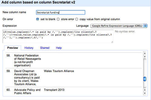
To only copy third party funders names across to the new column, we test to make sure that the replace was triggered, by testing to see if the proposed new column entry is different to the contents of the original cell, adding a further replace to tidy up any trailing commas

if(value.replace(/.* is paid by /,'').replace(/its clients?,? /,'')!=value,value.replace(/.* is paid by /,'').replace(/its clients?,? /,''),'').replace(/,$/,'')

secretariat funders

(I wonder if there is a tidier way of doing this?)

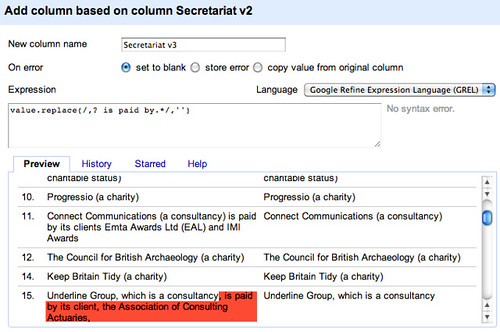
Let’s now create another column, Secretariat v3, based on Secretariat v2 that gets rid of the funders:

value.replace(/,? is paid by.*/,'')

delete funders

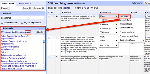
If we generate a text facet on this new column, we can display all the rows that have something set in this column:

open refine non-blank cells

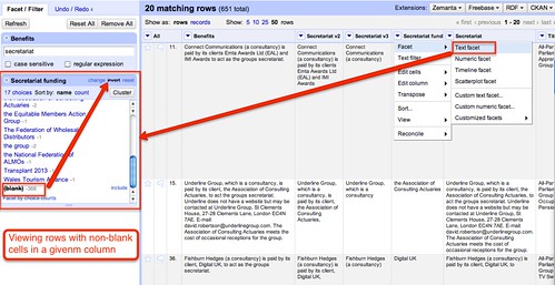
We also notice from the text facet counts that some funders appear to support multiple groups – we can inspect these directly:

problem - dupe data

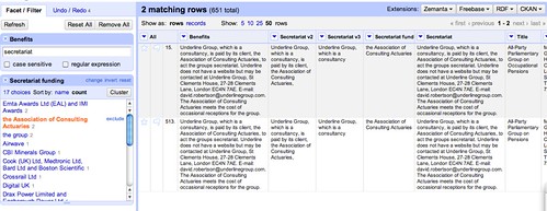
Hmm… some of the groups have similar looking names – are these the results of a name change, perhaps, leaving stale data in the original dataset – or are they really different groups? Such is the way of working with data that has now been obtained directly from a database! There’s often always more tidying to do!

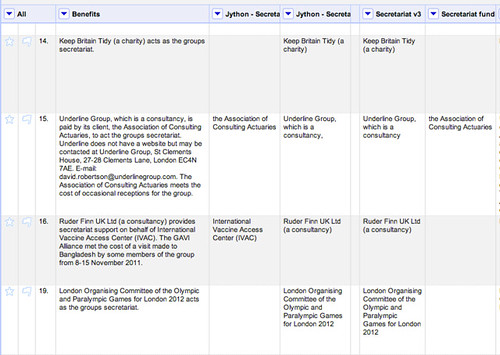
If we look to see if there are any groups that appear to offer a lot of secretariat support, we notice one in particular – Policy Connect:

popular secretariat

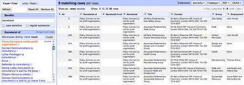
We can also see that many of the so-supported groups have Barry Sheerman as a contact, and a couple declare Nik Dakin; at least two of them employ the same person (John Arnold).

The point to make here is not so much that there may be any undue influence, just that this sort of commonality may go unnoticed when scattered across multiple documents in an effectively unstructured way.

Whilst there is still work that could be done to further tidy the data set (for example, pulling out “on behalf of” relationships as well as “paid by” relationships), we have got enough data to start asking some “opening” structured questions, such as: are there companies that provide secretariat services for more than one group (answer: Yes, though we need to check fo duplicate group names…); what companies or groups fund other parties to provide secretariat services? (Note we may only have partial data on this so far, but at least we have some to start working with, and by inspecting the data we can see how we may need to clean it further).

For example, here is a copy of a CSV file containing the data as tidied using the above recipe, and here is the OpenRefine project file. We can load the CSV file into a Google spreadsheet and start to interrogate it using the approach described in the School of Data post Asking Questions of Data – Garment Factories Data Expedition.

“Parsing” Data using Jython (Python) Regular Expressions
In the previous section we saw how we could use GREL expressions to start parsing out data from a text paragraph. In this section, we’ll see how we can use Jython (that is, Python) for a similar purpose.

To start with, here’s a quick example of how to pull out the names of groups providing secretariat services, as we did using the GREL script:
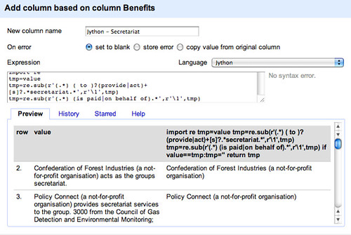
import re
tmp=value
tmp=re.sub(r'(.) ( to )?(provide|act)+[s]?.secretariat.',r'\1',tmp)
tmp=re.sub(r'(.
) (is paid|on behalf of).*',r'\1',tmp)
if value==tmp:tmp=''
return tmp

Jython secretariat

The first line (import re) loads in the required regular expression library. For convenience, we assign the contents of the cell to a tmp variable, then we look for a string that has the following structure:

  • .* – any number of characters
  • ( to )? – followed by a space character and optionally the word to
  • (provide|act)+[s]? – followed by either the word provide or act with an optional s
  • .*secretariat.* – followed by any number of characters, then the word secretariat then any number of characters.

The re.sub() function has the form re.sub( r'pattern to match',r'result of this expression',STRING_INPUT). In the script above, if the pattern is matched, tmp is set to the value of whatever is contained in the first pair of brackets of the expression being matched (\1).

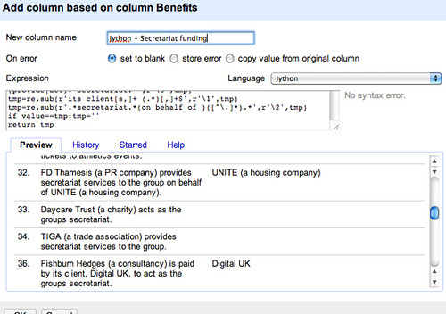
We can also use regular expressions to pull out the funding groups (Python regular expressions – documentation). So for example, do the initial configuration:

import re
tmp=value

In the following expression, we take whatever matches in the third set of brackets. This broadly matches patterns of the form “X is paid by Y to provide the secretariat” and allows us to extract Y.

tmp = re.sub(r'(.) (is paid by|on behalf of)(.) to (provide|act).secretariat.',r'\3', tmp)

This results in some strings of the form: “its client, Transplant 2013,” which we can tidy as follows:
tmp = re.sub(r'its client[s,]+ (.*)[,]+$',r'\1', tmp)

There are some constructions that are not captured, eg that take the form “X provides secretariat support on behalf of Y.” The following structure grabs Y out for these cases.

tmp = re.sub(r'.secretariat.(on behalf of )([^.]).',r'\2', tmp)

If we haven’t matched any payers (so the tmp string is unchanged), return a blank

if value==tmp: tmp=''
return tmp

Using Jython to grab funder names

Here’s how the different techniques compare:

Comparing performance

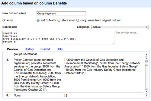
Remember that what we’re trying to do is structure the data so that we can start to run queries on it. Looking at the benefits, we notice that some groups have received financial support from different groups. For example, the All-Party Parliamentary Gas Safety Group has declared the following benefits:

Policy Connect (a not-for-profit organisation) provides secretariat services to the group. 3000 from the Council of Gas Detection and Environmental Monitoring; 7500 from the Energy Network Association; 6000 from Energy UK; 9000 from the Gas Industry Safety Group; 10,000 from the Gas Industry Safety Group (registered October 2011).

One of the things we might want to do in this case is pull out the amounts awarded as well as the organisations making the donation. Then we can start to count up the minimum benefits received (if we miss some of the data for some reason, we won’t have the total record!) as well as the organisations financially supporting each APG.

If we look at the benefits, we see they tend to be described in a common way – N,NNN from the Company X; MMMM from the Charity Y. Here’s one way we might start pulling out the data:

import re
tmp=value
m=re.findall(r'\d[,0-9]+ from the [^;.]*',tmp)
return m

*Note: it may be better to omit the the from that pattern… For example, our expression will miss “5000 from Bill & Melinda Gates Foundation (registered July 2012)”.

Group payments

A good example to test would be the one from the All Parliamentary Group on Global Health, which also includes constructions such as 5000 from the University of Manchester and 3000 from the Lancet (registered August 2012), which the expression above will identify as a single item, and 5000 from each of the following: Imperial College, Kings Health Partners, London School of Hygiene and Tropical Medicine, Cambridge University Health Partners (registered May 2012). which (if we fix the the problem would confuse it thoroughly!

If we return the items from the list as a single string, we can then split this list across multiple rows – change the last line to return '::'.join(m):

Joined items

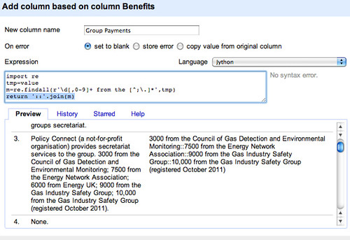
With the data in this form, we can generate multiple rows for each group, with one record per payment. Let’s join the separate items from the list using an easy to identify separator (::):

Split multi cells

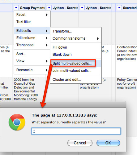
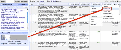
Using a similar approach to one we used before, use a text facet to only show rows with a value in the Group Payments column:

filter on non-blank again

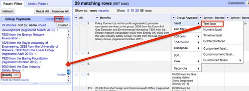
We can then fill values down on required columns to regenerate complete rows:

fill down a column

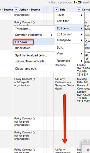
Note that if filled down the columns on the whole dataset, we would incorrectly start filling values in on rows that were not generated from splitting the payments column across multiple rows.

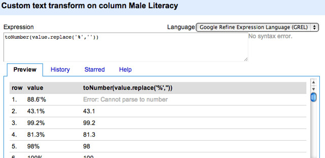
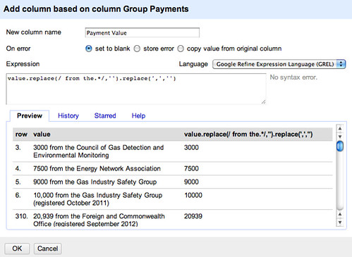
We can also create two new columns from the group payments column, one identifying the amount the other the name of the organisation that made the payment. Let’s go back to GREL to do this – first let’s pull out the amounts, and then remove any commas from the amount so all we’re left with is a number – value.replace(/ from the.*/,'').replace(',','')

payment extract

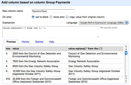
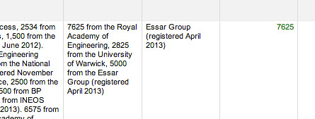
Let’s naively try to pull out the organisations responsible – value.replace(/.* from the /,'')

payer extract

NOTE: this actually causes an error… the failure to pull out atomic statements relating to payments means that if we assume sentences are of the simple form 5000 from the Essar Group (registered April 2013) rather than the more complex 7625 from the Royal Academy of Engineering, 2825 from the University of Warwick, 5000 from the Essar Group (registered April 2013) , we end up parsing out the wrong thing.

error in the parsing

This is one of the reasons why it’s much easier of people publish data as such!

However, let’s proceed, remembering that we have broken the data, but pressing on regardless to see what we might be able to do with it if we go back and correct our errors!

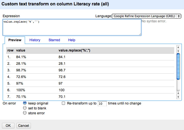
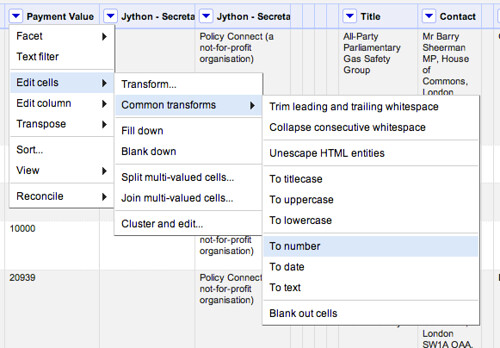
For example, let’s tidy up the data a bit more, casting the Payment Amount column to be a numeric type:

convert to number

We can then use a numeric filter to identify payments within a particular range, for example (remembering that our data may be meaningless!):

numeric facet filter

It’s also worth remembering the other problems and omissions we have introduced into this data – the the inclusion in the pattern recogniser for the amounts was over-zealous and ruled out a match on several organisations, for example; and as well as causing numerical errors, we have missed out information about separate payments that were anded together when they were declared in the same month.

The moral of this story is – look for what the exceptions might be and try to trap them out rather than letting them contaminate your data! Like I didn’t… doh!

That said, at least we’ve made a start, and can work iteratively to improve the quality of the data we have extracted – if we think it is worth spending the time doing so; we also have some data to hand that let’s us start exploring possible structured queries over the data, such as how much funding particular secretariats appear to have managed to bring in across several groups, for example, or how many benefits have been received by groups with a particular MP specified as a contact. (From the original data on Scraperwiki, we can also see which MPs or Lords are on the list of the 20 declared names for each group: do some only appear to join groups that declare benefits?!) In other words, even though we should not at this point trust any of the results of queries, because of the errors that were introduced, we can still start to explore the sorts of queries we might be able to write, which in turn can help us decide whether or not it is worth the effort cleaning the data any further…

…or maybe we should have considered what sort of data model we would be able to get out and interrogate in the first place?!

Flattr this!