You are browsing the archive for d3.

Data Roundup, 11 February

- February 11, 2014 in Data Roundup

Stephen Thomas – Earth

Tools, Events, Courses

Those of you who have fallen in love with d3.js should absolutely follow d3noob.org, an interesting blog where you can get useful tips and two free e-books on d3 and leaflet.js.

Ekuatorial is a new website built to display environmental changes through digital cartography. Read more about this ‘geo-journalism’ experiment in this introduction on Visualoop.

Did you know that Randy Krum, founder of Cool Infographics, is on tour for a series of events on data visualization? Check out his roadmap and don’t miss the date.

A new course on data journalism is about to start next week at Wits Journalism in Johannesburg. The course begins on Monday 17 and will be held by New York Time’s Ron Nixon.

Data Stories

San Valentine is getting closer: give yourself a minute to read this curious infographic on its origin and on how it is celebrated around the world.

The Sochi winter Olympics just started, and Twitter Data already published a visualization on it. See Tweets about #Sochi2014 on datawrapper. You might also want to scroll down this infographic on which winter Olympic sport would you play? posted on Visually.

The Global Investigative Journalism Network recently posted a graph on last week’s most popular data journalism links. If you wonder what topic recently captured data-addicted attention around the world, you should absolutely see it or play with the interactive version.

Data Sources

Accurat is an Italian information design agency which surely represents the avant garde in the data visualization market. If you are curious about how it works and what’s its operating model watch the interview with one of its co-founder, Giorgia Lupi, at the New York School of Visual Arts.

The Online Journalism Blog of Paul Bradshaw is always a gold mine of good informations. If you are looking for some tips and suggestions on data journalism, here you may find some.

Finally, we remind you that the Portuguese version of The Data Journalism Handbook is now available here.

Flattr this!

An Introduction to Cargo-Culting D3 Visualizations

- September 2, 2013 in HowTo, Tech, Tinkering, Visualisation


D3 is a fantastic framework for visualization – besides its beautiful outputs, the framework itself is elegantly designed. However, its elegance and combination of several technologies (javascript + svg + DOM manipulations) make it very hard to learn D3. Luckily, there is a huge range of D3 examples out there. Cargo-Cults to the rescue…

Cargo Cults were the way Melanesians responded when they suddenly were confronted with military forces in the second world war: strangers arrived wearing colorful clothes, marched up and down strips of land and suddenly: parachutes with cargo-crates were dropped. After the strangers left, the islanders were convinced that, if they just behaved like the strangers, cargo would come to them. As the islanders, we don’t have to understand the intricate details of D3 – we just have to perform the right rituals to be able to do the same visualizations…

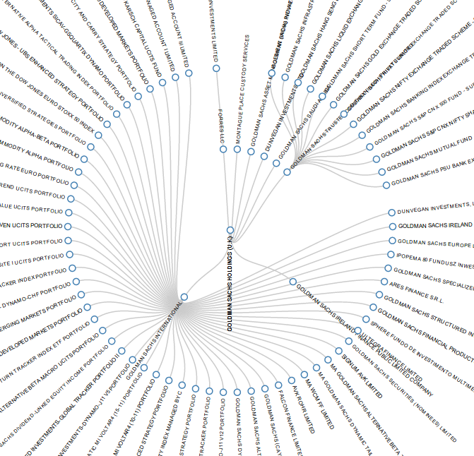
Let’s for example try to re-create a Reingold-Tilford tree of the Goldman Sachs network.
Things I’ll work with:
The Reingold-Tilford tree example
the Goldman Sachs Network over at Opencorporates (you can get the data in their json format)

The first thing I always look at is: how is the data formatted for the example: Most of the examples provide data with it that help you to understand how the data is layed-out for this specific example. This also means: if we bring our data into the same shape, we’ll be able to use our data in the example. So let’s look at the “flare.json” format, that is used in the example. It is a very simple json format where each entry has two attributes: a name and an array of children – this forms the tree for our tree layout. The data we have from Open Corporates looks different, here we always have parent and child – but let’s bring this into the same form.

First, I’ll get the javascript bits I’ll need: d3 and underscore (I like underscore for its functions that make working with data a lot nicer), then I’ll create an HTML page similar to the example. I’ll check in the code where the “flare.json” file is loaded and put my own json in it (the one from opencorporates linked above) (commit note- that changes later on, since opencorporates does not do CORS…).

I then convert the data using a javascript function (in our case a recursive one, that crawls down the tree)

 var getChildren = function(r,parent) {
    c=_.filter(r,function(x) {return x.parent_name == parent})
    if (c.length) {
      return ({"name":parent,
        children: _.map(c,function(x) {return (getChildren(r,x.child_name))})})
      }
    else {
      return ({"name":parent })
    }
  }
  root=getChildren(root,"GOLDMAN SACHS HOLDINGS (U.K.)")

Finally, I adjust the layout a bit to make space for the labels etc

The final result on githubfull repository

Flattr this!