You are browsing the archive for Election data.

Hacking the world’s most complex election system: part 2

- August 28, 2014 in Data for CSOs, Election data, On the Road


[Ed. Note: The School of Data was recently in Bosnia. This blog post is the 2nd in the series. See the first post by Codrina (School of Data Fellow).]

After all the brainstorming, all the coding, all the mapping, all the laughing and chatting the results of the Bosnian election data hacking are slowly, but surely finding their way to the surface.

School of Data Bosnia

After the crash course of only 3 hours for grasping how the Bosnian election system actually works and after a powerful and general brainstorming of what we have and what we want to get, the happy hackers divided into 3 teams: the data team, the development team and the storytellers each with clear tasks to achieve.
After a week’s work, the [git] repository is fully packed. Raw data, cleaned data, code and a wiki explaining how we aimed to make sense of the quite special Bosnian elections system. Still curious why we keep saying this election system is complicated? Check out this great video that the storytellers created:

The end of this wonderful event was marked down by a 2 hours power brainstorming regarding the flourishment of the Data Academy. Great ideas flew around the place and landed on our Balkan Data Academy sheet.

World, stay tuned! Something is definitely cooking in the wonderful Balkans!!

Flattr this!

Hacking the world’s most complex election system: part 1

- August 22, 2014 in Election data, On the Road

School of Data Fellow Codrina and Michael spent their week hacking the Bosnian election system. This is their report back:

OLYMPUS DIGITAL CAMERA

Elections are one of the most data-driven events in contemporary democracies around the world. While no two states have the same system rarely can one encounter an election system as complex as in Bosnia and Herzegovina. It is of little surprise that even people living in the country and eligible to vote often don’t have a clear concept of what they can vote for and what it means. To solve this Zasto Ne invited a group of civic hackers and other clever people to work on ways to show election results and make the system more tangible.

Through our experience wrangling data we spent the first days getting the data from previous elections (which we received from the electoral commission) into a usable shape. The data levels were very dis-aggregated and we managed to create good overviews over the different municipalities, election units and entities for the 4 different things citizens vote on in general elections. All the four entities generally have different systems, competencies and rules they are voted for. To make things even more complicated ethnicities play a large role and voters need to choose between ethnic lists to vote on (does this confuse you yet?). To top this different regions have very different governance structures – and of course there is the Brcko district – where everything is just different.

To be able to show election results on a map – we needed to get a complete set of municipal boundaries in Bosnia and Herzegovina. The government does not provide data like this: OpenStreetMap to the rescue! Codrina spent some time on importing what she could find on OSM and join it to a single shapefile. Then she worked some real GIS magic in QGis to fit in the missing municipal boundaries and make sure the geometries are correct.

Municipalities

In the meanwhile Michael created a list of municipalities, their electoral codes and the election units they are part of (and because this is Bosnia, each municipality is part of 3-4 distinct electoral units for the different elections except of course Brcko where everything is different). Having this list and a list of municipalities in the shapefile we had to work some clever magic to get the election id’s into there. The names (of course) did not fully match between the different data sets. Luckily Michael had encountered this issue previously and written a small tool to solve this issue: reconcile-csv. Using OpenRefine in combination with reconcile-csv made the daunting task of matching names that are not fully the same less scary and something we could quickly accomplish. We discovered an interesting inaccuracy in the OpenStreetMap data we used and thanks to local knowledge Codrina could fix it quite fast.

What we learned:

  • Everything is different in Brcko
  • Reconcile-CSV was useful once again (this made michael happy and Codrina extremely happy)
  • Michael is less scared of GIS now
  • OpenRefine is a wonderful, elegant solution for managing tabular data

Stay tuned for part 2 and follow what is happening on github

Flattr this!

Civic tech in the Balkans

- November 13, 2013 in Data Expeditions, Election data

1471380_534198600003029_1861051442_n

Last week the Community Boost_r program brought together information and technology activists from Eastern Europe in an un-conference style tech camp in Sarajevo. The camp featured two days packed with workshops and plenty of opportunity to nerd around. Milena and Michael were there for School of Data to run a data expedition and give a hands-on introduction into data-cleaning with Refine.

##Investigating election data in Montenegro and Bosnia
The first session we organized was a data expedition. Since elections are a hot topic in the region, we chose to work on two interesting datasets: one from Bosnian local elections and one from presidential and parliamentary elections in Montenegro. We worked in small looking at the different data we had.

The first group looked at a dataset of local elections in Bosnia obtained via FOIA by OneWorld SEE and containg detailed data on all candidates for the past 3 local elections (2004, 2008 and 2012). After a quick look at the data, the group decided to focus on 2 issues: gender representation and the degree to which the same candidates run for office several times. In the gender group we quickly realised there is a 33% compulsory quota of women candidates which all parties strictly abide by. However, only 5% of women candidates end up being elected. But the most interesting thing in the data was the little variation over year and parties – it was almost like there was a mastermind engineering the data.

Table 2

This mathematical precision showed up also when we tried to analyse on which positions are women more likely to be placed on a list. With no variation across political parties or years, it seems like women are overwhelmingly placed on positions 2, 5, 8 and 11 and of course few of them are candidates for mayor positions: 6% of total candidates and only 3% of elected mayors.

Over in the Montenegro group the participants quickly decided on wanting to do cluster-analysis of the existing data – to find clusters of districts that vote similarly. They found a quite strong difference between voting patterns in Podgorica and the rest of the country: rural to urban differences seem to be the cause here.

##Cleaning Data with Refine – hands on

Thanks to having too many ideas when asked out on an event we planned a session on Data cleaning with Refine for the second day. As this is a quite nerdy topic you can’t expect too many people when at the same time sessions discuss how to kick your local governments seating muscles. Nevertheless, a small, engaged crowd of people showed up and we took them through cleaning a dataset of bosnian tender information. (Walkthroughs available here). On the way through the workshop we took a small detour through regular expressions – a very handy special expression language to search text for specific patterns.

What we’ve learned

Besides the oddities of the election system in Bosnia and Herzegovina we met a large group of people involved in improving the communication of their citizens with municipal, local and federal governments. While the patterns seem very similar – the projects tend to replicate similar projects over and over again. A problem that seems to be slowly recognized in the community. The same is true for data: while some projects aim to bring together various civil society organizations to share their data – many start building their own codebase. We need to start sharing! If we work together collaboratively, we can achieve so much more.

Flattr this!

Documenting Egypt’s Elections Results

- August 20, 2013 in Community, Data for CSOs, Election data

With the unfolding events in Egypt, the debate about whether the country is witnessing a coup or a second revolution in less than three years, and the cover of Time magazine tagging the country as the “World’s Worst Democrats”, some might argue that this is not a suitable time to write about grassroots approaches to document election results. In fact, in such an environment, especially in a country that lacks a history of free and fair elections, it is needed to shed light on efforts made by individuals to battle the existing obstacles and to share this experience with others that could take it further into the future.

In the summer of 2012, Egypt had its first post-revolution presidential elections. This was also the country’s first free and fair election in its entire history. Just like everybody there, the local media was not used to covering or documenting elections. Each TV channel or newspaper had a few representatives only in some of the centres where votes were being counted. They followed the process and announced the results once they got them. But the problem was that no one was summing up the results. Additionally, the results being announced were limited to those locations where media representatives were present. Seeing this, Iyad El-Baghdadi and six other Twitter users created a shared spreadsheet and started adding the results there, using the numbers being announced on TV or circulated on social media. According to Iyad, the differences between the results in their sheet and the official ones announced later were less than 1%. So, I decided to ask him for more details about their workflow and how they acquired the numbers.

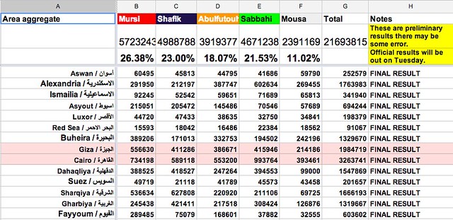
When it comes to the voting results, Iyad told us that they relied mainly on the results announced by the media, especially news websites, such as Al-Shorouk, Al-Masry Al-Youm, etc. He added that they ignored politically leaning sources. Data published was mainly raw data, and it needed lots of organization and validation from their side. Hence, their workflow was as follows. They set a Google spreadsheet where each contributor had to mention the source of his numbers alongside the numbers themselves. They also agreed on some standards. Uncertain or preliminary data were to be written in italics. When done with a governorate (state), numbers were summed up and then made bold and grey. The person doing the calculations had to list his name next to the calculations. They used the chat feature extensively to resolve conflicting numbers and ask for data validation when needed. The vote counting process took about 30 to 36 hours, so they organised themselves in shifts, benefiting from the fact that the team members were living in different time zones. They repeated the same process again for the runoff results.

Iyad and his team sure gained some experience from similar attempts that took place earlier. Evan Hill (@evanchill), a foreign journalist based in Cairo, collaborated with Hany Rasmy (@hany2m), an Egyptian Twitter user, a few months earlier, to collect and validate the parliamentary election results. The parliamentary elections took place in three stages, between late 2011 and early 2012. The Egyptian governorates were divided among the three stages. Evan and Hany set three separate spreadsheets for each of them. They plotted graphs for the results within their sheets, whereas Iyad told us that some people visualised their data separately.

We finally asked Iyad if he has any tips for anyone who might like to undertake similar work later on. He said that one of the most important things to pay attention to is the spreadsheet’s structure and organization. The more structured it is, the easier it is for participants to collaborate. He also added that the overall process has to be simple, with no technical complexities, however there should be a clear workflow and sort of tradition for participants to follow. The ones moderating the process should act in a professional way, guide others, and make sure no one is there just wasting others’ time or joking. Making the resulting data both human and computer readable encourages others to build on it and produce more in depth analysis and visualisations.

Flattr this!