Visiting Electionland
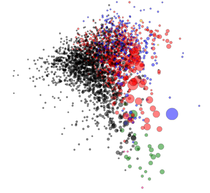
After the German elections, data visualization genius Moritz Stefaner created a map of election districts, grouping them not by geography but by election patterns. This visualisation impressively showed a still-existing divide in Germany. It is a fascinating alternative way to look at elections. On his blog, he explains how he did this visualization. I decided to reconstruct it using Austrian election data (and possibly more countries coming).
Austria recently published the last election’s data as open data, so I took the published dataset and cleaned it up by removing summaries and introducing names for the different states (yes, this is a federal state). Then I looked at how to get the results mapped out nicely.
In his blog post, Moritz explains that he used Z-Scores to normalize data and then used a technique called Multidimensional Scaling (MDS) to map the distances calculated between points into 2-dimensional space. So I checked out Multidimensional Scaling, starting on Wikipedia, where I discovered that it’s linear algebra way over my head (yes, I have to finish Strang’s course on linear Algebra at some point). The Wikipedia article fortunately mentions a R command cmdscale that does multidimensional scaling for you. Lucky me! So I wrote a quick R script:
First I needed to normalize the data. Normalization becomes necessary when the raw data itself is very hard to compare. In election data, some voting stations will have a hundred voters, some a thousand; if you just take the raw vote-count, this doesn’t work well to compare, as the numbers are all over the place, so usually it’s broken down into percentages. But even then, if you want to value all parties equally (and have smaller parties influence the graph as much as larger parties), you’ll need to apply a formula to make the numbers comparable.
I decided to use Z-Scores as used by Moritz. The Z-Score is a very simple normalization score that takes two things, the mean and the standard deviation, and tells you how many standard deviations a measurement is above the average measurement. This is fantastic to use in high-throughput testing (the biomed nerd in me shines through here) or to figure out which districts voted more than usual for a specific party.
After normalization, you can perform the magic. I used dist to calculate the distances between districts (by default, this uses Euclidean distance) and then used cmdscale to do the scaling. Works perfectly!
With newly created X and Y coordinates, the only thing left is visualization—a feat I accomplished using D3 (look at the code—danger, there be dragons). I chose a simpler way of visualizing the data: bubbles the size of voters in the district, the color of the strongest party.
You can see: Austria is less divided than Germany. However, if you know the country, you’ll find curious things: Vienna and the very west of Austria, though geographically separated, vote very similarly. So while I moved across the country to study when I was 18, I didn’t move all that much politically. Maybe this is why Vienna felt so comfortable back then—but this is another story to be explored another time.


Leave a Reply