How Does Climate Change Affect Iberian Animals and Plants?
As an organization, WWF (World Wide Fund for Nature) aims to safeguard the long-term survival of species, ecosystems and people in vulnerable places by catalysing climate adaptation efforts and supporting governments, communities and the private sector to balance conservation and development as they prepare for climate change. When we launched our Adaptation to Climate Change Program and decided to explain to society the concept, we knew we had to rely on two pillars:
- Facts, because, unfortunately, up until this point, the debate on how climate change affects and will affect humans, animals and nature sometimes still relies on beliefs.
- Communication and storytelling, because a fact is just a story waiting to be told.

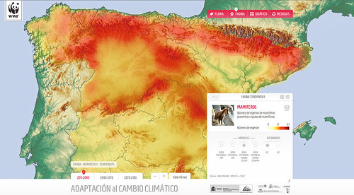
The image shows the spatial richness of Iberian mammals projected for the period 2011-2040 under climate change scenarios.
The Climate Change Adaptation visualization is the story of how hundreds of animals and plants could disappear or migrate to other regions if we don’t do anything to stop it. It’s the story of how many of the flora and fauna species living in Southern Spain may be extinct by the end of this century. In objective terms, this web application is a data visualization that explains various scenarios of evolution of flora and fauna in Spain in the next 90 years and proposes adaptation measures depending on the scenario. These evolution scenarios are based on projected changes in temperature and precipitation due to climate change. We portray the results for two global circulation models (CGDM2, ECHAM4) and two SRES IPCC scenarios (A2 and B2).
The app allows users to explore any plant or animal species and their area of distribution in the future according to a timeline divided into four time ranges: the present, 2011-2040, 2041-2070 and 2071-2100. The app also shows the main statistics regarding habitat loss for any species and species groups. For a sharper visualization we decided to give the option of visualizing the map in black and white, and the app may be used in full screen.
How the project came to life
Projected climate change impacts on biodiversity have recently been studied in Spain. The studies, promoted by the Spanish Government in 2011, analysed the impact on plants and animals and showed their future potential distribution. The methods and results of this kind of studies are often hard to understand for the general public. We wanted to use these studies to create awareness about this issue and to give an idea about the projected changes in our landscape. This was also an opportunity to present some of the work that we have been doing in our Adaptation Program. We consulted several experts to find the best way to show the results. We contacted a digital creative agency specialised in data visualization, OneBigRobot, and we sent them two documents of 400 pages each, one for fauna and one for flora, each one containing the projected living areas for approximately 200 species. The output seemed obvious: let’s take this text and graphic representations and convert them into interactive visualizations!

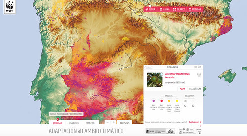
The image shows the current distribution of cork oaks in Spain (in purple) and the projected distribution between 2011 and 2040 due to climate change effects (in yellow).
But, in practice, things are not that easy and we encountered a number of difficulties along the way. When you enter the data visualization field, you have to be aware that the quality of the result is going to depend on how good the cooperation between the organization and the agency is. The organization has to communicate its goals, the scientific meaning of things and to be the “compass” of the project. The agency has to find ways to answer the questions that the organization brings to the table but it also has to push the project’s boundaries by asking new questions and making some choices that may seem difficult to accept for subject-matter experts, but that are necessary to make the visualisations readable. This usually means making some sacrifices on the side of the organisation, excluding some data and choosing to prioritize some stories over others.
The first true difficulty came up when the institutions behind the studies that we wanted to present sent us the data. They were all shape files (a standard GIS file format) but the set describing flora projections was done on a map grid of one square kilometre and the fauna set on a ten square kilometre grid. Also, one provided information only about the presence or absence of species and the other provided intensity for each grid. This was a problem for us because we chose to overlay the projected areas over a customised geographical map. This meant that for the fauna data we got huge squares of colour on a map and not really a nice fluid area over a map. We actually had to resort to Photoshop to solve this problem. We had to process more than 1.500 images each time we decided to change the design of some layers because we were working with three time frames, three statistical models and two climate change scenarios.
During this process we also realised that it would be interesting to have comparisons between two species. These comparisons allow the reader to see how an endangered species relies on the future of another. But we had already used so many colours that it was extremely difficult to find a new range of colours that would helps us show two species and their overlapping areas. And this is one of the issues that you will encounter when you work on a project like this. You’ll end up getting lots of ideas during the execution process about what to add to the project, which will make prioritising very difficult.
There are certainly things that could have been done better, but we are very proud that we tried to cover all the important stories we wanted to tell and that we were able to show so much information in a beautiful and useful way. Most importantly, we are proud that we got to communicate the importance of protecting natural areas and ecological corridors in the face of climate change, and we showed the scientific basis of climate change impacts on biodiversity to a wider audience.


Leave a Reply