The equivalent salary converter: the making of…
Nigel Babu took one of the “Get the Data” Challenges on the OKFN wiki and created the Equivalent Salary Converter. He also wrote a blog post sharing his thoughts throughout the process. Read on..

I spoke to Rufus Pollock from the Open Knowledge Foundation a week ago and he encouraged me to try one of the Get the Data challenges. I decided to build the equivalent salary converter, since I’d always been curious to have some way to compare and equate different salaries based on the cost of living.
What’s the data I need?
The first challenge was to understand what data I needed in order to solve this problem. I spent a few hours reading the Wikipedia page for Purchasing Power Parity . As someone who originally hated Economics, it took me a while to make sense of all this. I further branched to reading about the Big Mac Index and Geary-Khamis dollar, among others.
Finding the Data!
Since the original challenge itself is called “Get the Data Challenge”, I’ll honestly admit that this was perhaps the most challenging of all the tasks in building this application (XML parsing finished a close second :P). The Wikipedia article on Purchasing Power Parity has links to several data sources, which was a cause for great joy until I discovered all of them lead to 404s. I went through some parts of the World Bank data and looked at the UN Data website. I was stuck at not knowing what exactly I was looking for.
At some point, as I was going through another part of the World Bank data site, I saw something about indicators and decided to poke at it. At one point, I even wondered if I should give up and pick some of the other interesting data available like Physicians per 1000. Finally, I stumbled upon the PPP conversion factor data. I didn’t realize this was the data I needed until a little while later. For someone like me, who’s unfamiliar with the words involved, it’s not easy even recognizing that I’ve found what I was looking for. I exported the data from the World Bank website and decided to have a go at parsing it.
Parsing the data a.k.a. XML Hell
76756 lines of XML?! It sent shivers down my spine when I first opened the file. I started off with the lxml module to parse the data. It took me several hours of reading the documentation, and trial and error to get a hang of the API. I raced to write down a quick python script to take all the data from the XML and give me a CSV with data that I wanted. The original XML had much more data than I wanted. The script and CSV output of the script are both on GitHub if you’d like to look. I suspect if you’d like to play with another World Bank dataset, this script might give you a starting point. In retrospect, importing the data directly into Recline DataHub might have been a good idea.
Writing the App
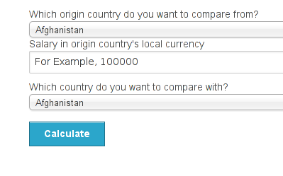
I strongly believe in MVP when I build an application. My MVP when starting was getting a form working which would let me select a country of origin and a target country and it would calculate the salary for that country. This is what the app can currently do. The original challenge involved showing a map and clicking on a point in the map would show the equivalent salary for that country. I’m very glad that I decided on an easier to achieve MVP or else I’d have nothing to show right now. The UI is built on Zurb Foundation and the minimal backend is written in Flask. The first iteration of the app didn’t use client-side Javascript to do the calculation, the form was POSTed to the server for every calculation. Later, I wrote that logic in JavaScript and it falls back to server side for folks with JavaScript disabled.
Over the next 2 weeks, I’d like to try and get a map based on kartograph working on the website. I got as far as being able to display the map, however, I couldn’t get click events to fire and I’m trying to figure out what’s wrong (Side Note: If you have any advice related to events on kartograph maps, please leave a comment or catch me on twitter/IRC). If I have enough time, I’d like to convert equivalent salary to dollars based on the day’s exchange rate and add a choropleth map to show which country would give the highest equivalent salary normalized to USD based on the day’s exchange rate (The current results are in local currency units). That’s much more complicated and it’s a stretch goal.
The data isn’t perfect though
After all this, I’ll have to add that the data isn’t perfect. The data I currently have is country-level Purchasing Power Parity conversion factor, but having lived in two cities in India, I know that it varies between cities too.
Overall, I’d have to say this was a fun experience and highly educational :-)
Have you wrangled some interesting data lately or created beautiful visualizations? Share the process with us at School of Data. Simply email: to schoolofdata [@] okfn.org


Leave a Reply