Geo-locating wells in South Sudan: how to wrangle data for development
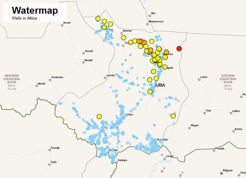
Dominik Moritz, a student at the University of Potsdam and an intern with the Open Knowledge Foundation, recently took part in the London ‘Development Data Challenge’. In this post, he walks through the process of how he used data to create this interactive visualisation, which pinpoints settlements in South Sudan and their proximity to the nearest well.

An introduction to the project
Visualizing geocoded data can be very difficult… or very easy, and at the same time beautiful and useful. At the Development Data Challenge in London on the weekend of 25th-26th August 2012, we built an interactive map of wells in South Sudan, to demonstrate how open data can be used to visualize problems and to help to find solutions.
The process we used to build the map can be split up into three separate parts.

1) First, we thought about questions we wanted to answer with our visualization. In this case, our goal was to visualize the distances from a village to the next water source – which could either be a well or a waterway.
2) In a second step, we searched for the data which could be used to create the visualization. We used data from the UNDP South Sudan IMWG data team. This data is not yet fully open, and there is still some work to be done to track all the contributing sources and to resolve some licensing issues. However, once the data is ready it will be published on the Datahub. In order to create a dataset that contains the distances to the next water source, we used two datasets; one dataset with settlements and one dataset with the locations of waterways and wells.
3) Once we had our data, all that remained was the build the map!
Using Leaflet to build a map
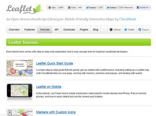
Once we had the data in a GeoJSON format, we needed to build a map view to show where settlements and wells are located. We used the Leaflet mapping library which provides an easy to use interface as well as a number of great plugins to work with. Leaflet itself is open source and so are the maps that are made from the data by the open street map project.

Creating an interactive map with leaflet is very easy.
- We created an html page that contains the hook, the position where the map will be inserted and added the leaflet library as explained in the documentation.
- We wanted our map to be full screen; so we added a few lines of CSS to scale the map to the full size.
- We then added the different layers, in order to pinpoint on the map those settlements which do not have a water source within a certain radius.
Refining the Visualisation – Colour & Clustering
To support the visualisation, we coloured the circles that show where the settlements are located. Initially, we also wanted to add a layer which would show all the settlements. However, we soon realized that there were far too many for this to be feasible. Luckily there is a plugin on Leaflet to cluster markers. Clustering means that a number of markers which are close to each other get combined into one. The plugin can easily handle up to 50,000 markers, which makes it a great tool for large datasets.

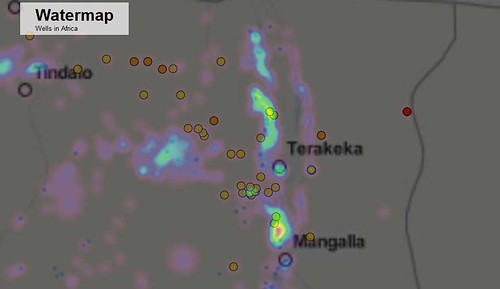
Clustering comes with its own problems however, and we soon realized that clustering makes it very difficult to see whether settlements are concentrated in a certain area – potentially useful information. This is why we added a heat map that shows where most settlements are concentrated. However, we noticed that the visualization is relatively slow and we hope that the plugin will improve in the future.
Future Possibilities… and a Cautionary Word
On the first day, we only added points to the map. However, it is also possible to add lines (in our case rivers) and even image overlays. We added a hydrogeographic map that shows the specific roles of climate and water in the landscape.
There are many more potential applications for the map. For example, we also spent some time trying to connect the wells data with spending data released through IATI and NGO websites, so that money could start to be connected to results and needs on the ground (and vice versa). There is much more work to be done on this, and members of the Standby Task Force team are hopeful that some of their data-gathering work connected to pre-crisis indicators will be useful for this in the future – as the South Sudan data proved to be.
It is also worth noting that the team didn’t ‘just’ spend the weekend cutting code however. Various work had to be done to ensure the integrity of the data, and the team spent a lot of time trying to track all the sources who had contributed to the dataset. There are also some ongoing licensing issues which need to be resolved before the datasets can be officially released.
As a team, we were really surprised by the results of our weekend’s work. Hopefully, this map should be a great starting point for anyone who is involved with a water project in South Sudan – and the process could be replicated in other areas. We hope to encourage more organisations and governments to publish their data so that people can work with the data and build visualizations.
You can see the map that Dominik’s team built, as well as the Github repository. Read more about other projects from the Development Data Challenge on the OKFN main blog.


Leave a Reply