InfoAmazonia and Why We Should Talk About Geojournalism
Gustavo Faleiros - June 20, 2013 in Data for CSOs, Data Journalism
I am sitting at the airport of La Guardia New York and watching one of the most desirable user tests that any software developer might ever dream about. At one of the iPad docks provided by the airline right off the boarding gate, a young Chinese boy, probably around 8 to 10 years old, is carefully studying satellite imagery of Atlanta, the final destination of the flight we are both waiting to board.
He is using the Google Earth app and starts spinning the globe around. He is now trying to compare Atlanta with another city (maybe his own?). He calls his brother and explains what he is doing. I don´t understand Mandarin but I am truly amazed with his interest in those images. The engineer at Google, sure enough, would be smiling gratified. A tool like Google Earth, which serves to give relevant information to either a young man or an expert, was pretty much our first inspiration to create InfoAmazonia.

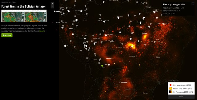
Story about forest fires in Bolivia alongside a map of fires in South America. Source: InfoAmazonia.
In 2008, when the United States Holocaust Memorial Museum used satellite imagery to show to the world what was happening in Darfur, I was struck by the power of conveying information in that format: interactive maps guiding you through the stories of each village affected. After that, we immediately did our first tests reporting on forest fires in Brazil and trying to combine stories coming from journalists with shapefiles of the most damaged protected areas.
Since those first experiments, the scene around digital mapping has evolved at a very quick pace. And the main novelty, I would say, was the emergence of data journalism itself, which brought a much more conceptual approach to what we were actually trying to tell with our visualizations. Almost at same time, while developing InfoAmazonia, we came up with the term “geojournalism”, which can be seen as a branch of data journalism dedicated to the use geographical data.
But that is not the only issue we are trying to address with this term. Actually, what InfoAmazonia does, since its launch in June 2012, is to provide a platform where you can both locate physical data (e.g. watersheds, forest fires or mining pits) and news stories. It is pretty much thinking like a cartographer: you convey information by adding layers.
InfoAmazonia creates visualizations from data provided by satellites, but it has also compiled a large database of stories coming from the region, or that are talking about the region. A report about deforestation in Peru, published on the Washington Post, for example, is a new log in our database. So far, 800 stories have already been aggregated on our platform.
In this case, one can see InfoAmazonia as a big aggregator or a news clipping service. This is correct too. We have already created RSS feeds and soon we hope to have an API for this database of geo-tagged stories. But we love the graphical appeal of the maps. This combination of a layer of stories and a layer of data gives the user a means to dig deeper into the issues at hand. Placing these layers in dialogue with each other helps us to reveal the threats that the largest rainforest on Earth is facing.
It was exactly this capacity of piling large amounts of data without losing visual coherence and interaction that has led us to work with MapBox. Based in Washington DC, the company has worked out beautiful presentation solutions for our ideas, giving prominence to news stories by creating a window to display them on the left hand side of each map. The advantage of working with this mapping software is that you can really build a map from scratch, which, as I have said, makes you think like a cartographer: every single detail, from the base layer to the quantity of information your are aggregating, is essential.

Story about illegal gold extraction within a protected area in Suriname alongside a map of mining concessions in the Amazon countries. Source: InfoAmazonia.
Telling stories along with data-rich maps, a practice we are calling geojournalism, transforms maps into a new type of blank page for journalists, which they can use to create news. Based on this belief we have recently worked together with software studios in Sao Paulo to launch a WordPress theme, called MapPress, which allows journalists to map their stories in the same way we do on InfoAmazonia. It is pretty simple and we want to see journalists choosing regions around the world that can be better reported with data and geo-tagged news. You can learn more about MapPress here.

