Data Roundup, 2 April
Marco Menchinella - April 2, 2014 in Data Roundup

Ars Electronica – Brain Art
Tools, Events, Courses
The Argentinean La Naciòn Data Blog continues to foster citizen participation in collecting and using open data. This time it did it by presenting VozData, a shared platform through which people can transform complex public documents into easily readable databases.
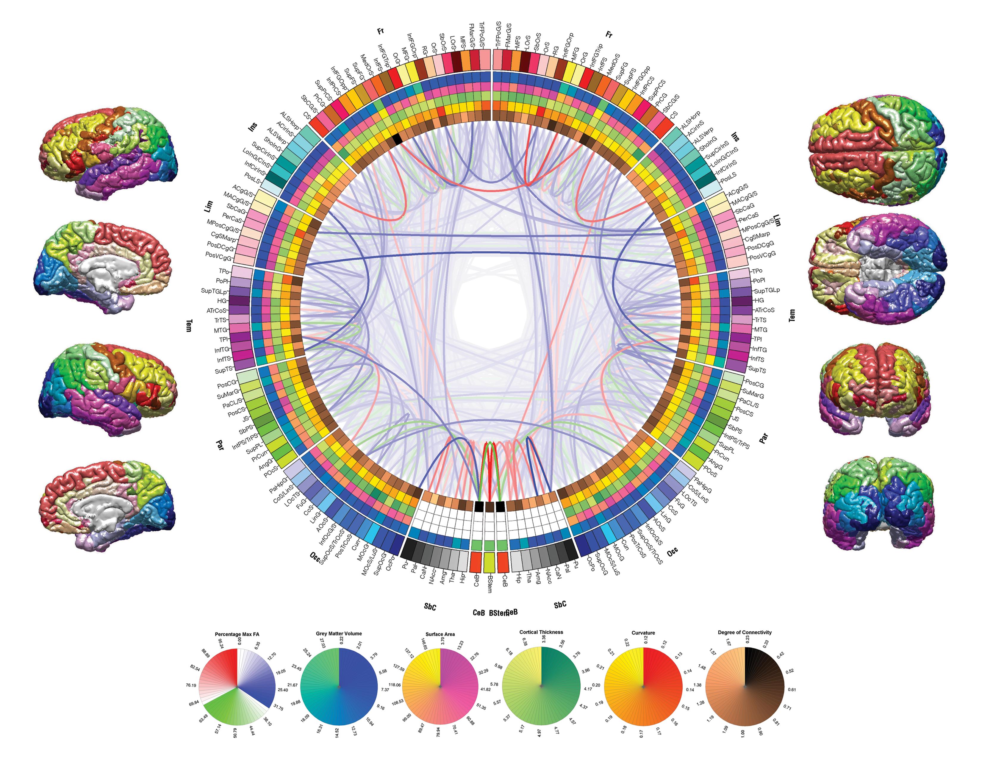
Do you want to put your visualization skills into practice? The Infographic Competition: Visualizing the Scale of the Brain gives you the opportunity to do it. Hurry up: the deadline is on April 30th.
Data Stories
The Guardian Data Blog recently published two interesting data journalism pieces we would like to recommend. The first is an article on Death Penalty Statistics written by Leila Haddou which summarizes the state of the art of executions in the world. The second is an interactive map showing country-by-country data on Europe’s young adults living with parents by Ami Sedghi and George Arnett.
If you are a fanatic about cars, you should take a quick look at Exploring Your Car’s European Roots, which displays the most important historical achievements in car and motor production.
The Data Desk of the Los Angeles Times recently released Crime L.A., a daily updated map which shows both violent and property crime trends in more than 200 neighborhoods of the city.
Google Flu Trend certainly was one of the biggest experiment in predictive analytics ever done in the recent history. Read Kaiser Fung’s point of view on why it represented a failure and Alexis Madrigal’s arguments in its defense.
Sam Wang from The New York Times published an article with data on autism showing the difference between the attention paid to the topic by the press and the scientific evidence.
Cartography is surely much better now that the second version of the Map of the Internet has just been released. The display of the oceans and the lands of the virtual world absolutely deserves applause and five minutes of your time.
Data Sources
The Washington Data Community is about to start a completely new version of their weekly newsletter. Subscribe to it and you will also get useful data job alerts.
A list of visualization tools is always worth reading. Code Geekz assembled one that may interest you containing 30 links.

