Data Roundup, September 11
We’re rounding up data news from the web each week. If you have a data news tip, send it to us at [email protected].
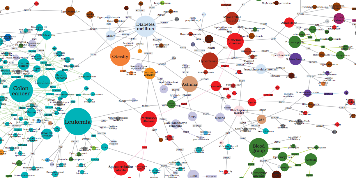
The democratization of datavis tools is great — the more brains we can have to code and decipher this big picture, the better.
— Manuel Lima at Ars Electronica, shared by @VisualizingOrg
School of Data News
Course testing began last week, a big thanks to our intrepid alpha cohort! Our volunteers are amazing; their feedback is invaluable and we’re incorporating it into new challenges as we write them.
New on the blog:
- Net Neutrality Map by Michael Bauer. Mapping a 700GB dataset with jvectormap, Python, and SQL.
- Equivalent Salary Converter by Nigel Babu. Creating a simple salary converter app, with details on sourcing data and parsing XML to CSV with Python.
- Geo-locating wells in South Sudan by Dominik Moritz, created at the London Data Development Challenge. Building an interactive map with GeoJSON and Leaflet.
The world’s first Open Knowledge Festival starts in just over a week, and everyone here is buzzing about it! School of Data will be running an Open Peer Learning Workshop with Peer to Peer University and Creative Commons. Sign up for the workshop. (p.s. Tickets to OKFest are going fast! Get your ticket soon.)
Datasets
The ENCODE Project: The ENCyclopedia of DNA Elements was big news this week. The international project began in 2003, and its goal is to identify functional elements in the human genome sequence. The dataset is massive and complicated. ENCODE: The Rough Guide to the Human Genome and The New World of DNA both explain more about the importance of the project. All ENCODE data is publicly available for search and download. Tools for visualization and data mining of the data are also available.
Randolph Glacier Inventory: With this summer’s melt of Greenland’s ice sheet all over the news, this global inventory of glacier outlines from 1920-2010 is timely. Data is available for download, and tools are available for viewing the data in Google Earth (via @kelsosCorner).
Tools
Screenscraper Comparison: Tom Longley of Tactical Tech shared an epic comparison of screenscraper tools and software created by Scott Wilson. It includes information on cost, operating system, and many other factors (via @Info_Activism). (Sidenote: Tactical Tech is writing some fantastic courses for the School of Data. More info coming soon…)
Events
Data Art Hackathon, London, 14-15 September: Two days of an “arts meets tech” hackathon that aims to bring together creatives and coders to create new ways of visualizing data. Sign up for arthacking here.
DataKind’s London Data Dive, 28-30 September: Our friends at DataKind are bringing their first international Datadive to the UK. Find out more and RSVP for the Datadive.
Inspiration
There was a lot of appreciative chatter on the web this week about the Public Lab for Open Technology and Science (PLOTS), an international collaborative network of people making and using open-source tools for environmental data collection and analysis. Sunlight Labs filmed an interview with Liz Barry of the Public Lab for their OpenGov Champions Series. The PLOTS open data archive includes maps from around the world.
Visualizing.org curated an interesting collection of “Big Picture” data visualization for Ars Electronica.
More
The hacker group AntiSec released 1 million Apple device IDs they claim to have obtained by hacking a Java vulnerability in an FBI computer. In Digging into the UDID data, Alasdair Allan gives a thorough and detailed view of the released data, including many visualizations.
Spreadsheet Journalism is a new blog by Abbott Katz with detailed posts about using spreadsheets for data journalism.
Two options for thinking about Correlation vs. Causation: an eye candy version, and an advanced discussion.
Additions
Have we missed something? Send suggestions or corrections to [email protected], or find us on Twitter at @SchoolOfData.


Leave a Reply