
Joriel “Joz” Jimenez – Lego Castle Advent Calendar
Every data addict knows that each file containing numbers in rows and columns must be filtered and cleaned first. The Data Cleanser help you doing it by rapidly removing duplicates. Try it here.
The Partnership for Open Data officially launched the Impact Stories Competition. Submit a story on how open data has positively changed the community you live in and get the chance to win 1000 dollars.
Data Stories
The Guardian Data Blog ranked the biggest cities in the world according to their cost of living and to the average price paid for a 1kg loaf of bread. Read more about how the economy is changing in countries’ capitals here.
Matthew C. Klein works for the Bloomberg View and recently succeeded in transforming complex financial and economic data into a story told through a series of attractive visualizations. How We Spend is the title of the project, and it absolutely deserves to be seen.
As I am a fan of curious infographics, here is one on the saying Practice Makes Perfect from Daily Infographic.
Shane O’Neill from InformationWeek interviewed Phil Simon, technology expert and author of the book ‘The Visual Organization’ where he discusses the importance of turning data into visualizations. Take a look at it here.
If you are passionate about history and you live in Washington D.C., here is an interesting article from the Washington Post on D.C. historic houses you might want to see.
Young or aspiring data journalists may take inspiration from this (very short) interview with Duarte Romero Varela, a graduate student from Birmingham University who talks about his first impressions of working for Infogr8.
Have you ever seen conditional probability visualized? No? Well, now you can admire this beautiful visual explanation of it made by Victor Powell for Setosa.
The Economist published an interesting short article showing when and how Lego became one of the leading toy brands in the world. Read about its expansion in ‘Empire Building’.
Data Sources
Dyanna Gregory and Trina Chiasson from Infoactive are leading a wonderful project called Data Made Simple aimed at realizing a free e-book on the fundamentals of data visualization. Help them here by filling a short survey.
Pie charts are probably the most hated way to represent data. If you tired of them and you are looking for good alternatives Helpmeviz explain here how to avoid and replace them with better graphs.
Credits
Thanks to @EdRamthun and @stelldirvornet!
![]()
 Click here to see the interactive version of the map above
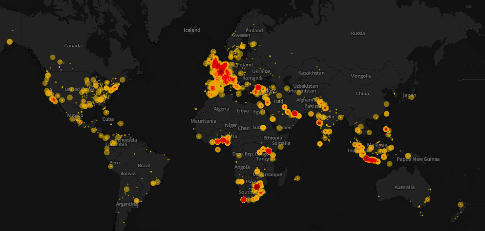
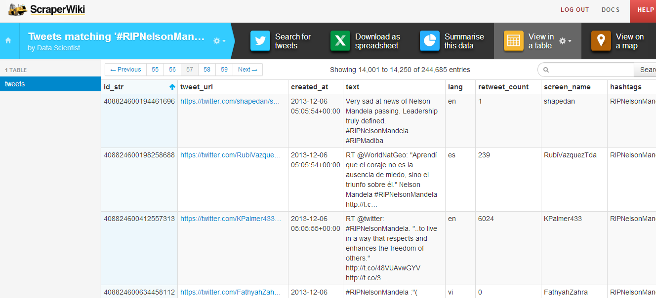
Data visualization is awesome! However, it conveys its goal when it tells a story. This weekend, Mandela’s death dominated the Twitter world and hashtags mentioning Mandela were trending worldwide. I decided to design a map that would show how people around the world tweeted the death of Nelson Mandela. First, I started collecting tweets associated with #RIPNelsonMandela using ScraperWiki. I collected approximately 250,000 tweets during the death day of Mandela. You can check this great recipe at school of data blog on how to extract and refine tweets.
After the step above, I refined the collected tweets and uploaded the data into CartoDB. It is one of my favorite open source mapping tools and I will make sure to write a CartoDB tutorial in future posts. I used the Bubble or proportional symbol map which is usually better for displaying raw data. Different areas had different tweeting rates and this reflected how different countries reacted. Countries like South Africa, UK, Spain, and Indonesia had higher tweeting rates. The diameter of the circles represents the number of retweets. With respect to colors, the darker they appeared, the higher the intensity of tweets is.
That’s not the whole story! Basically, it is easy to notice that some areas have high tweeting rates such as Indonesia and Spain. After researching about this topic, it was quite interesting to know that Mandela had a unique connection with Spain, one forged during two major sporting events. In 2010, Nelson Mandela was present in the stadium when Spain’s international football team won their first ever World Cup Football trophy as well. Moreover, for Indonesians, Mandela has always been a source of joy and pride, especially as he was fond of batik and often wore it, even in his international appearances.
Nonetheless, it was evident that interesting insights can be explored and such data visualizations can help us show the big picture. It also highlight events and facts that we are not aware of in the traditional context.
![]()

Photo credit: Rachel Andrew
Noah Veltman, OpenNews Fellow at the BBC, wrote a series of Learning Lunches and generously allowed School of Data to republish them.
These Learning Lunches are series of tutorials that aim to bridge the context gap and to demystify technical topics that come up often in newsroom development. They are a high-level but concrete discussion of technologies intended to foster more productive collaboration among developers, journalists, and designers. They involve as little code as possible but provide ample guidance for those who want to learn more.
]]>
COURSES, TOOLS & EVENTS
Here are some tips on visualisation from the best in science academia. A useful resource has opened up for one month at Nature.com where their columns on visualizing scientific data were made available to view for August.
Want to learn faster and get more done? This writer on Machined Learnings advocates using less data… to start with at least.
Looking for an introduction course to data science? London’s General Assembly will be holding one on the 19th August… a £20 introduction to the basics.
And there’s a funding opportunity from @Sciencewise – a resource center set up to help policy-makers in science and technology explain what they do better. See their call for proposals on how to advance open government through public dialogue.
DATA STORIES
Who lives where: Christians, Shia Muslims, Wahhabists – the Financial Times has mapped religious diversity in the Middle East.. a useful look at a complex region.
Another interesting visualization of global problems comes from John Beieler who has shown all global social disturbances since 1979 on a fast-moving timeline map. He used data from the University of Dallas which recorded daily disturbances worldwide for the past forty years to create this.
And on a less globally-significant level, this is what Reddit conversations look like, visualized with d3 and embedly.
And if you think your data visualisations are fancy: take a look at these from 13th century monks on the Visual Complexities blog. There are some striking similarities with today’s visual ideas.
You wait ages for a bus and then three come along at once? How Chicago city hopes to fix this age-old problem… by cutting bus crowding with data.
SOURCES
New York City has released some very detailed datasets on land use, including very detailed maps of the waterfront, information about taxes and political boundaries.
And finally, the University of California inches closer to open – and free – academic publishing.
After 6-year-long fight with the for-profit academic publishing industry, the University of California Senate approved open access standards for research, Techcrunch reports.
We’re rounding up data news from the web each week. If you have a data news tip, send it to us at [email protected].
![]()