 program at AUB. The Data team at Data Aurora were really happy sharing this experience with students from different academic backgrounds, including media studies, engineering or business.
The workshop was mainly led by Ali Rebaie, a Senior School of Data fellow, and Bahia Halawi, a data scientist at Data Aurora, along with the data community team assistants; Zayna Ayyad, Noor Latif and Hsein Kassab. The aim of the workshop was to give the students an introduction to the world of open data and data journalism, in particular, through tutorials on open source tools and methods used in this field. Moreover, we wanted to put students on track regarding the use of data.
On the first day, the students were introduced to data journalism, from a theoretical approach, in particular, the data pipeline which outlined the different phases in any data visualization project: find, get, verify, clean, analyze and present. After that, students were being technically involved in scraping and cleaning data using tools such as open refine and Tabula.
Day two was all about mapping, from mapping best practices to mapping formats and shapes. Students were first exposed to different types of maps and design styles that served the purpose of each map. Moreover, best mappings techniques and visualizations were emphasized to explain their relative serving purpose. Eventually, participants became able to differentiate between the dot maps and the choropleth maps as well as many others. Then they used twitter data that contained geolocations to contrast varying tweeting zones by placing these tweets at their origins on cartodb. Similarly, they created other maps using QGIS and Tilemill. The mapping exercises were really fun and students were very happy to create their own maps without a single line of code.
On the third day, Bahia gave a lecture on network analysis, some important mathematical notions needed for working with graphs as well as possible uses and case studies related to this field. Meanwhile, Ali was unveiling different open data portals to provide the students with more resources and data sets. After these topics were emphasized, a technical demonstration on the use of network analysis tool to analyze two topics was performed. Students were analyzing climate change and later, the AUB media group on Facebook was also analyzed and we had its graph drawn. It was very cool to find out that one of the top influencers in that network was among the students taking the training. Students were also taught to do the same analysis for their own friends’ lists. Facebook data was being collected and the visualizations were being drawn in a network visualization tool.
After completing the interactive types of visualizations, the fourth day was about static ones, mainly, infographics. Each student had the chance to extract the information needed for an interesting topic to transform it into a visual piece. Bahia was working around with students, teaching them how to refine the data so that it becomes simple and short, thus usable for building the infographic design. Later, Yousif, a senior creative designer at Data Aurora, trained the students on the use of Photoshop and illustrator, two of the tools commonly used by infographic designers. At the end of the session, each student submitted a well done infographic of which some are posted below.
After the workshop Zayna had small talks with the students to get their feedback and here she quoted some of their opinions:
“It should be a full course, the performance and content was good but at some point, some data journalism tools need to be more mature and user-friendly to reduce the time needed to create a story,” said Jad Melki, Director of media studies program at AUB, “it was great overall.”
“It’s really good but the technical parts need a lot of time. We learned about new apps. Mapping, definitely I will try to learn more about it,” said Carla Sertin, a media student.
“It was great we got introduced to new stuff. Mapping, I loved it and found it very useful for me,” said Ellen Francis, civil engineering student. “The workshop was a motivation for me to work more on this,” she added, “it would work as a one semester long course.”
Azza El Masri, a media student, is interested in doing MA in data journalism. “I like it I expected it to be a bit harder, I would prefer more advanced stuff in scraping,” she added.
]]>
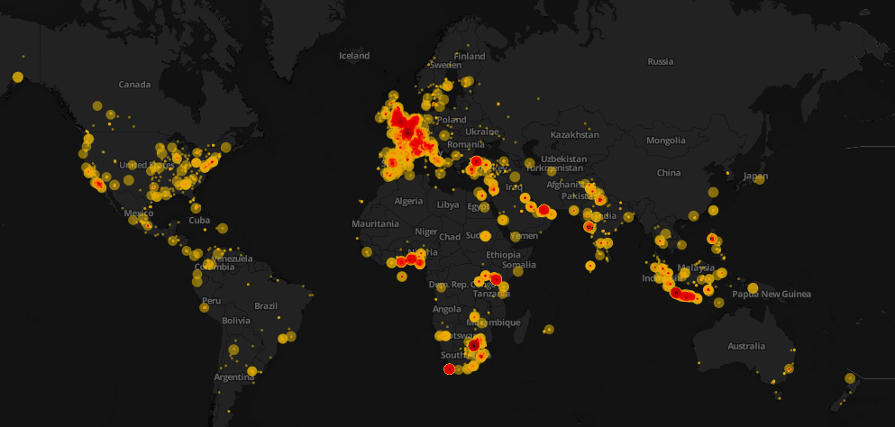
 Click here to see the interactive version of the map above
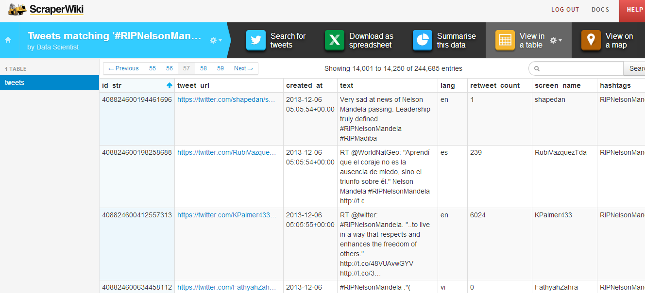
Data visualization is awesome! However, it conveys its goal when it tells a story. This weekend, Mandela’s death dominated the Twitter world and hashtags mentioning Mandela were trending worldwide. I decided to design a map that would show how people around the world tweeted the death of Nelson Mandela. First, I started collecting tweets associated with #RIPNelsonMandela using ScraperWiki. I collected approximately 250,000 tweets during the death day of Mandela. You can check this great recipe at school of data blog on how to extract and refine tweets.

After the step above, I refined the collected tweets and uploaded the data into CartoDB. It is one of my favorite open source mapping tools and I will make sure to write a CartoDB tutorial in future posts. I used the Bubble or proportional symbol map which is usually better for displaying raw data. Different areas had different tweeting rates and this reflected how different countries reacted. Countries like South Africa, UK, Spain, and Indonesia had higher tweeting rates. The diameter of the circles represents the number of retweets. With respect to colors, the darker they appeared, the higher the intensity of tweets is.
That’s not the whole story! Basically, it is easy to notice that some areas have high tweeting rates such as Indonesia and Spain. After researching about this topic, it was quite interesting to know that Mandela had a unique connection with Spain, one forged during two major sporting events. In 2010, Nelson Mandela was present in the stadium when Spain’s international football team won their first ever World Cup Football trophy as well. Moreover, for Indonesians, Mandela has always been a source of joy and pride, especially as he was fond of batik and often wore it, even in his international appearances.
Nonetheless, it was evident that interesting insights can be explored and such data visualizations can help us show the big picture. It also highlight events and facts that we are not aware of in the traditional context.
]]>We’re rounding up data news from the web each week. If you have a data news tip, send it to us at [email protected].

Photo by chsh/ii
TOOLS, COURSES AND EVENTS
Datawrapper 1.0 is an open source tool to create graphs and charts easily that has just been released. During the last months it has been working as a beta version. It’s designed by Mirko Lorenz and it allows you to create embeddable data visualisations in a very simple way.
The OKFN has created a new chapter in France as a way of relate local initiatives with the international open knowledge community. You can follow the French group on Twitter.
If you are interested in data visualisation, Alberto Cairo is organizing the second edition of a free course called ‘introduction to infographics and data visualisation’, hosted by the Knight Center for Journalism in the Americas at the University of Texas. For the first edition more than 2000 people enrolled in just a few days. This time there will be more vacancies but more than 1100 students joined the course so far.
Next 1st and 2nd of December, 8 Latin American countries will celebrate an international hackathon called ‘Desarrollando América Latina’ (Developing Latin America). The aim of this event is to develop apps to ‘solve cross curricular social problems’ of the region. It will take place in Argentina, Bolivia, Brazil, Costa Rica, Chile, México, Perú, and Uruguay.
News:Rewired is a must-go event in the UK. This conference hosted by Journalism.co.uk tackles the most important challenges of digital communication each year, and that includes data.
DATA STORIES
Data can measure (almost) everything, even happiness. The ONS has launched a report about the well-being in the UK and they even designed a wheel to interact with the data.
And even though we don’t know if happiness is just about the money, The Guardian Datablog made the wages map of Britain
Emil Johansson also likes maps, but he prefers the Middle Earth instead of Great Britain. This Swedish student is the author of the Lord of the Rings Project, a data driven work about Tolkien’s universe. It was launched a few months ago, but it has became so successful that his owner had to ask for money to buy a bigger host. He collected more than 700 dollars in just 3 days.
BIG DATA
Earlier this month Margaret Hodge, chair of the Public Accounts Committee, stated that data should play an important role in government decisions but that there were some coordination problems that prevented this to happen. This week, public sector took a big step towards the use of big data with the announce of a new code of practice to protect privacy in government datasets.
And on the other side of the Atlantic, O’Reilly’s data blog Strata talks about how the public sector efficiency could be improve with the right use of big data.
]]>