You are browsing the archive for Resources.

Tool Review: WebScraper

- October 13, 2014 in Community, HowTo, Resources

Crosspost from DataMeet.org

Usually when I have any scraping to do I ask Thej  if he can do it and then take a nap. However, Thej is on vacation so I was stuck either waiting for him to come back or I could try to do it myself. It was basic text, not much html, no images, and a few pages, so I went for it with some non coder tools.

I checked the School of Data scraping section for some tools and they have a nice little section on using browser based scraping tools. I did a chrome store search and came across WebScraper.

I glanced through the video sort of paying attention got the gist of it and started to play with the tool.  It took awhile for me to figure out.  I highly recommend very carefully going through the tutorials.  The videos take you through the process but are not very clear for complete newbies like me so it took a few views to understand the hierarchy concept and how to adapt their example to the site I was scraping.

I got the hang of doing one page and then figuring out how to tell it to go to another page, again I had to spend quite a bit of time rewatching the tutorial. At the end of the day I got the data in neat columns in CSV without too much trouble.  I would recommend WebScraper for people who want to do some basic scraping.

It is as visual as you can get though the terminology is still very technical.   You have to do into the developer tools folder which can feel intimidating but ultimately satisfying in the end.

Though I’ll probably still call Thej.

Flattr this!

Data Visualization and Design – Skillshare

- September 26, 2014 in Community, Events, HowTo, Resources, School_Of_Data, Storytelling, Visualisation

Observation is 99 % of great design. We were recently joined by School of Data/Code for South Africa Fellow Hannah Williams for a skillshare all about the data visualization and design. We all know dataviz plays a huge part in our School of Data workshops as a fundamental aspect of the data pipeline. But how do you know that, beyond using D3 or the latest dataviz app, you are helping people actually communicate visually?

In this 40 minute video, Hannah shares some tips and best practices:

Design by slides

The world is a design museum – what existing designs achieve similar things? How specifically do they do this? How can this inform your digital storytelling?

Resources:

Want to learn more? Here are some great resources from Hannah and the network:

Hannah shared some of her other design work. It is great to see how data & design can be used in urban spaces: Project Busart.


We are planning more School of Data Skillshares. In the coming weeks, there will be sessions about impact & evaluation as well as best practices for mapping.

Flattr this!

Tech projects for transparency – a new guide to the ‘Fundamentals’ that deliver impact and save money

- June 25, 2014 in Community, Data for CSOs, HowTo, Impact Case Study, narrative, Resources

[Cross-posted from the TABridge network. Visit tech.transparency-initiative.org to learn more and download the new ‘Fundamentals’ guide. Thanks Jed Miller for the post for the support. The report was written by Dirk Slater of FabRiders. ]
Fundamentals_cover_pr

LONDON, 17 June 2014—The Transparency and Accountability Initiative is proud to launch a practical new guide for transparency campaigners planning and executing technology projects.

Fundamentals for Using Technology in Transparency and Accountability Organisations presents clear, step-by-step guidance to the key phases in a technology project, from defining your strategy, to spending wisely, to tracking outcomes.

The guide is also designed to help funders identify projects with the potential to succeed and provide effective support to grantees.

Too often, technology projects burn money and staff time, but still lack impact. In ‘Fundamentals,’ author Dirk Slater and experts from our TABridge network distil years of experience into the principles and steps that drive success in technology projects.
The guide will help you:

  • Clarify why you’re creating your technology project and how it contributes to your overall organisational strategy.
  • Ensure you have the internal capacity and external expertise to manage the project.
  • Build in early and regular evaluations of your progress so that rather than end up with an expensive failure, you can detect problems early and adjust as you go.

Vanessa Herringshaw, director of the Transparency and Accountability Initiative, said:

“Digital tools have great potential to improve transparency, but if we’re honest, it’s also really easy to get it wrong. Developing technologies to expose corruption and engage citizens in the fight for accountable government demands significant resources, but without smart planning, money gets wasted and opportunities get lost. The guide is a roadmap for NGOs and funders who want to get tech right.”

“Technology is not a panacea,” said Rakesh Rajani, civil society co-chair of the Open Government Partnership and head of East African CSO Twaweza, “It is one piece in larger social change. T/AI’s ‘Fundamentals’ guide addresses the reality that tools that don’t match the local context or aren’t linked into other approaches can’t solve the deep problems that weaken government accountability or citizen mobilization alone. The guide seeks to help people think through these needs and linkages, and make more effective choices.”

‘Fundamentals’ is presented in six chapters, which can be used separately or as a unit:

It also includes appendices that help organisations to match technology tactics to different stakeholders; ensure that projects are guided by a user-centred approach; ask the right questions when planning mobile-based outreach; and enlist data and open data effectively for advocacy.

To support our community of practice and deepen the impact of the guide, the Transparency and Accountability Initiative is hosting a series of webinars this spring and summer, based on the guide’s key recommendations.

For easy use, ‘Fundamentals’ is available to read online or to download in full or chapter by chapter. Learn more and get started at: http://tech.transparency-initiative.org/fundamentals.

Flattr this!

Think Tanker’s Data ToolBox

- November 8, 2013 in Resources

I’m in Prague at the Policy Research, Technology and Advocacy Event @ the Hub, run by Open Society Foundations Think Tank Fund. It’s a fascinating event with some of Europe’s best Think Tank minds; I had the pleasure of helping them work through tools that can help them to troubleshoot some of the issues they face in their day to day work.

So which tools should be in the Think Tankers Data Toolbox?

There are many excellent curated lists of tools useful for policy research, analysis and visualisation, which seem to be the most interesting topics here. Here’s just a few:


* The On Think Tanks blog has a great list of visualisation resources
* Digital Methods Toolkit from the Digital Methods Initiative.

Let’s look at the specific problems the group raised and what tools we know to help with them!

Getting Data: “What’s the best tool for conducting an online survey?”

The results of a great #groupthink from the room, who knew many options I’d never heard of – here’s what they came up with/ In no particular order:

Special thanks to Dora Hardy from Open Society Foundations for this list!

Keen to hear from you which is the best – please feel free to drop comments in the section below.

Getting Data: “My government doesn’t give me data!”

Try asking publicly! Check out online Freedom of information sites on the web such as AsktheEU. Many countries also have their own sites!

Tip: Want to see examples of how people have ensured they get machine-readable data (i.e. spreadsheets not PDFs) from Freedom of Information request. See this successful example of asking for the EU budget to see what to ask for!

Extracting Data: “My data is trapped in a PDF! Help!”

We focussed today on Tabula – a great tool which allows you to highlight tables in a PDF and extract them as CSV files. Unfortunately, it struggled with a Cyrillic copy of the Serbian Gazette, but here’s hoping that future updates will help to support other character sets.

Want more information about other options? Try the School of Data course on PDF extraction

Cleaning Data: “Are there any tools to automatically assess data quality?”

Getting into potentially dangerous territory here, however, one suggestion was made. Open Studio, by Talend – I don’t have experience with it myself, but again – any testimonials from personal experience, please drop them in the comments box.

Analysing Data: “I have huge volumes of documents and don’t know where to start”.

Projects such as Document Cloud allow you to upload and search lots and lots of documents (even PDFs). Check out also The Overview Project for an example of a tool which helps to visualise common topics in a big dump of documents and links between themes in documents. Below: visualisation of the Wikileaks War Logs: Large Words = commonly occurring words, Points = Documents, Lines = show which documents connected to the topics.


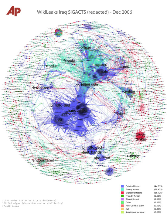
Overview, by the Associated Press

Analysing Data: “Do you have a primer for network analysis?”

Sure do! Check out this quick guide – we promise to update it soon to take account of new changes to the Twitter API.

What else we showed.

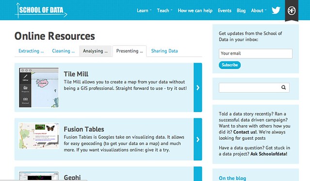
The final part of the workshop was dedicated to a quick session on Geocoding. Using a Google Spreadsheet and using some highly refined copy and paste skills from the School of Data tutorial on Geocoding, we created a beautiful TileMill map in the themed colours of ExpertForum.

If you want to get a map in your themed colours, you’ll need a colour capturer to grab your organisation’s colours. I used “Hues”, available in the App Store, but there are lots of options available.

Black magic

After the session, I showed a couple of people how to get data out of tables online where copy-paste doesn’t work. Check out the School of Data tutorial on IMPORTHTML if you have similar problems!

Final plug

Screen Shot 2013-11-08 at 16.54.15

Thinking of entering the On Think Tanks Datavis competition? Check out these guidelines by, School of Data Advisory board member, Gregor Aisch (DrivenByData) to avoid committing a visualisation faux-pas.

Submissions for the On Think Tanks Data Visualisation Competition close on 20th November. Get your submission in now!

Enjoyed this? Want to stay in touch? Join the School of Data Announce Mailing List for updates on more training activities from the School of Data.

Flattr this!

Data Explorer Missions Launched in collaboration with P2PU – Sign Up Now

- April 5, 2013 in Data Blog, Resources

The data expedition described on this post is over. For more recent data expedition announcements, visit the blog.

8364602336_facaa10cdf_oImage CC-By-SA J Brew on Flickr

At the School of Data, we teach in two ways.

1) By producing materials to help people tackle working with data and
2) By running Data Expeditions – where learners tackle a problem, answer a question or work on a project together, learning from one another as they get hands on with real data.

It’s come to our attention, that sometimes, it’s handy to combine the two – handing people materials to tackle the challenges they are likely to encounter along the way. The Data Explorer Mission is like a data expedition with one crucial difference: your guide is a robot…

Read on to learn more…

Your Mission: Tell Stories with Carbon Data

Learn how to tinker with, refine and tell a story with data in this 4-week course. Each week you’ll be commissioned to work with others on a project that will hone your data-wrangling skills. Lessons will be pulled from Open Knowledge Foundation and Tactical Tech with help from Peer 2 Peer University. At the end of the course, you will have finessed, wrangled, cleaned and visualized a data set and shared it with the world.

What to Expect

The course will run April 15 to May 3, and each week your team will receive weekly “Missions” from Mission Control over email. You’ll work together on those projects, including a 30-minute Google Hangout each week. Each “Mission” will lead up to your final project. For each skill you master in the course, you can earn a Badge to show your mastery and to get feedback to further your talents.

The Topic

Carbon Emissions. Don’t worry if you don’t know anything about them at the moment, you don’t need to be a topic expert and the data skills you will learn will be very transferrable to other areas!

The Level

No prior experience is required, we’ll cover spreadsheets and working with data. If you’re more advanced, you are also welcome to join us to hone your skills, and the only limit on what you can learn is your imagination – so if you’re prepared to push yourselves on the project front the data-skills-bucket is your oyster!

About Mission Control

Normally – Data Expeditions are guided by a human sherpa, in this course, we’re weaving School of Data course material with a robot sherpa to help guide participants through the phases of the expedition. You’ll need to listen out for Mission Control’s instructions to guide you through the phases, keep timing and look out for handy tips, but organising your team is up to your group…

Sign up by completing the form below!

Flattr this!