This article is part tutorial, part demonstration of the process I go through to complete a data expedition alone, or as a participant during a School of Data event. Each of the following steps will be detailed: Find, Get, Verify, Clean, Explore, Analyze, Visualize, Publish
Depending on your data, your source or your tools, the order in which you will be going through these steps might be different. But the process is globally the same.
FIND
A data expedition can start from a question (e.g. how polluted are european cities?) or a data set that you want to explore. In this case, I had a question: Has the dynamic of the physical video game magazine market been declining in the past few years ? I have been studying the video game industry for the past few weeks and this is one the many questions that I set myself to answer. Obviously, I thought about many more questions, but it’s generally better to start focused and expand your scope at a later stage of the data expedition.
A search returned Wikipedia as the most comprehensive resource about video game magazines. They even have some contextual info, which will be useful later (context is essential in data analysis).

https://en.wikipedia.org/wiki/List_of_video_game_magazines
GET
The wikipedia data is formatted as a table. Great! Scraping it is as simple as using the importHTML function in Google spreadsheet. I could copy/paste the table, but that would be cumbersome with a big table and the result would have some minor formatting issues. LibreOffice and Excel have similar (but less seamless) web import features.
importHTML asks for 3 variables: the link to the page, the formatting of the data (table or list), and the rank of the table (or the list) in the page. If no rank is indicated, as seen below, it will grab the first one.

Once I got the table, I do two things to help me work quicker:
- I change the font and cell size to the minimum so I can see more at once
- I copy everything, then go to Edit→Paste Special→Paste values only. This way, the table is not linked to importHTML anymore, and I can edit it at will.
VERIFY
So, will this data really answer my question completely? I do have the basic data (name, founding data, closure date), but is it comprehensive? A double check with the French wikipedia page about video game magazines reveals that many French magazines are missing from the English list. Most of the magazines represented are from the US and the UK, and probably only the most famous. I will have to take this into account going forward.
CLEAN
Editing your raw data directly is never a good idea. A good practice is to work on a copy or in a nondestructive way – that way, if you make a mistake and you’re not sure where, or want to go back and compare to the original later, it’s much easier. Because I want to keep only the US and UK magazines, I’m going to:
- rename the original sheet as “Raw Data”
- make a copy of the sheet and name it “Clean Data”
- order alphabetically the Clean Data sheet according to the “Country” column
- delete all the lines corresponding to non-UK or US countries.

Tip: to avoid moving your column headers when ordering the data, go to Display→Freeze lines→Freeze 1 line.

Some other minor adjustments have to be made, but they’re light enough that I don’t need to use a specialized cleaning tool like Open Refine. Those include:
- Splitting the lines where 2 countries are listed (e.g. PC Gamer becomes PC Gamer UK and PC Gamer US)
- Delete the ref column, which adds no information
- Delete one line where the founding data is missing
EXPLORE
I call “explore” the phase where I start thinking about all the different ways my cleaned data could answer my initial question[1]. Your data story will become much more interesting if you attack the question from several angles.
There are several things that you could look for in your data:
- Interesting Factoids
- Changes over time
- Personal experiences
- Surprising interactions
- Revealing comparisons
So what can I do? I can:
- display the number of magazines in existence for each year, which will show me if there is a decline or not (changes over time)
- look at the number of magazines created per year, to see if the market is still dynamic (changes over time)
For the purpose of this tutorial, I will focus on the second one, looking at the number of magazines created per year Another tutorial will be dedicated to the first, because it requires a more complex approach due to the formatting of our data.
At this point, I have a lot of other ideas: Can I determine which year produced the most enduring magazines (surprising interactions)? Will there be anything to see if I bring in video game website data for comparison (revealing comparisons)? Which magazines have lasted the longest (interesting factoid)? This is outside of the scope of this tutorial, but those are definitely questions worth exploring. It’s still important to stay focused, but writing them down for later analysis is a good idea.
ANALYSE
Analysing is about applying statistical techniques to the data and question the (usually visual) results.
The quickest way to answer our question “How many magazines have been created each year?” is by using a pivot table.
- Select the part of the data that answers the question (columns name and founded)
- Go to Data->Pivot Table
- In the pivot table sheet, I select the field “Founded” as the column. The founding years are ordered and grouped, allowing us to count the number of magazines for each year starting from the earliest.
- I then select the field “Name” as the values. Because the pivot tables expects numbers by default (it tries to apply a SUM operation), nothing shows. To count the number of names associated with each year, the correct operation is COUNTA. I click on SUM and select COUNT A from the drop down menu.

This data can then be visualized with a bar graph.

The trendline seems to show a decline in the dynamic of the market, but it’s not clear enough. Let’s group the years by half-decade and see what happens:

The resulting bar chart is much clearer:

The number of magazines created every half-decade decreases a lot in the lead up to the 2000s. The slump of the 1986-1990 years is perhaps due to a lagging effect of the North american video game crash of 1982-1984
Unlike what we could have assumed, the market is still dynamic, with one magazine founded every year for the last 5 years. That makes for an interesting, nuanced story.
VISUALISE
In this tutorial the initial graphs created during the analysis are enough to tell my story. But if the results of my investigations required a more complex, unusual or interactive visualisation to be clear for my public, or if I wanted to tell the whole story, context included, with one big infographic, it would fall into the “visualise” phase.
PUBLISH
Where to publish is an important question that you have to answer at least once. Maybe the question is already answered for you because you’re part of an organisation. But if you’re not, and you don’t already have a website, the answer can be more complex. Medium, a trendy publishing platform, only allows images at this point. WordPress might be too much for your need. It’s possible to customize the Javascript of tumblr posts, so it’s a solution. Using a combination of Github Pages and Jekyll, for the more technically inclined, is another. If a light database is needed, take a look at tabletop.js, which allows you to use a google spreadsheet as a quasi-database.
Any data expedition, of any size or complexity, can be approached with this process. Following it helps avoiding getting lost in the data. More often than not, there will be a need to get and analyze more data to make sense of the initial data, but it’s just a matter of looping the process.
[1] I formalized the “explore” part of my process after reading the excellent blog from MIT alumni Rahoul Bhargava http://datatherapy.wordpress.com
]]>This time around, the #OpenData party moved from the Nigeria Capital – Abuja to Gusau, Zamfara and was held at the Zamfara Zakat and Endowment Board Hall between September Thursday, 25 and Friday, 26, 2014. With 40 participant all set for this budget data expedition, participants included the state Budget Monitoring Group (A coalition of NGOs in Zamfara) coordinated by the DFID (Development for International Development) State Accountability and Voice Initiative (SAVI),other international NGOs such as Society for Family Health (SFH), Save the Children, amongst others.
But how do you teach data and its use in a less-technology savvy region? We had to de-mystify teaching data to this community, by engaging in traditional visualization and scraping – which means the use of paper artworks in visualizing the data we already made available on the Education Budget Tracker. “I never believed we could visualize the education budget data of the federal government as easy as what was on the wall” exclaimed Ahmed Ibrahim of SAVI
As budgets have become a holy grail especially with state government in Nigeria, of most importance to the participants on the first day, was how to find budget data, and processes involved in tracking if services were really delivered, as promised in the budget. Finding the budget data of the state has been a little bit hectic, but with much advocacy, the government has been able to release dataset on the education and health sector. So what have been the challenges of the NGOs in tracking or using this data, as they have been engaged in budget tracking for a while now?
“Well, it is important to note that getting the government to release the data took us some time and rigorous advocacy, added to the fact that we ourselves needed training on analysis, and telling stories out of the budget data” explained Joels Terks Abaver of the Christian Association of Non Indigenes. During one of the break out session, access to budget information and training on how to use this budget data became a prominent challenge in the resolution of the several groups.
The second day took participants through the data pipelines, while running an expedition on the available education and health sector budget data that was presented on the first day. Alas! We found out a big challenge on this budget data – it was not location specific! How does one track a budget data that does not answer the question of where? When involved in budget tracking, it is important to have a description data that states where exactly the funds will go. An example is Construction of Borehole water pump in Kaura Namoda LGA Primary School, or we include the budget of Kaura Namoda LGA Primary School as a subtitle in the budget document.

Taking participants through the data pipelines and how it relates to the Monitoring and Evaluation System
In communities like this, it is important to note that soft skills are needed to be taught – , like having 80% of the participants not knowing why excel spreadsheets are been used for budget data; like 70% of participants not knowing there is a Google spreadsheet that works like Microsoft Excel; like all participants not even knowing where to get the Nigeria Budget data and not knowing what Open Data means. Well moving through the school of data through the Open Data Party in this part of the world, as changed that notion.”It was an interesting and educative 2-day event taking us through the budget cycle and how budget data relates to tracking” Babangida Ummar, the Chairman of the Budget Working Group said.
Going forward, this group of NGO and journalist has decided to join trusted sources that will be monitoring service delivery of four education institutions in the state, using the Education Budget Tracker. It was an exciting 2-day as we now hope to have a monthly engagement with this working group, as a renewed effort in ensuring service delivery in the education sector. Wondering where the next data party will happen? We are going to the South – South of Nigeria in the month of October – Calabar to be precise, and on the last day of the month, we will be rocking Abuja!
]]>In this 40 minute video, Hannah shares some tips and best practices:
Design by slides
The world is a design museum – what existing designs achieve similar things? How specifically do they do this? How can this inform your digital storytelling?
Resources:
Want to learn more? Here are some great resources from Hannah and the network:
- Open Font Library
- Google Fonts
- Photo Pin (Creative Commons Images)
- Image Optimizer
- NattyWare (image fixing)
- Screenpresso
Hannah shared some of her other design work. It is great to see how data & design can be used in urban spaces: Project Busart.
We are planning more School of Data Skillshares. In the coming weeks, there will be sessions about impact & evaluation as well as best practices for mapping.
]]>If you have a story that unfolds across several places over a period of time, storymaps can provide an engaging interactive medium with which to tell the story. This post reviews some examples of how interactive map legends can be used to annotate a story, and then rounds up seven tools that provide a great way to get started creating your own storymaps.
Interactive Map Legends
The New York Times interactives team regularly come up with beautiful ways to support digital storytelling. The following three examples all mahe use of floating interactive map legends to show you the current location a story relates to as they relate a journey based story.
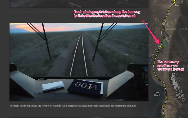
Riding the Silk Road, from July 2013, is a pictorial review featuring photographs captured from a railway journey that follows the route of the Silk Road. The route is traced out in the map on the left hand side as you scroll down through the photos. Each image is linked to a placemark on the route to show where it was taken.
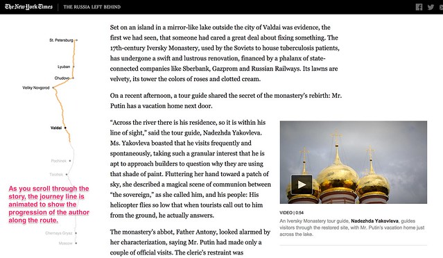
The Russia Left Behind tells the story of a 12 hour drive from St. Petersburg to Moscow. Primarily a textual narrative, with rich photography and video clips to illustrate the story, an animated map legend traces out the route as you read through the story of the journey. Once again, the animated journey line gives you a sense of moving through the landscape as you scroll through the story.
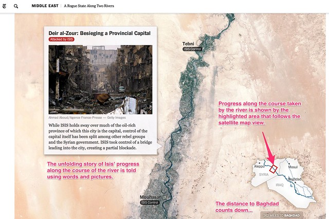
A Rogue State Along Two Rivers, from July 2014, describes the progress made by Isis forces along the Tigris and Euphrates Rivers is shown using two maps. Each plots the course of one of the rivers and uses place linked words and photos to tell the story of the Isis manoeuvres along each of the river ways. An interactive map legend shows where exactly along the river the current map view relates to, providing a wider geographical context to the local view shown by the more detailed map.
All three of these approaches help give the reader a sense of motion though the journey traversed that leads the narrator being in the places described at different geographical storypoints described or alluded to in the written text. The unfolding of the map helps give the reader the sense that a journey must be taken to get from one location to another and the map view – and the map scale – help the reader get a sense of this journey both in terms of the physical, geographical distance it relates to and also, by implication, the time that must have been expended on making the journey.
A Cartographic Narrative
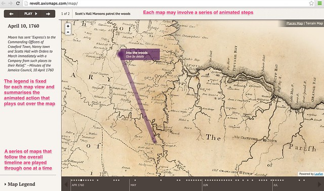
Slave Revolt in Jamaica, 1760-1761, a cartographic narrative, a collaboration between Axis Maps and Harvard University’s Vincent Brown, describes itself as an animated thematic map that narrates the spatial history of the greatest slave insurrection in the eighteenth century British Empire. When played automatically, a sequence of timeline associated maps are played through, each one separately animated to illustrate the supporting text for that particular map view. The source code is available here.
This form of narrative is in many ways akin to a free running, or user-stepped, animated presentation. As a visual form, it also resembles the pre-produced linear cut scenes that are used to set the scene or drive the narrative in an interactive computer game.
Creating you own storymaps
The New York Times storymaps use animated map legends to give the reader the sense of going on a journey by tracing out the route being taken as the story unfolds. The third example, A Rogue State Along Two Rivers also makes use of a satellite map as the background to the story, which at it’s heart is nothing more than a set of image markers placed on to an an interactive map that has been oriented and constrained so that you can only scroll down. Even though the maps scrolls down the page, the inset legend shows the route being taken may not be a North-South one at all.
The linear, downward scroll mechanic helps the reader feel as if they are reading down through a story – control is very definitely in the hands of the author. This is perhaps one of the defining features of the story map idea – the author is in control of unraveling the story in a linear way, although the location of the story may change. The use of the map helps orientate the reader as to where the scenes being described in the current part of the story relate to, particularly any imagery.
Recently, several tools and Javascript code libraries have been made available from a variety of sources that make it easy to create your own story maps within which you can tell a geographically evolving story using linked images, or text, or both.
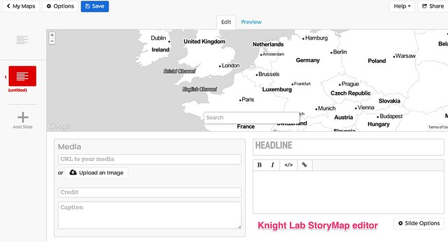
Knight Lab StoryMap JS
The Knight Lab StoryMap JS tool provides a simple editor synched to a Google Drive editor that allows you to create a storymap as a sequence of presentation slides that each describe a map location, some header text, some explanatory text and an optional media asset such as an image or embedded video. Clicking between slides animates the map from one location to the next, showing a line between consecutive points to make explicit the linkstep between them. The story is described using a custom JSON data format saved to the linked Google Drive account.
CartoDB Odyssey.js
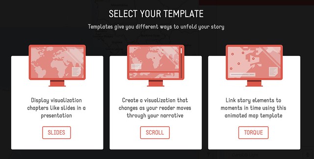
Odyssey.js provides a templated editing environment that supports the creation of three types of storymap: a slide based view, where each slide displays a location, explanatory text (written using markdown) and optional media assets; a scroll based view, where the user scrolls down through a stroy and different sections of the story trigger the display of a particular location in a map view fixed at the top of the screen; and a torque view which supports the display and playback of animated data views over a fixed map view.
A simple editor – the Odyssey sandbox – allows you to script the storymap using a combination of markdown and map commands. Storymaps can be published by saving them to a central githib repository, or downloaded as an HTML file that defines the storymap, bundled within a zip file that contains any other necessary CSS and Javascript files.
Open Knowledge TimeMapper
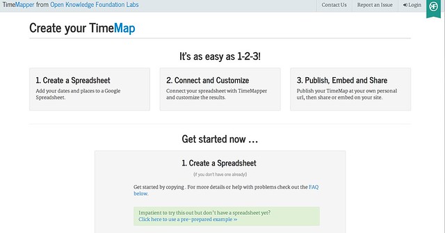
TimeMapper is an Open Knowledge Labs project that allows you to describe location points, dates, and descriptive text in a Google spreadsheet and then render the data using linked map and timeline widgets.
JourneyMap (featuring waypoints.js
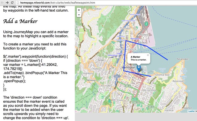
JourneyMap is a simple demonstration by Keir Clarke that shows how to use the waypoints.js Javascript library to produce a simple web page containing a scrollable text area that can be used to trigger the display of markers (that is, waypoints) on a map.
[waypoints.js on Githhub; JourneyMap src]
Google Earth TourBuilder
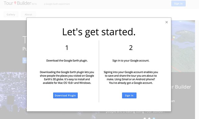
Google Earth TourBuilder is a tool for building interactive 3D Google Earth Tours using a Google Earth browser plugin. Tours are saved (as KML files?) to a Google Drive account.
[Note: Google Earth browser plugin required.]
ESRI/ArcGIS Story Maps
ESRI/ArcGIS Story Maps are created using an online ArcGIS account and come in three type with a range of flavours for each type: “sequential, place-based narratives” (map tours), that provide either an image carousel (map tour) that allows you to step through a sequence of images that are displayed separately alongside a map showing a corresponding location or a scrollable text (map journal) with linked location markers (the display of half page images rather than maps can also be triggered from the text); curated points-of-interest lists that provide a palette of images, each member of which can be associated with a map marker and detailed information viewed via a pop-up (shortlist), a numerically sequence list that displays map location and large associated images (countdown list), and a playlist that lets you select items from a list and display pop up infoboxes associated with map markers; or map comparisons provided either as simple tabbed views that allow you to describe separate maps, each with its own sidebar description, across a series of tabs, with separate map views and descriptions contained within an accordion view, and swipe maps that allow you to put one map on top of another and then move a sliding window bar across them to show either the top layer or the lower layer. A variant of the swipe map – the spyglass view alternatively displays one layer but lets you use a movable “spyglass” to look at corresponding areas of the other layer.
[Code on github: map-tour (carousel) and map journal; shortlist (image palette), countdown (numbered list), playlist; tabbed views, accordion map and swipe maps]
Leaflet.js Playback
Leaflet.js Playback is a leaflet.js plugin that allows you to play back a time stamped geojson file, such as a GPS log file.
[Code on Github]
Summary
The above examples describe a wide range of geographical and geotemporal storytelling models, often based around quite simple data files containing information about individual events. Many of the tools make a strong use of image files as pat of the display.
it may be interesting to complete a more detailed review that describes the exact data models used by each of the techniques, with a view to identifying a generic data model that could be used by each of the different models, or transformed into the distinct data representations supported by each of the separate tools.
UPDATE 29/8/14: via the Google Maps Mania blog some examples of storymaps made with MapboxGL, embedded within longer form texts: detailed Satellite views, and from the Guardian: The impact of migrants on Falfurrias [scroll down]. Keir Clarke also put together this demo: London Olympic Park.
UPDATE 31/8/14: via @ThomasG77, Open Streetmap’s uMap tool (about uMap) for creating map layers, which includes a slideshow mode that can be used to create simple storymaps. uMap also provides a way of adding a layer to map from a KML or geojson file hosted elsewhere on the web (example).
]]>Storymaps can be used to visualize a linear explanation of the connections and relations between a set of geotemporarly distributed events.
In my recent presentation, I explore these topics. The talk was given at Digital Pedagogy: transforming the interface between research and learning?, hosted by KCL on behalf of the Hestia Project.
]]>The Time magazine published a video containing 5 inventions that they consider the top 5 inventions of 2013. Let’s take that video as an example here and see how we can embed annotations and other multimedia content in it.
You first need to go to https://popcorn.webmaker.org/, and sign in there. The signup process is easy and you normally do not need to create a password or anything.
After clicking on the sign in button, you will be asked to enter your email address. If you are using an email from one of their Identity Providers, such as Gmail or Yahoo Mail, then you will be taken to your email provider’s login page to login to your email account then you will be redirected back after being authenticated. In case you are using an email provider that is not known to them – e.g. [email protected] – then you will need to create a new password on Mozilla persona.
After logging in, you need to add the url of the YouTube video to the Popcorn maker. Links are added in the “Create new media clip” media section. You can add more than one video or audio links. If you have worked with other video editing tools, such as Windows Movie Maker for example, you will notice many similarities in the process of adding multiple media files and arranging them to work in the order you want. You also can cut and paste parts of the videos you add and reorder them, or use the audio of a SoundCloud file and make it the soundtrack of your YouTube or Vimeo video.
Now after we add the URL of the Time magazine’s video, and clicking on the “Create clip” button, the video will appear in the “My media gallery” section. The media gallery is a sort of repository where you can have all your media files. To start working with the media files you have, you need to drag them into the layers section at the bottom left side of the Popcorn Maker page.
You can think of Popcorn layers as those layers you see in Photoshop, GIMP or in Windows Movie Maker. The horizontal line shows the timeline for which item(s) are to be played at each point in time, while the vertical layers control which items to appear superimposed on each other. For example, if you are having two media items, media1 and media2. If you need them to appear one after the other, you can add them both in the same layer while making sure that the second one starts only when the first one is finished, but if you want the audio of one item to appear along with the video of the other item, then you need to place them in two separate layers and make them start at the same time.
In the image above, we are having two layers, with our video in layer 1, while layer 0 contains a text item.
In order to add the above text item, we need first to click on the “+ Event” tab on the right, then click on text. A new text item will then be added to layer 0, and you will be given some fields to fill for that new item. The most important field of course is the “text” field, where you can write what to be written in your new text area. You can also set the start and end time for its appearance on the screen, or you can do the same thing by dragging and resizing the text item shown in layer 0. You can also change the text’s font, size and colour. In our case here, we added the following text in the beginning of the video, “Time’s Best Inventions of 2013”, then we moved the video item a bit to the right to appear right after the text disappears.
To edit any item you have, just click on it in the layers pane and its settings will be shown in the Events section on the right. To delete an item, just drag it to a new layer, and then delete that layer.
In the minute, 1:25, they speak about the invention of invisible skyscrapers in South Korea. So, let’s show a map with the location of South Korea on top of the video then.
We first need to click on the “+ Event” tab on the right, then click on the “Googlemap” item. This time a map item will be added into a separate layer. We already start the video 4 seconds late after the introductory text. Thus, we need the map to appear at the minute 1:29 (1:25 + 0:04). Let’s type in that value manually, and also let’s keep the map on screen for 10 seconds. In the location field let’s type “South Korea” and set the map type to “Road Map” and the zoom level to 3. We then can change the size and the position of the map item on the screen by dragging and resizing it. We also can double click on the map item to manually change its pan and zoom.
In a similar fashion to adding Text and Google Maps, you can also add images, speaker popups, and 3D models from Sketchfab. You also should find it easy to pause and skip parts of your embedded multimedia content.
When done, you need to give your project a name then click on the save button as shown above.
Finally, here comes the fun part where you can embed the output video along with the interactive multimedia on top of it into your own blog or journal. To do so, you have to click on “Project”, then copy and paste the HTML code shown in the “Embed” tab into your own blog or web page.
]]>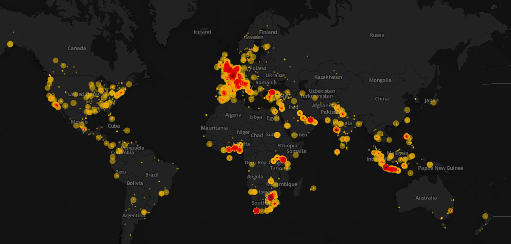 Click here to see the interactive version of the map above
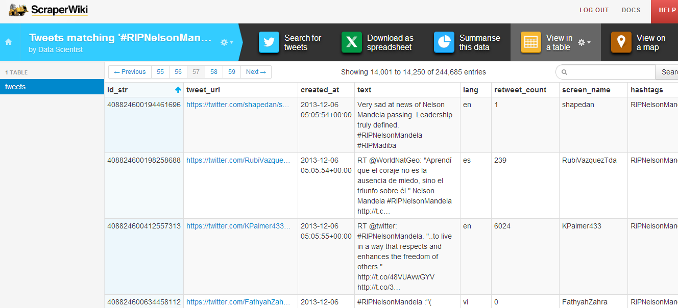
Data visualization is awesome! However, it conveys its goal when it tells a story. This weekend, Mandela’s death dominated the Twitter world and hashtags mentioning Mandela were trending worldwide. I decided to design a map that would show how people around the world tweeted the death of Nelson Mandela. First, I started collecting tweets associated with #RIPNelsonMandela using ScraperWiki. I collected approximately 250,000 tweets during the death day of Mandela. You can check this great recipe at school of data blog on how to extract and refine tweets.
After the step above, I refined the collected tweets and uploaded the data into CartoDB. It is one of my favorite open source mapping tools and I will make sure to write a CartoDB tutorial in future posts. I used the Bubble or proportional symbol map which is usually better for displaying raw data. Different areas had different tweeting rates and this reflected how different countries reacted. Countries like South Africa, UK, Spain, and Indonesia had higher tweeting rates. The diameter of the circles represents the number of retweets. With respect to colors, the darker they appeared, the higher the intensity of tweets is.
That’s not the whole story! Basically, it is easy to notice that some areas have high tweeting rates such as Indonesia and Spain. After researching about this topic, it was quite interesting to know that Mandela had a unique connection with Spain, one forged during two major sporting events. In 2010, Nelson Mandela was present in the stadium when Spain’s international football team won their first ever World Cup Football trophy as well. Moreover, for Indonesians, Mandela has always been a source of joy and pride, especially as he was fond of batik and often wore it, even in his international appearances.
Nonetheless, it was evident that interesting insights can be explored and such data visualizations can help us show the big picture. It also highlight events and facts that we are not aware of in the traditional context.
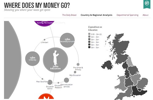
]]>One of the most common problems associated with storytelling around numbers is getting across in a meaningful way how big a particular number is in the grander scheme of things: is the £38 billion or so budgeted to be spent in the UK on education in 2013 large amount, or a small amount, for example, compared to other budget areas?
Sites such as WhereDoesMyMoneyGo use graphical techniques to help put numbers such as these into some sort of overall budgetary context, as well as breaking down the numbers to show how they are further apportioned:
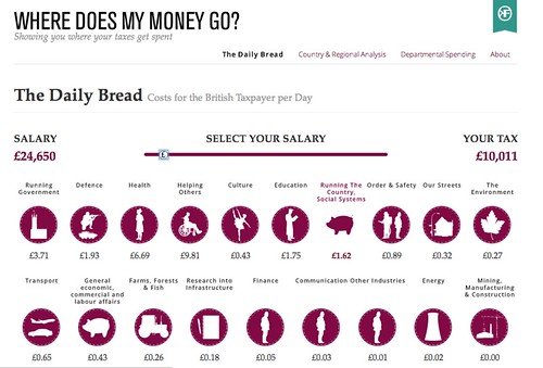
Another strategy for making numbers meaningful is to put them into a personally meaningful, everyday context. Once again, WhereDoesMyMoneyGo provides an interesting example of this. The Daily Bread is an application which allows a user to enter their approximate salary, and then see not only what the tax take is, but how it is allocated to different budgetary areas on a “pounds spent per day” basis:
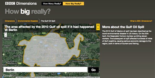
Communicating the extent of a geographical area can often be made more meaningful by putting the size of one area in the context of another: the number of football (soccer) pitches that can fit into a given area is one commonly used measure, for example. A couple of years ago, design agency BERG produced a prototype for the BBC called BBC Dimensions that allowed users to see the extent of one geographically related event centred on a location chosen by the user:
Again, this approach can be used to personalise a story and make it locally meaningful for audiences anywhere in the world.
I recently came across another unit that can be used to help people make sense of risks associated with mortality – the micromort. Originally coined by decision analyst Ronald Howard in a paper entitled Microrisks for Medical Decision Analysis published in the International Journal of Technology Assessment in Health Care / Volume 5 / Issue 03 / July 1989 , pp 357-370 (not an open access journal – so you’ll need a subscription, or willingness to pay, to read the article…), a micromort is a 1 in 1 million chance of death, a short form for 1 microprobability of mortality.
As David Speigelhalter, a Cambridge don with a passionate interest in risk, describes, about 50 people a day in England and Wales – population 50 million – have a non-natural death each day. That is, residents of England and Wales have a 50/50 million = 1 in a million chance of having a non-natural death each day; using our new found unit, they are exposed to 1 micromort a day.
If we now measure the chance in a million of dying from any particular activity, we can calculate the number of micromorts associated with that activity, and then make a comparison on that basis between activities.
David Spiegelhalter has further developed this notion of making sense of risks to life expectancy, introducing the notion of microlives, where one microlife represents thirty minutes of life expectancy. Engaging in particular activities that are unhealthy, and might be expected to reduce (or increase) your life expectancy, can then be compared in terms of the numbers of microlives they cost (or gain) you when you partake of that activity.
What all these examples show is how we can help audiences engage with data driven stories by trying to put them into a personally meaningful context, ideally something that can reach out at the human level to each member of that audience. Determining what comparative scale or relocation trick to use in any given situation may be culturally determined depending on the audience you are trying to reach out to. As with many data stories – pay attention to the units!
If you have an examples of useful scalings for communicating the relative size or impact of a particular measurement or event, please let us know via the comments below.
]]>


