Image credit: Rosario Fiore
School of Data is re-publishing Noah Veltman‘s Learning Lunches, a series of tutorials that demystify technical subjects relevant to the data journalism newsroom.
This Learning Lunch is about using geographic data to make maps for the web.
Are you sure?
Just because something can be represented geographically doesn’t mean it should. The relevant story may have nothing to do with geography. Maps have biases. Maps can be misleading. They may emphasize land area in a way that obscures population density, or show “geographic” patterns that merely demonstrate an underlying demographic pattern. Before you proceed, make sure a map is what you actually want.
For a more detailed take on this question, read When Maps Shouldn’t Be Maps.
What maps are made of
Maps generally consist of geographic data (we’ll call this geodata for short) and a system for visually representing that data.
Part 1: Geodata
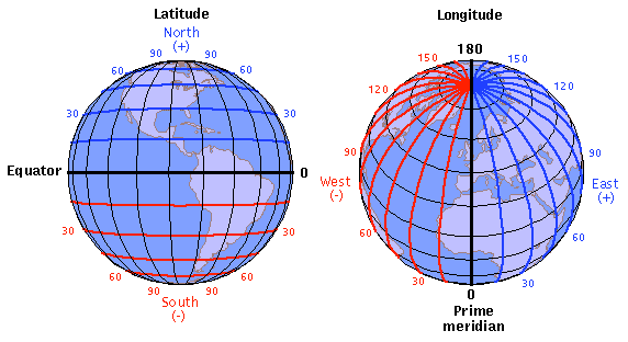
Latitude and Longitude
Most geodata you encounter is based on latitude/longitude coordinates on Earth’s surface (mapping Mars is beyond the scope of this primer).
Latitude ranges from -90 (the South Pole) to 90 (the North Pole), with 0 being the equator.
Longitude ranges from -180 (halfway around the world going west from the prime meridian) to 180 (halfway around the world going east from the prime meridian), with 0 being the prime meridian. Yes, that means -180 and 180 are the same.
If you are an old-timey sea captain, you may find or write latitude and longitude in degrees + minutes + seconds, like:
37°46'42"N, 122°23'22"W
Computers are not old-timey sea captains, so it’s easier to give them decimals:
37.77833, -122.38944
A latitude/longitude number pair is often called a lat/lng or a lat/lon. We’ll call them lat/lngs.
Want to quickly see where a lat/lng pair is on earth? Enter it into Google Maps, just like an address.
* Sometimes mapping software wants you to give a lat/lng with the latitude first, sometimes it wants you to give it with the longitude first. Check the documentation for whatever you’re using (or, if you’re lazy like me, just try it both ways and then see which one is right).
* Precision matters, so be careful with rounding lat/lngs. At the equator, one degree of longitude is about 69 miles!
Map geometry
Almost any geographic feature can be expressed as a sequence of lat/lng points. They are the atomic building blocks of a map.
A location (e.g. a dot on a map) is a single lat/lng point:
37.77833,-122.38944
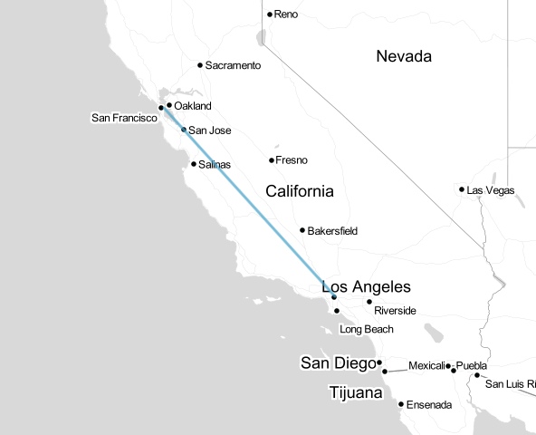
A straight line (e.g. a street on a map) is a pair of lat/lng points, one for the start and one for the end:
37.77833,-122.38944 to 34.07361,-118.24
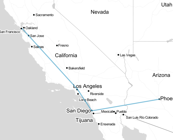
A jagged line, sometimes called a polyline, is a list of straight lines in order, a.k.a. a list of pairs of lat/lng points:
37.77833,-122.38944 to 34.07361,-118.24
34.07361,-118.24 to 32.7073,-117.1566
32.7073,-117.1566 to 33.445,-112.067
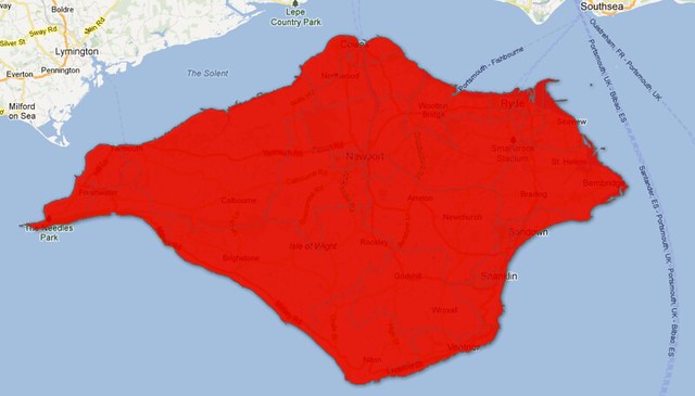
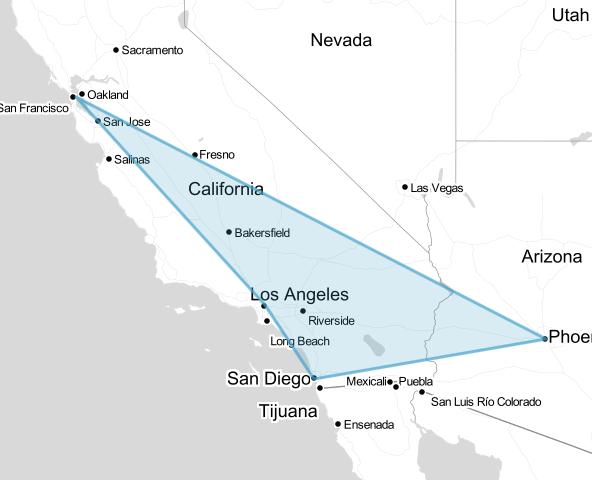
A closed region (e.g. a country on a map) is just a special kind of jagged line that ends where it starts. These are typically called polygons:
37.77833,-122.38944 to 34.07361,-118.24
34.07361,-118.24 to 32.7073,-117.1566
32.7073,-117.1566 to 33.445,-112.067
33.445,-112.067 to 37.77833,-122.38944
The bottom line: almost any geodata you find, whether it represents every country in the world, a list of nearby post offices, or a set of driving directions, is ultimately a bunch of lists of lat/lngs.
Map features
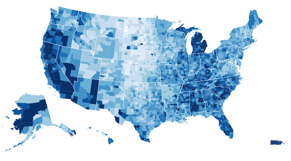
Most common formats for geodata think in terms of features. A feature can be anything: a country, a city, a street, a traffic light, a house, a lake, or anything else that exists in a fixed physical location. A feature has geometry and properties.
A feature’s geometry consists of any combination of geometric elements like the ones listed above. So geodata for the countries of the world consists of about 200 features.* Each feature consists of a list of points to draw a jagged line step-by-step around the perimeter of the country back to the starting point, also known as a polygon. But wait, not every country is a single shape, you say! What about islands? No problem. Just add additional polygons for every unconnected landmass. By combining relatively simple geometric elements in complex ways, you can represent just about anything.
Let’s say you have the Hawaiian islands, each of which is represented as a polygon. Should that be seven features or one?* It depends on what kind of map we’re making. If we are analyzing something by state, we only care about the islands as a group and they’ll all be styled the same in the end. They should probably be a single feature with seven pieces of geometry. If, on the other hand, we are doing a map of Hawaiian wildlife by island, we need them to be seven separate features. There is also something called a “feature collection,” where you can loosely group multiple features for certain purposes, but let’s not worry about that for now.
A feature’s properties are everything else that matter for your map. For the countries of the world, you probably want their names, but you may also want things like birth rate, population, largest export, or whatever else is going to be involved in your map.
* One of the lessons you will learn when you start making maps is that questions that you thought had simple answers – like “What counts as a country?” and “How many Hawaiian islands are there?” – get a little complicated.
Geodata formats
So we’ve learned that geodata is a list of features, and each feature is a list of geometric pieces, and each geometric piece is a list of lat/lngs, so the whole thing looks something like this:
Feature #1:
    geometry:
        polygon #1: [list of lat/lngs]
        polygon #2: [list of lat/lngs] (for Easter Island)
        ...
    properties:
        name: Chile
        capital: Santiago
        ...
Feature #2:
    geometry:
        polygon #1: [list of lat/lngs]
        polygon #2: [list of lat/lngs]
        ...
    properties:
        name: Argentina
        capital: Buenos Aires
        ...
So we just need a big list of lat/lng points and then we can all go home, right? Of course not. In the real world, this data needs to come in some sort of consistent format a computer likes. Ideally it will also be a format a human can read, but let’s not get greedy.
Now that you know that geodata is structured like this, you will see that most common formats are very similar under the hood. Four big ones that you will probably come across are:
Shapefiles
This is the most common format for detailed map data. A “shapefile” is actually a set of files:
- .shp — The geometry for all the features.
- .shx — A helper file that stores what order the shapes should be in.
- .dbf — stores the properties of each feature in a spreadsheet-like format.
- Other optional files storing things like a project description and styling (only the above three files are required).
If you open a shapefile in a text editor, it will look like gibberish, but it will play really nicely with desktop mapping software, also called GIS software or geospatial software. Shapefiles are great for doing lots of detailed manipulation and inspection of geodata. By themselves, they are pretty lousy for making web maps, but fortunately it’s usually easy to convert them into a different format.
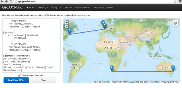
GeoJSON
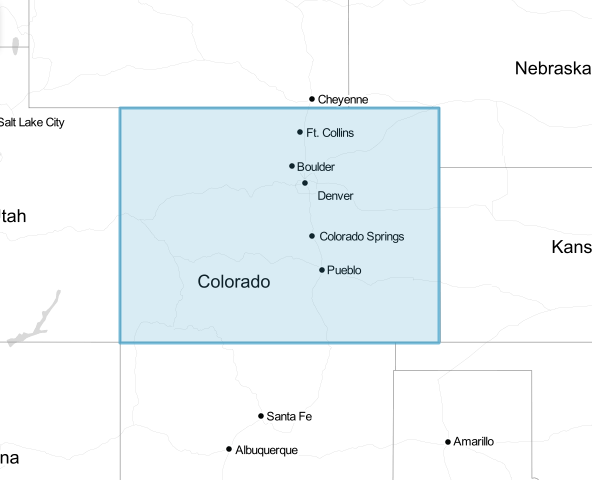
A specific flavor of JSON that is great for web mapping. It’s also fairly human readable if you open it in a text editor. Let’s use the state of Colorado as an example, because it’s nice and rectangular.
{
  "type": "Feature",
  "geometry": {
    "type": "Polygon",
    "coordinates": [
      [
        [-102.04,36.99],
        [-102.04,40.99],
        [-109.05,40.99],
        [-109.05,36.99],
        [-102.04,36.99]
      ]
    ]
  },
  "properties": {
    "name": “Colorado"
    “capital”: “Denver”
  }
}
This means: Draw a polygon by starting from the first point ([-102.04,36.99]), drawing a line to the next point ([-102.04,40.99]), and repeating until the end of the list.
Notice that the last point is the same as the first point, closing the loop – most software doesn’t require this extra point and will close the loop for you.
KML
A specific flavor of XML that is heavily favored by Google Maps, Google Earth, and Google Fusion Tables. The basic components behave very similarly to GeoJSON, but are contained in XML tags instead of curly braces. KML supports lots of extra bells and whistles like camera positioning and altitude for making movies in Google Earth. It plugs really nicely into Google products, but generally needs to be converted to something else in order to make other web maps. So what does Colorado look like in KML?
<Polygon id="Colorado">
    <altitudeMode>clampToGround</altitudeMode>
    <outerBoundaryIs>
        <LinearRing>
            <coordinates>
                -102.04,36.99
                -102.04,40.99
                -109.05,40.99
                -109.05,36.99
                -102.04,36.99
            </coordinates>
        </LinearRing>
    </outerBoundaryIs>
</Polygon>
The XML tags can be very confusing, but note that the meat of this data is quite similar to the GeoJSON example. Both of them are just a list of points in order, with a lot of scary braces and brackets as window dressing.
TopoJSON
The new hotness. TopoJSON takes in a basic geodata format, like GeoJSON, and spits out a clever reduction of it by focusing on the part of a map we usually care about: borders and connections (a.k.a. topology). The details are beyond the scope of this primer, but you can read about the TopoJSON magic here: https://github.com/mbostock/topojson/wiki
Remember: different software accepts different file formats for geodata, but at the end of the day everyone speaks lat/lng. Different file formats are just dialects of the mother tongue.
I’m not a cartographer. Where do I get geodata I can actually use?
There are lots of good sources for geodata online. Here are a few helpful sources:
Natural Earth
http://www.naturalearthdata.com/
Offers shapefile downloads of a few different data sets for the entire earth: Cultural (country boundaries, state/province boundaries, roads, railroads, cities, airports, parks, etc.) and Physical (coastline, islands, rivers, lakes, glaciers, etc.).
US Census Bureau
http://www.census.gov/geo/maps-data/data/tiger.html
Detailed shapefiles or KML files for the entire US.
Geocommons
http://geocommons.com/
A wide variety of user-contributed geodata, easy to search, browse, or preview. Data reliability may vary.
Wikimedia Commons
http://commons.wikimedia.org/
Lots of detailed maps in SVG format, which can be easily used and modified for the web (see “SVG/Canvas Maps” below).
OpenStreetMap
http://www.openstreetmap.org/
A well-populated database of land, boundaries, roads, and landmarks for the entire earth. This is available as a special XML format, and has to be converted to be used with most software. Because it covers the whole earth and has good coverage of roads, points of interest, etc., it is often used to generate a whole-earth set of map tiles (see “Slippy Maps” below).
Google
http://www.google.com/
If you don’t have the map data you need, look around! You’d be surprised how much is out there once you start looking.
ogr2ogr Converter
http://ogre.adc4gis.com/
Not a source of data, but a handy converter if you need to convert between a shapefile and GeoJSON.
Desktop GIS Software
http://www.qgis.org/ (free)
http://www.esri.com/software/arcgis (very not free)
You’ll want to start getting the hang of desktop GIS software, especially if you’ll be working with shapefiles. Quantum GIS is free and excellent. Arc GIS is also very powerful but very expensive. These are not a data source, per se, but an important method of whipping imperfect data into shape before mapping it.
A note of caution: be distrustful of any geographic data you find, especially if it’s complex or you’ll be combining data from multiple sources. Geographic data is not immune to the variability of accuracy on the internet. You will find no shortage of misshapen shapefiles, mislabeled locations, and missing puzzle pieces.
Part 2: Turning Geodata Into A Web Map
The point of all this data drudgery is to make a cool map, right? So let’s forget about the curly braces and the geometry lessons and get to it. Broadly speaking, you have three options for mapping your data for display on the web. Before we look at them, make sure you ask yourself the following question:
Does my map need to be interactive?
Just because you can make your map interactive and animated doesn’t mean you should. Some of the best maps in the news are just images. Images are great for the web because virtually everything supports them. This isn’t exactly an alternative to other methods, because in order to make an image, you’ll need to make a map with something else first: desktop GIS software, Adobe Illustrator, or one of the three options below. Once you have the display you want, you can either take a screenshot or export it as an image. Even still, avoiding unnecessary interactivity and complexity in favor of flat images will cut down on a lot of mapping headaches.
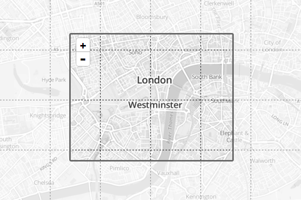
Option 1: Slippy Maps
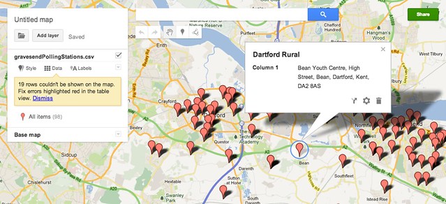
Whether you know it or not, you’ve used a lot of slippy maps. Google Maps is a slippy map. Yahoo! Maps is a slippy map. Does MapQuest still exist? If so, it’s probably a slippy map. I’m using the term “slippy” to refer to a web map with a background layer that “slips” around smoothly, allowing you to pan and zoom to your heart’s content. The underlying magic of a slippy map is a set of tiles in the background that are just flat images, so you could also call them tile-based maps. At each zoom level, the entire globe is divided into a giant grid of squares. Wherever you are on the map, it loads images for the squares you’re looking at, and starts loading nearby tiles in case you move around. When you move the map, it loads the new ones you need. You can add other layers and clickable objects on top of the tiles, but they are the basic guts of a slippy map.
Slippy maps are great because:
- They’re easy on browsers and bandwidth. They only need to load the part of the world you’re looking at, and they’re image-based. Every major browser and device supports them.
- People are used to them. Thanks to the popularity of Google Maps, everyone has lots of practice using slippy maps.
- They’re pretty easy to make responsive to screen size. Just shrink the map box, the underlying tiles don’t change.
- They gracefully support most key mapping features, like zooming, panning, and adding markers. They keep track of the messy details so you can focus on geography.
Slippy maps are not great because:
- Generating your own tiles can be a complicated task, requiring data, styling, and some technical savvy.
- Even if you reuse tiles from an old map, or borrow someone else’s tiles, you sacrifice fine visual control.
- Image-based tiles are not well-suited for making things dynamic.
- You are usually confined to the standard Web Mercator map projection and zooming behavior.
As a loose rule of thumb, slippy maps are a good choice to the extent that:
- Browser compatibility and performance are paramount.
- You need to display a large explorable area at different zoom levels.
- You don’t need precise visual control over everything.
- Not all of the map components need to be dynamic or interactive.
How do I make one?
In order to use geodata to make a slippy map, you are really making two maps:
- Background tiles – You have to feed a set of data about where land is, where roads are, where points of interest are, etc. into a piece of software and have it generate images based on that. You can skip this step if you are content with an existing set of tiles (see below).
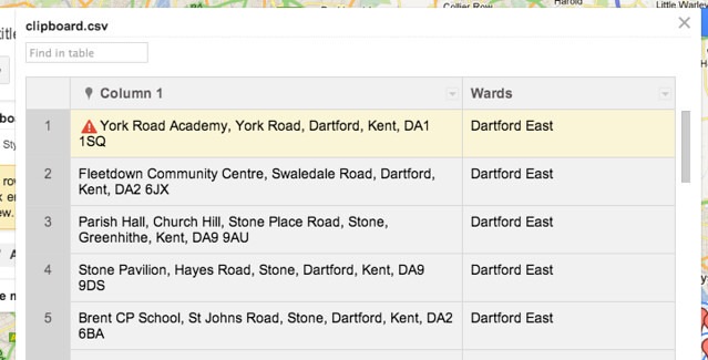
- Other content – Once you have tiles, you can use geodata to add things on top like markers or highlighted lines.
One of the best resources for making your own slippy map is Leaflet. This library will do most of the dirty work of a slippy map and let you focus on customizing it. You’ll have to write a little bit of JavaScript, but probably a lot less than you think.
Here is how we might draw Colorado in Leaflet:
map.addLayer(new L.polygon([
    [36.99,-102.04],
    [40.99,-102.04],
    [40.99,-109.05],
    [36.99,-109.05]
]));
Leaflet also speaks GeoJSON, so if we had a GeoJSON file with these coordinates we could feed it in directly:
L.geoJson(states).addTo(map);
You can use any tiles you want in Leaflet, including Google Maps.
Tiles
You can generate your own background tiles with TileMill.
Here is a very detailed tutorial on making your own tiles with TileMill:
http://dataforradicals.com/the-insanely-illustrated-guide-to-your-first-tile-mill-map/
You can create custom-styled tiles based on OpenStreetMap data with CloudMade:
http://developers.cloudmade.com/projects/show/tiles
You can also borrow beautiful tiles from Stamen Design:
http://maps.stamen.com/
Or use Google Maps for your base tiles:
https://developers.google.com/maps/
MapBox has a detailed guide on the nuts & bolts of slippy maps:
http://mapbox.com/developers/guide/
Option 2: JavaScript + SVG/Canvas
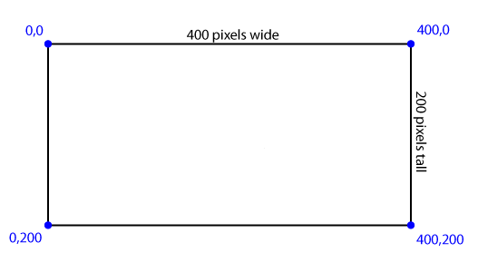
Another option is to draw a map from scratch right in a web page. This is typically done using either SVG or the HTML5 <canvas> element, which are both methods of creating a drawing space in a webpage and then drawing lots of lines and shapes based on a set of instructions. Unlike maps, which speak lat/lng, these methods speak pixels. The point in the upper-left corner is 0,0. Any other pixel is X,Y where X is the number of pixels to the right of that corner, and Y is the number of pixels below it.
Under the hood, SVG looks like HTML because it basically is.
<svg width="400" height="200">
    [Your drawing instructions go here]
</svg>
It allows you to draw basic shapes like lines, circles and rectangles, and do other advanced things like gradients and animation. When dealing with maps you’ll be dealing with a lot of <path> elements, which are the standard SVG way of drawing lines, and, by extension, complicated polygons. These can be straight lines, jagged lines, curved lines, line gumbo, deep-fried lines, line stew, you name it. A path gets its instructions on what to draw from one big list of instructions called a data string.
<path d="M200,0 L200,200 Z" /> (Start at 200,0, draw a line to 200,200, and then stop)
The syntax is a little off-putting but it’s not really any different from a polyline generated by lat/lng pairs. It just uses different abbreviations: M for where to start, L for where to draw the next line to, Z to stop. You can use the exact same system to draw geographic things like countries, you just need a lot more points. You might draw Aruba like this:
<path id="Aruba" d="M493.4952430197009,554.3097009349817 L493.6271899111516,554.5053144486982 L493.7591368026024,554.5053144486982 L493.7591368026024,554.6357015002002 L493.8910836940532,554.7660710469861 L493.8910836940532,554.8964231416435 L493.7591368026024,554.8964231416435 L493.6271899111516,554.8964231416435 L493.6271899111516,554.8312492725454 L493.7591368026024,554.8312492725454 L493.7591368026024,554.7660710469861 L493.6271899111516,554.7008884583952 L493.36329612825017,554.5053144486982 L493.23134923679936,554.5053144486982 L493.23134923679936,554.4401143422353 L493.23134923679936,554.3749098398575 L493.23134923679936,554.3097009349817 L493.23134923679936,554.2444876210226 L493.23134923679936,554.1792698913926 L493.23134923679936,554.1140477395024 L493.36329612825017,554.2444876210226 Z" />
You’ll notice that these numbers are way outside the range of a lat/lng. That’s because they aren’t lat/lngs. They are pixel values for a drawing space of a particular size. To go from lat/lng to pixels, you need to use what’s called a map projection, a method for turning lat/lngs into a 2-D drawing. When you make a slippy map, you will generally be automatically using what’s called the Web Mercator projection, but there are lots of others and you’ll need to pick one when making an SVG/Canvas map. This is a bit beyond the scope of this primer, but you can read about the built-in d3 map projections.
SVG/Canvas maps are great because:
- You have total visual control. You’re starting with a blank canvas and you can dictate everything about how it looks.
- They’re easy to make interactive and dynamic in new and exciting ways. All the pieces of the map are elements on the page just like anything else, so you can style and manipulate them with CSS and JavaScript.
- You don’t necessarily need real geodata to make one. If you already have an SVG (like the Wikimedia maps of the world) you can use that instead and skip all the lat/lng business.
SVG/Canvas maps are not great because:
- They have browser compatibility issues. IE8 doesn’t support them. (You can add support for IE7 and IE8 with certain libraries)
- Because your data is lat/lngs and the output is pixels, you need to deal with map projections to translate it before you draw.
- Performance becomes an issue as they get more complex.
- Implementing them often requires a reasonably high level of comfort with JavaScript.
- Users won’t necessarily know what to do. You will have to quickly teach impatient users how your special new map works to the extent that it deviates from what they’re used to.
How do I make one?
By far the most popular method for dynamically-drawn maps is d3, a fantastic but sometimes mind-bending JavaScript library that is good for many things, of which maps are just one.
There are lots of d3 mapping examples and tutorials, but they probably won’t make sense without a healthy amount of JavaScript under your belt:
http://bost.ocks.org/mike/map/
http://www.schneidy.com/Tutorials/MapsTutorial.html
http://www.d3noob.org/2013/03/a-simple-d3js-map-explained.html
If you want to go easy on the JavaScript, Kartograph.js is also a good option, and as a bonus, it includes support for IE7 and IE8.
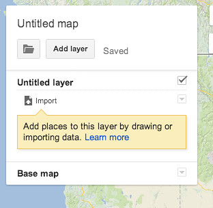
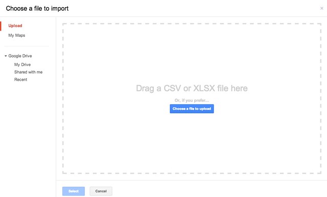
Option 3: Let someone else do most of the work
If you have geographic data ready there are a number of services out there that will handle a lot of the actual mapping for you, with varying levels of control over the output:
Google Maps
https://maps.google.com/
Google Earth
http://earth.google.com/
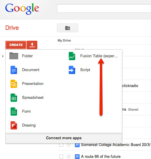
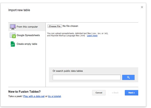
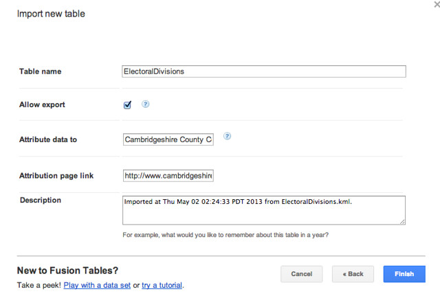
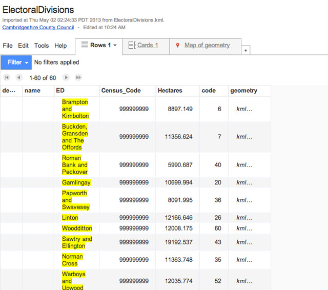
Google Fusion Tables
http://www.google.com/drive/start/apps.html#fusiontables
CartoDB
http://cartodb.com
BatchGeo
http://batchgeo.com/