You are browsing the archive for Data for CSOs.

Two-day data training in Macedonia

- January 5, 2015 in Data for CSOs, Skillhare

At the end of November (26th-28th), in Dojran – a city in Macedonia, we held a two-day training with Milena. Tailored to the needs of the 24 participants from different CSOs, we tried to cover as much as possible of the topics we narrowed down using the form we composed for determining their skills and needs.

15744717149_815962dc69_z

15904939606_5c95d53b46_z

We started the training with the basic introduction to what data is and where to find it, and the first day we mostly focused on working with spreadsheets, formulas and pivot tables. The next day we shared some thoughts and skills on data visualization, worked with different online data visualization and mapping tools and talked about creating beautiful timelines. Anyhow, the agenda for the training is here for everyone to check, use and adapt.

15308502654_ccc0d72c23_z

During the two days we tried to be as flexible as possible and adapt to the real time needs of the participants, and to engage everyone in a more interactive way of learning through practical exercises and teamwork.

Here you can see some more photos from the training.

Flattr this!

Data 101 Knowledge Sharing with Publish What You Pay Indonesia

- December 5, 2014 in Data for CSOs, Events

Starting in August the School of Data Fellow for Indonesia, Yuandra Ismiraldi working together with Publish What You Pay Indonesia organized a weekly / bi-weekly event of knowledge sharing regarding data skills. This knowledge sharing event is free and open for all, so people can just come and learn various skills about working with data.


Data PipelineThe skills shared are mainly the detailed and technical version of the data pipeline concept of the School of Data:

  • Finding & getting data: Google advanced search, use of data portals, using Tabula to get data from PDFs
  • Cleaning data: data cleaning principles, using Open Refine to clean up messy data
  • Analyzing data: Excel, Tableau
  • Visualizing data: visualization principles, Infogr.am, Piktochart, etc
  • And a lot of other data related stuff: spatial data, examples of advocacy using data


The event is more focused on discussions around each topic. The School of Data Fellow first gives a short presentation about the topic and continues with technical hands sessions or with a discussion based on a case study, depending on the topic. With these kinds of knowledge sharing, hopefully that CSOs such as PWYP Indonesia will have a more hands on experience on working with data.

PWYP Indonesia Extractive Industries Infographic

Right now the knowledge sharing has been done about 10 times, with some encouraging results. PWYP Indonesia began to use data more thoroughly as the underlying base for some of their advocacy program and have created some infographics in order to better communicate their data better. Hopefully, knowledge sharing like this can continue and better support CSOs in using data for their advocacy uses.

Flattr this!

Open Data Club – Talking about data with CSOs in Indonesia

- December 3, 2014 in Community, Data for CSOs, Events

Back in September, the School of Data conducted a training for CSOs working with election data in cooperation with Perludem and supported by The Asia Foundation. The training was the kick off of an initiative aiming to create a community of Indonesian CSOs that are interested in working with data to strengthen their advocacy strategy. This is how the Open Data Club was born in the end of October.

Meetup of Open Data Club of CSOs in Jakarta

Meetup of Open Data Club of CSOs in Jakarta

The Open Data Club membership was open for all CSO interested in working with data. Right now the meetings are concentrated in Jakarta but as the community gaining more momentum it will try to do the meetup in other cities as well. Need to be noted that this is might the first data-related community of CSOs, so this is a great start for data awareness for CSO in Indonesia. Right now there are more than 10 organizations took part in the meetups, including some goverments and funders.

The first meetup, initiated by Perludem, had quite a mixed group, ranging from CSOs, goverment, and other data focused movements. However the focus is still on how to use data for advocacy, a theme that CSOs are very interested in. There was a lot of talking about how CSOs can get data, manage and analyse it and finally use it to for storytelling and evidence based campaigning in the form of infographics or interactive apps. One important point that also has been raised is how CSOs can collaborate and potentially combine their data and push more for knowledge sharing and collective advocacy.

The Open Data Club became a weekly meetup in which the participating CSOs take turns in hosting the event. This means that they all visit the offices of all participants CSOs and get to know each other a little better. One more interesting thing is that the CSOs are starting to bond and create action plans (called bubbles) of things they want to achieve through the meetups. By doing this, hopefully after several meetups there will something concrete that the Open Data Club can create and build together.

The Open Data Club marks something quite important for CSO in Indonesia. It shows that interest and awareness on working with data is gaining ground in Indonesia and the CSOs are starting to collaborate and work together for the greater good. Let’s hope this great community can create great things in the future!

Flattr this!

National Training on Working With Data For Extractive Industries in Indonesia

- November 7, 2014 in Data for CSOs, Events

Capacity Building Workshop for Publish What You Pay Indonesia

Following on from the Capacity Building workshop held in September 2014 with Publish What You Pay Indonesia (PWYP Indonesia) and supported by South East Asia Technology & Transparency Initiative (SEATTI) – HIVOS, at the beginning of October, I helped lead a a two day national training regarding extractive industries data for CSO in Indonesia, with the same audience. Done in parallel with the national work meeting of the PWYP Indonesia coalition of CSOs, the training was focused on raising awareness of data usage and giving the basics on how to work with data for CSOs in the extractive industries sector in Indonesia. The two day training attracted 20+ participants from various CSO that joined in the PWYP Indonesia coalition and by the end of training we hoped they would have their own data project to continue working on.

The First Day

The first day was dedicated to learning the basics, and the theory! In the beginning, the participants are being given the rough theory and basic stuff on how to work with data & data usage, that is based primarily on the School of Data’s data pipeline. The concept of data work in the pipeline (asking a question, finding data, getting data, cleaning data, analyzing data, and visualizing data) also became the building blocks of the training.

After the participant got a heavy dose of the basic stuff regarding how to work with data, then we went straight into the technical how-to’s, and got their hands dirty. We talked about how to finding data using Google’s advanced search, using the newly launched Indonesian Data Portal data.id, how to create their own forms using Google Docs, and how to get data from PDF using tools like Tabula. After they got their hands full of finding & getting data, then we went to the next step of cleaning data by showing them what we mean by ‘messy data’, and exactly what kind of clean data that they want to achieve in order for the data to be usable, and re-usable by others.

As a session bonus in the end to close the first day, the participants were given a sample demonstration on how they can easily analyze their social media data using Wolfram Alpha. It was really a lot of stuff to chew on the first day, because it was so full of the basics, but the participants felt excited, and a silver lining that can be taken from this session is that actually a lot of the data pipeline concept has already been done by the CSO in their everyday work; the only difference, however, is that they weren’t (yet!) understanding it in terms of the big picture. To understand their work flow better, looking at it through the ‘data pipeline’ framework really helped.

The Second Day

On to the second day!

The second day was done in parallel with the PWYP’s national seminar, and the data training track was put after the keynote and panel discussion regarding transparency in the extractive industries area. Even though the data training session was optional, and scheduled for the afternoon, this did not hinder the energy of the participants of the data training. The session was just packed as the first day’s session!

The materials for the second day focused more on the actual implementation of the theory of the data pipeline that we went through on Day 1. The participants were introduced to the concept of data visualization and the tools that they can use for visualization, then using these tools and everything that was covered on Day 1, they were encouraged to try and create a data project plan using the pipeline as a template.

As always with visualization, the participants were very interested and active in this session. Inevitably, we had a couple of minor glitches regarding internet connectivity, and it came up that some of the visualisation tools that we recommended actually needed an internet connection, but nevertheless the the session turned out nicely offline. After the “Creating your own data project” session facilitated by the PWYP Indonesia team, there was much discussion – which even continued after the time for the training has ended. Such incredible energy for data training!

Recap

Overall, there was a lot of interest in the technique of how actually to work with data, and how the usage of data can help the CSO groups to improve their advocacy work. This was great to see – because once you start to learn that data can help you, you will be hooked to learn more and more about data and how to work with them :)

Flattr this!

Breaking the Knowledge Barrier: The #OpenData Party in Northern Nigeria

- October 1, 2014 in Community, Data Expeditions, Data for CSOs, Events, Follow the Money, Geocoding, Mapping, Spreadsheets, Storytelling, Uncategorized, Visualisation

If the only news you have been watching or listening to about Northern Nigeria is of the Boko Haram violence in that region of Nigeria, then you need to know that other news exist, like the non-government organizations and media, that are interested in using the state and federal government budget data in monitoring service delivery, and making sure funds promised by government reach the community it was meant for.

This time around, the #OpenData party moved from the Nigeria Capital – Abuja to Gusau, Zamfara and was held at the Zamfara Zakat and Endowment Board Hall between September Thursday, 25 and Friday, 26, 2014. With 40 participant all set for this budget data expedition, participants included the state Budget Monitoring Group (A coalition of NGOs in Zamfara) coordinated by the DFID (Development for International Development) State Accountability and Voice Initiative (SAVI),other international NGOs such as Society for Family Health (SFH), Save the Children, amongst others.

IMAG1553

Group picture of participants at the #OpenData Party in Zamfara

But how do you teach data and its use in a less-technology savvy region? We had to de-mystify teaching data to this community, by engaging in traditional visualization and scraping – which means the use of paper artworks in visualizing the data we already made available on the Education Budget Tracker. “I never believed we could visualize the education budget data of the federal government as easy as what was on the wall” exclaimed Ahmed Ibrahim of SAVI

IMAG1516

Visualization of the Education Budget for Federal Schools in Zamfara

As budgets have become a holy grail especially with state government in Nigeria, of most importance to the participants on the first day, was how to find budget data, and processes involved in tracking if services were really delivered, as promised in the budget. Finding the budget data of the state has been a little bit hectic, but with much advocacy, the government has been able to release dataset on the education and health sector. So what have been the challenges of the NGOs in tracking or using this data, as they have been engaged in budget tracking for a while now?

Challenges of Budget Tracking Highlighted by participants

Challenges of Budget Tracking Highlighted by participants

“Well, it is important to note that getting the government to release the data took us some time and rigorous advocacy, added to the fact that we ourselves needed training on analysis, and telling stories out of the budget data” explained Joels Terks Abaver of the Christian Association of Non Indigenes. During one of the break out session, access to budget information and training on how to use this budget data became a prominent challenge in the resolution of the several groups.

The second day took participants through the data pipelines, while running an expedition on the available education and health sector budget data that was presented on the first day. Alas! We found out a big challenge on this budget data – it was not location specific! How does one track a budget data that does not answer the question of where? When involved in budget tracking, it is important to have a description data that states where exactly the funds will go. An example is Construction of Borehole water pump in Kaura Namoda LGA Primary School, or we include the budget of Kaura Namoda LGA Primary School as a subtitle in the budget document.

Taking participants through the data pipelines and how it relates to the Monitoring and Evaluation System

Taking participants through the data pipelines and how it relates to the Monitoring and Evaluation System

In communities like this, it is important to note that soft skills are needed to be taught – , like having 80% of the participants not knowing why excel spreadsheets are been used for budget data; like 70% of participants not knowing there is a Google spreadsheet that works like Microsoft Excel; like all participants not even knowing where to get the Nigeria Budget data and not knowing what Open Data means. Well moving through the school of data through the Open Data Party in this part of the world, as changed that notion.”It was an interesting and educative 2-day event taking us through the budget cycle and how budget data relates to tracking” Babangida Ummar, the Chairman of the Budget Working Group said.

Going forward, this group of NGO and journalist has decided to join trusted sources that will be monitoring service delivery of four education institutions in the state, using the Education Budget Tracker. It was an exciting 2-day as we now hope to have a monthly engagement with this working group, as a renewed effort in ensuring service delivery in the education sector. Wondering where the next data party will happen? We are going to the South – South of Nigeria in the month of October – Calabar to be precise, and on the last day of the month, we will be rocking Abuja!

Flattr this!

Data for Social Change in South Africa

- September 29, 2014 in Community, Data Blog, Data Expeditions, Data for CSOs, Data Journalism, School_Of_Data


We recently kicked off our first local Code for South Africa School of Data workshops in Johannesburg and Cape Town for journalists and civil society respectively.

I arrived in the vibrant Maboneng district in central Johannesburg excited (and a little nervous) about helping my fellow school of Data Fellow Siyabonga facilitate our first local workshop with media organisations The Con and Media Monitoring Africa. Although I’ve attended a data workshop this was my first experience of being on the other end and it was an incredible learning experience. Siya did a fantastic job of leading the organisations in defining and conceptualising their data projects that they’ll be working on over the course of the rest of the year and I certainly borrowed and learned a lot from his workshop format.

It was great to watch more experienced facilitators, Jason from Code for South Africa and Michael from The School of Data, work their magic and share their expert knowledge on more advanced tools and techniques for working with and presenting data and see the attendees eyes light up at the possibilities and potential applications of their data.

Johannesburg sunset

Johannesburg sunset at the workshop venue

A few days later we found ourselves back in the thick of things giving the second workshop in Cape Town for civil society organisations Black Sash and Ndifuna Ukwazi. I adapted Siyabonga’s workshop format slightly, shifting the emphasis from journalism to advocacy and effecting social change for our civil society attendees.

We started off examining the broader goals of the organisation and worked backwards to identify where and how data can help them achieve their goals, as data for data’s sake in isolation is meaningless and our aim is to help them produce meaningful data projects that make a tangible contribution to their goals.

The team from Ndifuna Ukwazi at work

The team from Ndifuna Ukwazi at work

We then covered some general data principles and skills like the data pipeline and working with spreadsheets and easy-to-use tools like Datawrapper and Infogr.am, as well as some more advanced (and much needed) data cleaning using Open Refine as well as scraping data using Tabula which the teams found extremely useful, having been manually typing out information from pdfs up until this point.

Both organisations arrived with the data they wanted to work with at hand and it immediately became apparent that it needed a lot of cleaning. The understanding the organisations gained around working with data allowed them to reexamine the way they collect and source data, particularly for Black Sash who realised they need to redesign their surveys they use. This will be an interesting challenge over the next few months as the survey re-design will still need to remain compatible with the old survey formats to be useful for comparison and analysis and I hope to be able to draw on the experience and expertise of the School of Data network to come up with a viable solution.

BlackSash_at_work

Siya working his magic with the Black Sash team

By the end of the workshop both organisations had produced some visualisations using their data and had a clear project plan of how they want to move forward, which I think is a great achievement! I was blown away by the enthusiasm and work ethic of the attendees and I’m looking forward to working with them over the next few months and helping them produce effective data projects that will contribute to more inclusive, equitable local governance.


Flattr this!

Hacking the world’s most complex election system: part 2

- August 28, 2014 in Data for CSOs, Election data, On the Road


[Ed. Note: The School of Data was recently in Bosnia. This blog post is the 2nd in the series. See the first post by Codrina (School of Data Fellow).]

After all the brainstorming, all the coding, all the mapping, all the laughing and chatting the results of the Bosnian election data hacking are slowly, but surely finding their way to the surface.

School of Data Bosnia

After the crash course of only 3 hours for grasping how the Bosnian election system actually works and after a powerful and general brainstorming of what we have and what we want to get, the happy hackers divided into 3 teams: the data team, the development team and the storytellers each with clear tasks to achieve.
After a week’s work, the [git] repository is fully packed. Raw data, cleaned data, code and a wiki explaining how we aimed to make sense of the quite special Bosnian elections system. Still curious why we keep saying this election system is complicated? Check out this great video that the storytellers created:

The end of this wonderful event was marked down by a 2 hours power brainstorming regarding the flourishment of the Data Academy. Great ideas flew around the place and landed on our Balkan Data Academy sheet.

World, stay tuned! Something is definitely cooking in the wonderful Balkans!!

Flattr this!

Tech projects for transparency – a new guide to the ‘Fundamentals’ that deliver impact and save money

- June 25, 2014 in Community, Data for CSOs, HowTo, Impact Case Study, narrative, Resources

[Cross-posted from the TABridge network. Visit tech.transparency-initiative.org to learn more and download the new ‘Fundamentals’ guide. Thanks Jed Miller for the post for the support. The report was written by Dirk Slater of FabRiders. ]
Fundamentals_cover_pr

LONDON, 17 June 2014—The Transparency and Accountability Initiative is proud to launch a practical new guide for transparency campaigners planning and executing technology projects.

Fundamentals for Using Technology in Transparency and Accountability Organisations presents clear, step-by-step guidance to the key phases in a technology project, from defining your strategy, to spending wisely, to tracking outcomes.

The guide is also designed to help funders identify projects with the potential to succeed and provide effective support to grantees.

Too often, technology projects burn money and staff time, but still lack impact. In ‘Fundamentals,’ author Dirk Slater and experts from our TABridge network distil years of experience into the principles and steps that drive success in technology projects.
The guide will help you:

  • Clarify why you’re creating your technology project and how it contributes to your overall organisational strategy.
  • Ensure you have the internal capacity and external expertise to manage the project.
  • Build in early and regular evaluations of your progress so that rather than end up with an expensive failure, you can detect problems early and adjust as you go.

Vanessa Herringshaw, director of the Transparency and Accountability Initiative, said:

“Digital tools have great potential to improve transparency, but if we’re honest, it’s also really easy to get it wrong. Developing technologies to expose corruption and engage citizens in the fight for accountable government demands significant resources, but without smart planning, money gets wasted and opportunities get lost. The guide is a roadmap for NGOs and funders who want to get tech right.”

“Technology is not a panacea,” said Rakesh Rajani, civil society co-chair of the Open Government Partnership and head of East African CSO Twaweza, “It is one piece in larger social change. T/AI’s ‘Fundamentals’ guide addresses the reality that tools that don’t match the local context or aren’t linked into other approaches can’t solve the deep problems that weaken government accountability or citizen mobilization alone. The guide seeks to help people think through these needs and linkages, and make more effective choices.”

‘Fundamentals’ is presented in six chapters, which can be used separately or as a unit:

It also includes appendices that help organisations to match technology tactics to different stakeholders; ensure that projects are guided by a user-centred approach; ask the right questions when planning mobile-based outreach; and enlist data and open data effectively for advocacy.

To support our community of practice and deepen the impact of the guide, the Transparency and Accountability Initiative is hosting a series of webinars this spring and summer, based on the guide’s key recommendations.

For easy use, ‘Fundamentals’ is available to read online or to download in full or chapter by chapter. Learn more and get started at: http://tech.transparency-initiative.org/fundamentals.

Flattr this!

Putting Points on Maps Using GeoJSON Created by Open Refine

- May 19, 2014 in Data Cleaning, Data for CSOs, HowTo, Mapping

Having access to geo-data is one thing, quickly sketching it on to a map is another. In this post, we look at how you can use OpenRefine to take some tabular data and export it in a format that can be quickly visualised on an interactive map.

At the School of Data, we try to promote an open standards based approach: if you put your data into a standard format, you can plug it directly into an application that someone else has built around that standard, confident in the knowledge that it should “just work”. That’s not always true of course, but we live in hope.

In the world of geo-data – geographical data – the geojson standard defines a format that provides a relatively lightweight way of representing data associated with points (single markers on a map), lines (lines on a map) and polygons (shapes or regions on a map).

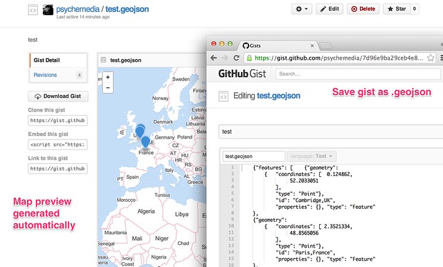
Many applications can read and write data in this format. In particular, Github’s gist service allows you to paste a geojson data file into a gist, whereupon it will render it for you (Gist meets GeoJSON).

Gists_and_test

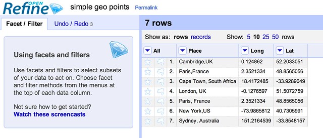
So how can we get from some tabular data that looks something like this:

simple_geo_points-tab_-_OpenRefine

Into the geojson data, which looks something like this?

{"features": [   {"geometry": 
        {   "coordinates": [  0.124862,
                 52.2033051
            ],
            "type": "Point"},
         "id": "Cambridge,UK",
         "properties": {}, "type": "Feature"
    },
   {"geometry": 
        {   "coordinates": [ 151.2164539,
                 -33.8548157
            ],
            "type": "Point"},
         "id": "Sydney, Australia",
         "properties": {}, "type": "Feature"
    }], "type": "FeatureCollection"}

[We’re assuming we have already geocoded the location to get latitude and longitude co-ordinates for it. To learn how to geocode your own data, see the School of Data lessons on geocoding or this tutorial on Geocoding Using the Google Maps Geocoder via OpenRefine].

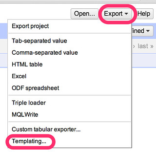
One approach is to use OpenRefine [openrefine.org]. OpenRefine allows you to create your own custom export formats, so if we know what the geojson is supposed to look like (and the standard tells us that) we can create a template to export the data in that format.

Steps to use Open Refine:

Locate the template export tool is in the OpenRefine Export drop-down menu:

export-_OpenRefine

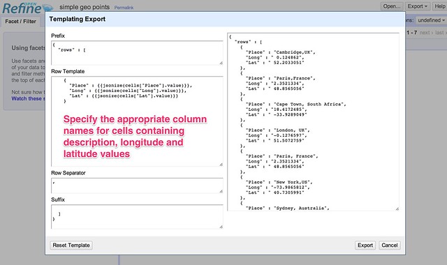
Define the template for our templated export format. The way the template is applied is to create a standard header (the prefix), apply the template to each row, separating the templated output for each row by a specified delimiter, and then adding a standard footer (the suffix).

simple_geo_points_-_OpenRefine

Once one person has worked out the template definition and shared it under an open license, the rest of us can copy it, reuse it, build on it, improve it, and if necessary, correct it…:-) The template definitions I’ve used here are a first attempt and represent a proof-of-concept demonstration: let us know if the approach looks like it could be useful and we can try to work it up some more.

It would be useful if OpenRefine supported the ability to save and import different template export configuration files, perhaps even allowing them to be imported from and save to a gist. Ideally, a menu selector would allow column names to be selected from the current data file and then used in template.

Here are the template settings for template that will take a column labelled “Place”, a column named “Lat” containing a numerical latitude value and a column named “Long” containing a numerical longitude and generate a geojson file that allows the points to be rendered on a map.

Prefix:

{"features": [

Row template:

 {"geometry": 
        {   "coordinates": [ {{cells["Long"].value}},
                {{cells["Lat"].value}}
            ],
            "type": "Point"},
         "id": {{jsonize(cells["Place"].value)}},
         "properties": {}, "type": "Feature"
    }

Row separator:

,

Suffix:

], "type": "FeatureCollection"}

This template information is also available as a gist: OpenRefine – geojson points export format template.

Another type of data that we might want to render onto a map is a set of markers that are connected to each other by lines.

For example, here is some data that could be seen as describing connections between two places that are mentioned on the same data row:

point_to_point_demo_tab_-_OpenRefine

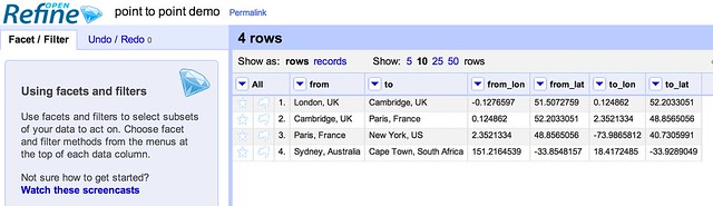
The following template generates a place marker for each place name, and also a line feature that connects the two places.

Prefix:

{"features": [

Row template:

 {"geometry": 
        {   "coordinates": [ {{cells["from_lon"].value}},
                {{cells["from_lat"].value}}
            ],
            "type": "Point"},
         "id": {{jsonize(cells["from"].value)}},
         "properties": {}, "type": "Feature"
    },
{"geometry": 
        {   "coordinates": [ {{cells["to_lon"].value}},
                {{cells["to_lat"].value}}
            ],
            "type": "Point"},
         "id": {{jsonize(cells["to"].value)}},
         "properties": {}, "type": "Feature"
    },
{"geometry": {"coordinates": 
[[{{cells["from_lon"].value}}, {{cells["from_lat"].value}}], 
[{{cells["to_lon"].value}}, {{cells["to_lat"].value}}]], 
"type": "LineString"}, 
"id": null, "properties": {}, "type": "Feature"}

Row separator:

,

Suffix:

], "type": "FeatureCollection"}

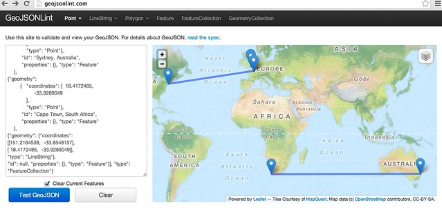
If we copy the geojson output from the preview window, we can paste it onto a gist to generate a map preview that way, or test it out in a geojson format checker such as GeoJSONLint:

GeoJSONLint_-_Validate_your_GeoJSON

I have pasted a copy of the OpenRefine template I used to generate the “lines connecting points” geojson here: OpenRefine export template: connected places geojson.

Finally, it’s worth noting that if we can define a standardised way of describing template generated outputs from tabular datasets, libraries can be written for other programming tools or languages, such as R or Python. These libraries could read in a template definition file (such as the gists based on the OpenRefine export template definitions that are linked to above) and then as a direct consequence support “table2format” export data format conversions.

Which makes me wonder: is there perhaps already a standard for defining custom templated export formats from a tabular data set?

Flattr this!

Deadly Environment

- April 22, 2014 in Data for CSOs

Deadly Environment: impunity

Global Witness‘s new report Deadly Environment documents the past decade’s shocking rise in killings of people defending environmental and land rights. As competition for natural resources intensifies, more and more ordinary people—particularly in indigenous communities—are being murdered for resisting land grabs, expulsion from their homes, and other abuses. These crimes are going almost entirely unpunished.

School of Data worked with the Global Witness team to develop the interactive graphics that accompany the minisite of the report. We wanted to highlight the overall acceleration of the killings, their geographical distribution, and the horrifying extent of their impunity. Conscious of the moral gravity of the project, we also sought to bring the human qualities of the data to the surface.

The result is a series of graphics developed with D3.js and presented sequentially using Owl Carousel. In the graphics that highlighted individual killings, a mouseover display of the case’s details was created using the d3-tip plugin. Geospatial data for the map graphic was taken from Natural Earth.

These interactive graphics helped Global Witness’s report reach a wider audience, particularly on Twitter, where promotional tweets including screencaps of the graphics were very widely shared.


Flattr this!