You are browsing the archive for Data Expeditions.

Memories from San Jose

- January 29, 2015 in Data Expeditions, Блог, Интернационален

This article was originally posted in Spanish at Escuela de Datos by Phi Requiem, School of Data fellow in Mexico.


Last November, the Open Government Partnership (OGP) Summit took place in Latin America. CSO participants from 18 countries got together to share and exchange in an “unconference” where many topics were discussed. It was really interesting to learn about ways data things are handled in different countries, and to pinpoint the similarities and differences between our contexts.

Screen Shot 2015-01-13 at 16.48.14
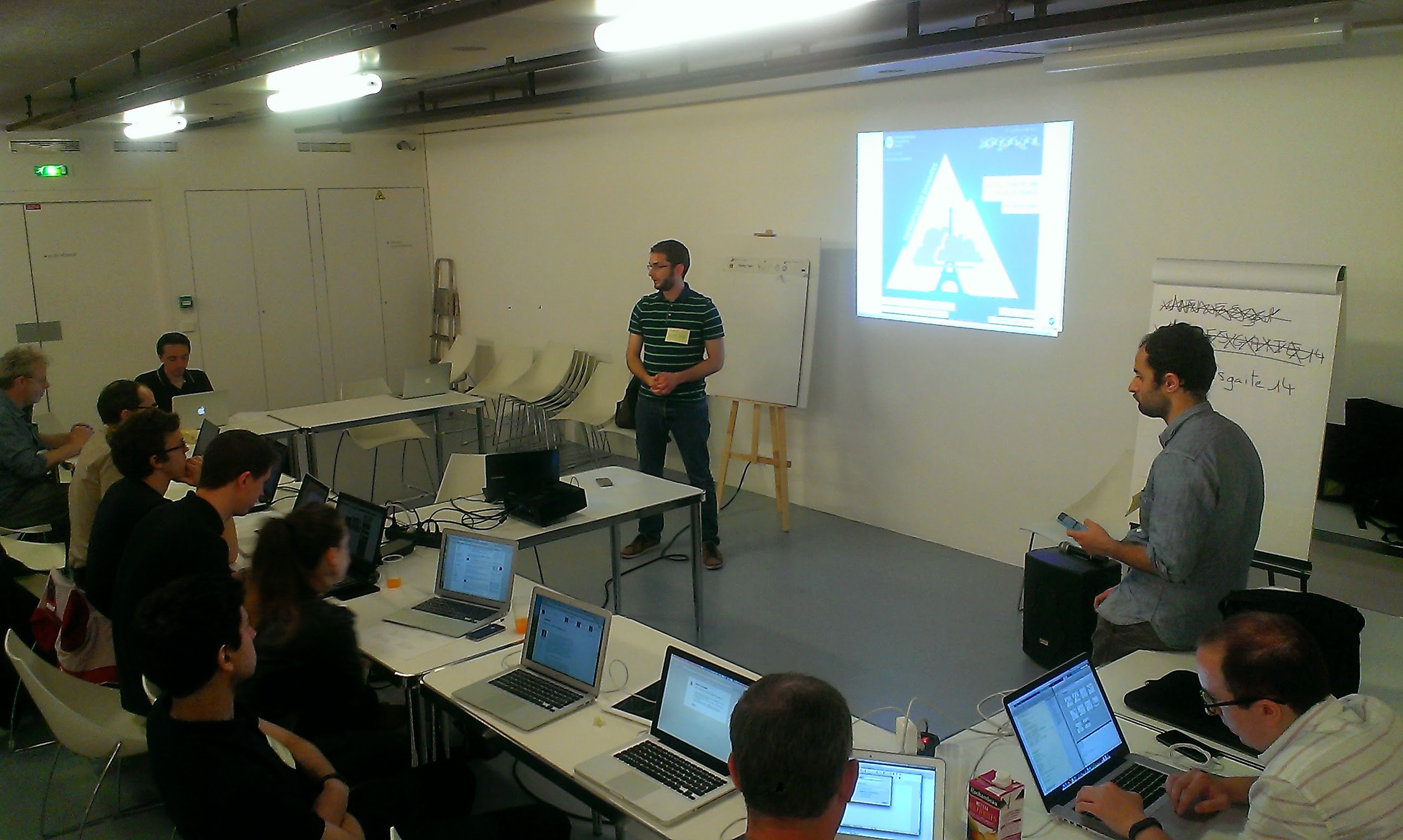
After a few words from the President of Costa Rica and other government representatives, a series of talks and roundtables began… And then, in parallel, Antonio (School of Data fellow in Peru) and I started a datathon.

In this datathon, our task was to give training and support to the five teams asking questions to the dataset on the commitments of the OGP countries, and which can be found here → Action Plan Commitments and IRM Data, http://goo.gl/yZmcKC, http://goo.gl/vLgYWj

The first step is to approach the data and structure it. After this, it was time to pose the questions we wanted to answer through the analysis of this data, and a lot of great questions (and interesting purposes) arose – many more than time allowed us to develop further. Teams picked the topics that seemed most relevant to them.

Screen Shot 2015-01-13 at 16.49.48Teams were already working on their analysis at 9 sharp the following morning, while OGP San Jose sessions were taking place. The datathon participants looked for more data, did cross-comparisons, scraping, etc. By noon, they had found results and answers – it was time to start working to present them in visualizations, infographics, maps, articles, etc. At 3PM, the teams impressed us with their presentations, and showed us the following outcomes: http://ogpcr.hackdash.org

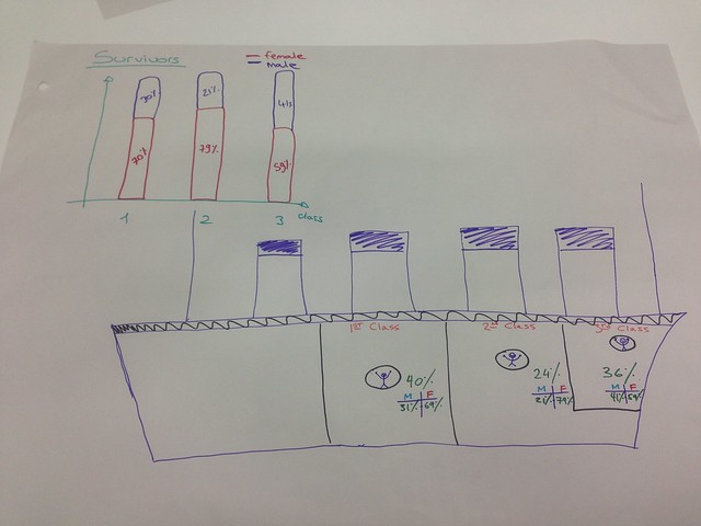
  • Team Cero Riesgos: Generating information on risks by area. Data: OIJ, Poder Judicial.
  • Team Accesa: Comparing the perception of Latin American citizens on current topics in the LatinoBarometer with the commitments and achievements per country. The goal: to know if governments are responding to citizen concerns.
  • Team E’dawokka: Comparing the agendas and priorities of Central America with those in the rest of Latin America.
  • Team InfografiaFeliz: What countries look like in the Human Development Index in terms of their anti-corruption measures (and their success).
  • Team Bluffers: Measuring the percentage of delay and achievement of the commitments acquired by each country, and relating the design process for the commitments (measured by their relevance and potential impact) and their achievement.

At the end of the day, the jury chose teams InfografiaFeliz and Accesa as winners (which earned them a prize in cash).

Screen Shot 2015-01-13 at 16.51.43This was the first data expedition in Costa Rica, and you can find more in the following links: https://www.facebook.com/ogpsanjose, https://twitter.com/OGPSanJose, https://www.flickr.com/photos/ogpsanjose , http://grupoincocr.com/open-data/miembros-de-grupo-inco-ganan-la-primera-expedicion-de-datos-en-costa-rica

What I take away from my experience in this expedition is that people are always willing to learn and create, but not everyone is aware of what open data is, or how it can be useful for them. Initiatives of this sort are achieving their mission, but are insufficient – and that’s why we need to keep in touch with the participants and encourage them to share their experiences, and, why not: to replicate these initiatives.

Here are some tips for people with an interest in running data expeditions:

  • It’s difficult to explain the difference between a hackathon and a data expedition… But, the earlier this is out of the way, the better.
  • There most be a conceptual baseline. With such limited time it’s difficult to give introductions or previous workshops, but trying to do a bit of this can be really useful.
  • Teams always have good ideas to handle information and show conclusions, but many times impose limitations on themselves because they think the technical barriers are huge. Having a hackpad or Drive folder with examples and lists of tools can help people overcome that fear.

Flattr this!

Education Data Dive in Tanzania

- November 10, 2014 in Data Expeditions, Events

We recently had a round of training in Dar es Salaam to continue growing momentum and capacity around open data in Tanzania, which is part of a bigger commitment by the Tanzanian government to the Open Government Partnership (OGP), a global initiative that aims at promoting transparency, empower citizens, fight corruption and encourage use of new technologies to improve governance. In Tanzania this commitment covers three main sectors: education, health and water.

“Open Data Training: Education Data Dive” workshop was held on 6-10 October 2014, in Dar Es Salaam, with representatives from Ministry of Education and Vocational Training (MoEVT), Prime Minister’s Office- Regional Administration and Local Government, National Examination Council of Tanzania (NECTA), E-Government Agency (EGA), National Bureau of Statistics (NBS) and National Council of Technical Education (NACTE), Tanzania Education Authority and other institutions.

Group photo for training in Dar es Salaam

Group photo for training in Dar es Salaam

This was my first time co-facilitating a workshop of this kind as a School of Data Fellow in Tanzania. And it was a fantastic opportunity for me to sharpen my facilitation skills and also to learn from other facilitators, including the main facilitator and a more experienced among us all, Michael Bauer from the School of Data. It was a wonderful thing seeing all these government agencies responsible for education, in one room, learning and sharing from one another, which even by their own admission is very rare situation. When we were preparing for this workshop we knew that there is an existing expertise and knowledge about specific education datasets, but the challenge is mainly in letting other agencies know this so that they can be able to collaborate between themselves. It was fitting then that we had several datasets from some of the agencies that we used during our workshop to bring participants to a common understanding of open data concepts, teach and practice data wrangling skills and clean and join key datasets that some of them were already familiar with.

We started the workshop by focusing on developing a common understanding of open data and data management with concepts such as improving usability of already available public data providing better metadata and improving data workflows, to open licensing of data. Then we proceeded to introduction of various tools for data cleaning, analysis and visualization, including Open Refine, QGIS, Fusion Tables and Pivot Tables. This was the first time that most of the participants were using these tools, and they were excited to see how these tools opened up a world of possibilities that they did not know that existed with the datasets that they are working with often. An example was clearly illustrated by one participant from the PMO-RALG who was glad to have discovered Pivot Tables, as most of the tasks that he is working on most datasets would be simplified a lot using Pivot Tables skills. These practical hands on sessions were met with enthusiasm by all participants, and despite dedicating two full days, they were still up to spending more time cleaning, merging, analyzing and visualizing their datasets using these tools.

Brainstorming during the workshop

Brainstorming during the workshop

One major discussion that resonated throughout the workshop and how these agencies through working together might be able to come up with solutions about this , was the lack of unique codes that can be used to identify schools by different education stakeholders when dealing with education datasets containing schools. Most participants were of the agreement that merging data sets and coming up with analysis and visualizations during the workshop, would have been much easier, if we had unique codes used by every agency whose data sets were used during the workshop.

The latter part of the workshop was mainly spent, collecting feedback about the workshop and jointly plan the way forward for the implementation of what participants learned in their daily workflows. The follow up plan was drafted in which we will have a bi–weekly sessions with some of the participants to work together to implement what they learned during the workshop and also to revise various techniques about the tools learned and to dive deep into techniques we could not cover during the workshop.

Post-it notes from the workshop

Post-it notes from the workshops

The highlight for me of this workshop was the informal discussions that participants were having during breaks in which most of them were of the agreement that Open Data initiatives need not be seen as a foreign based concept imposed on Tanzania, but rather Tanzanians themselves need to see the benefits and take ownership of this concept.

Flattr this!

School of Data Goes to MozFest 2014 ! – Part 2

- October 31, 2014 in Data Expeditions, Events

Part 2 of our MozFest recap: check out the first blog post for our Day 1 adventures…

Third Day Recap – Second School of Data Session!

After our first successful session, the School of Data team went in excitedly for the second session on Day 3! The floors were packed in the morning because the organizers made the surprising decision of giving (we think everyone) who attended the Mozilla Festival a Firefox OS Flame phone. A sweet phone, which caused long queues in the Ravensbourne building.

With the sessions now in full steam, the second School of Data session was scheduled in the afternoon, and we brought a familiar School of Data format: that is, the data expedition! The theme for today session is “Analysing Data Using Spreadsheets”, and we went ahead, data sherpa style!

The theme chosen for this data expedition session was all about the re-enacting the Titanic. We provided data on the passengers of the Titanic, and from there we tried to work the data through the familiar School of Data data pipeline. We split the participants into two groups based on the operating system that they use, and then we started hacking! We started by first using a lot of post it notes to try finding questions that we could answer using the data, and after that we used spreadsheet tools such as Excel to find some answers, and last but not least, visualize those answers.

We had an interesting mix of participants in this session, with some them having already worked with spreadsheets a lot, which led to the wonderful situation where participants were teaching with other about various things such as pivot table techniques, formulae, and even the super useful but hard to notice text to column button in Excel (and we also learn new things too) – as following the collaborative learning spirit of Mozilla Festival.

In the end, this is what we made : A visualization of titanic, showing the survival rate of the passengers, separated by gender and passenger class. Really nice expedition :)

School Of Data @ Mozilla Festival London

Flattr this!

Breaking the Knowledge Barrier: The #OpenData Party in Northern Nigeria

- October 1, 2014 in Community, Data Expeditions, Data for CSOs, Events, Follow the Money, Geocoding, Mapping, Spreadsheets, Storytelling, Uncategorized, Visualisation

If the only news you have been watching or listening to about Northern Nigeria is of the Boko Haram violence in that region of Nigeria, then you need to know that other news exist, like the non-government organizations and media, that are interested in using the state and federal government budget data in monitoring service delivery, and making sure funds promised by government reach the community it was meant for.

This time around, the #OpenData party moved from the Nigeria Capital – Abuja to Gusau, Zamfara and was held at the Zamfara Zakat and Endowment Board Hall between September Thursday, 25 and Friday, 26, 2014. With 40 participant all set for this budget data expedition, participants included the state Budget Monitoring Group (A coalition of NGOs in Zamfara) coordinated by the DFID (Development for International Development) State Accountability and Voice Initiative (SAVI),other international NGOs such as Society for Family Health (SFH), Save the Children, amongst others.

IMAG1553

Group picture of participants at the #OpenData Party in Zamfara

But how do you teach data and its use in a less-technology savvy region? We had to de-mystify teaching data to this community, by engaging in traditional visualization and scraping – which means the use of paper artworks in visualizing the data we already made available on the Education Budget Tracker. “I never believed we could visualize the education budget data of the federal government as easy as what was on the wall” exclaimed Ahmed Ibrahim of SAVI

IMAG1516

Visualization of the Education Budget for Federal Schools in Zamfara

As budgets have become a holy grail especially with state government in Nigeria, of most importance to the participants on the first day, was how to find budget data, and processes involved in tracking if services were really delivered, as promised in the budget. Finding the budget data of the state has been a little bit hectic, but with much advocacy, the government has been able to release dataset on the education and health sector. So what have been the challenges of the NGOs in tracking or using this data, as they have been engaged in budget tracking for a while now?

Challenges of Budget Tracking Highlighted by participants

Challenges of Budget Tracking Highlighted by participants

“Well, it is important to note that getting the government to release the data took us some time and rigorous advocacy, added to the fact that we ourselves needed training on analysis, and telling stories out of the budget data” explained Joels Terks Abaver of the Christian Association of Non Indigenes. During one of the break out session, access to budget information and training on how to use this budget data became a prominent challenge in the resolution of the several groups.

The second day took participants through the data pipelines, while running an expedition on the available education and health sector budget data that was presented on the first day. Alas! We found out a big challenge on this budget data – it was not location specific! How does one track a budget data that does not answer the question of where? When involved in budget tracking, it is important to have a description data that states where exactly the funds will go. An example is Construction of Borehole water pump in Kaura Namoda LGA Primary School, or we include the budget of Kaura Namoda LGA Primary School as a subtitle in the budget document.

Taking participants through the data pipelines and how it relates to the Monitoring and Evaluation System

Taking participants through the data pipelines and how it relates to the Monitoring and Evaluation System

In communities like this, it is important to note that soft skills are needed to be taught – , like having 80% of the participants not knowing why excel spreadsheets are been used for budget data; like 70% of participants not knowing there is a Google spreadsheet that works like Microsoft Excel; like all participants not even knowing where to get the Nigeria Budget data and not knowing what Open Data means. Well moving through the school of data through the Open Data Party in this part of the world, as changed that notion.”It was an interesting and educative 2-day event taking us through the budget cycle and how budget data relates to tracking” Babangida Ummar, the Chairman of the Budget Working Group said.

Going forward, this group of NGO and journalist has decided to join trusted sources that will be monitoring service delivery of four education institutions in the state, using the Education Budget Tracker. It was an exciting 2-day as we now hope to have a monthly engagement with this working group, as a renewed effort in ensuring service delivery in the education sector. Wondering where the next data party will happen? We are going to the South – South of Nigeria in the month of October – Calabar to be precise, and on the last day of the month, we will be rocking Abuja!

Flattr this!

Data for Social Change in South Africa

- September 29, 2014 in Community, Data Blog, Data Expeditions, Data for CSOs, Data Journalism, School_Of_Data


We recently kicked off our first local Code for South Africa School of Data workshops in Johannesburg and Cape Town for journalists and civil society respectively.

I arrived in the vibrant Maboneng district in central Johannesburg excited (and a little nervous) about helping my fellow school of Data Fellow Siyabonga facilitate our first local workshop with media organisations The Con and Media Monitoring Africa. Although I’ve attended a data workshop this was my first experience of being on the other end and it was an incredible learning experience. Siya did a fantastic job of leading the organisations in defining and conceptualising their data projects that they’ll be working on over the course of the rest of the year and I certainly borrowed and learned a lot from his workshop format.

It was great to watch more experienced facilitators, Jason from Code for South Africa and Michael from The School of Data, work their magic and share their expert knowledge on more advanced tools and techniques for working with and presenting data and see the attendees eyes light up at the possibilities and potential applications of their data.

Johannesburg sunset

Johannesburg sunset at the workshop venue

A few days later we found ourselves back in the thick of things giving the second workshop in Cape Town for civil society organisations Black Sash and Ndifuna Ukwazi. I adapted Siyabonga’s workshop format slightly, shifting the emphasis from journalism to advocacy and effecting social change for our civil society attendees.

We started off examining the broader goals of the organisation and worked backwards to identify where and how data can help them achieve their goals, as data for data’s sake in isolation is meaningless and our aim is to help them produce meaningful data projects that make a tangible contribution to their goals.

The team from Ndifuna Ukwazi at work

The team from Ndifuna Ukwazi at work

We then covered some general data principles and skills like the data pipeline and working with spreadsheets and easy-to-use tools like Datawrapper and Infogr.am, as well as some more advanced (and much needed) data cleaning using Open Refine as well as scraping data using Tabula which the teams found extremely useful, having been manually typing out information from pdfs up until this point.

Both organisations arrived with the data they wanted to work with at hand and it immediately became apparent that it needed a lot of cleaning. The understanding the organisations gained around working with data allowed them to reexamine the way they collect and source data, particularly for Black Sash who realised they need to redesign their surveys they use. This will be an interesting challenge over the next few months as the survey re-design will still need to remain compatible with the old survey formats to be useful for comparison and analysis and I hope to be able to draw on the experience and expertise of the School of Data network to come up with a viable solution.

BlackSash_at_work

Siya working his magic with the Black Sash team

By the end of the workshop both organisations had produced some visualisations using their data and had a clear project plan of how they want to move forward, which I think is a great achievement! I was blown away by the enthusiasm and work ethic of the attendees and I’m looking forward to working with them over the next few months and helping them produce effective data projects that will contribute to more inclusive, equitable local governance.


Flattr this!

Data skills in Jakarta: Lego, visualisations, and APIs!

- September 24, 2014 in Community, Data Expeditions, Events, Partnership for Open Data, School_Of_Data

This week, School of Data was in Jakarta, Indonesia, for our first workshop facilitated with our School of Data fellow, Yuandra Ismiraldi, and Open Knowledge Ambassador, Ramda Yanurzha, together with local organisation Perludem, and a coalition of other CSOs in attendance.

We began with a jargon-busting exercise, and working out where the common problems were that people in the room were facing. Common themes were accessibility, actual availability of the data and data validity.

There were also common terms that people had heard, but weren’t so sure about – as always, lots of acronyms! API, CSV, RSS, to name a few. Here are some others:

Next, we talked about a topic that often gets missed out in open data discussions: data ethics. Here, we didn’t just mean how to make sure your data is correct and you’re reporting things accurately, but also in terms of what data you’re publishing and working with, what you’re asking from the government, and how you deal with sensitive topics.

This topic sparked lots of discussions among the group; from wondering what to do with data that is available about the families of parliamentarians, to the line between what is considered ‘public’ and what is considered to be ‘private’ data, and questioning the role that cultural context has to play in making these judgements.

Especially as lots of the groups present work with election data, the question of public-private data – ie. data on those elected to public office – is particularly pertinent, and it definitely sounded like there was a lot more to be explored.

Next, Ramda gave us a quick run through of where to find data, including the new Indonesian data portal (I was happy to discover it’s running on CKAN, too!) – http://data.id. Lots of the participants had expressed a desire to delve into data visualisations, and Perludem were kind enough to provide us with an incrediblye 3000 pieces of Lego, so we were excited to run our first ‘offline data visualisation’ session, with Lego!

Some of our favourite offline visualisations:

Visualising the room: the group here gathered data on participants, and visualised it, by gender, and then looking at more detailed ‘features’ – how many of us were wearing glasses (45%) – rings (21%) – watches (33%) – and batik shirts (21%).

Visualising World Bank development indicators on Indonesia: (personally, this is the coolest thing I’ve seen done with World Bank data, ever!) – different economic indicators are shown visualised between two different years (the red and the yellow) – and, it’s all shaped into the rough shape of Indonesia!

And, the loudest cheer went to the group who used paper as well as lego, to visualise commodity prices in Indonesia!

The next day was dedicated mainly to taking those offline visualisation skills online, using Datawrapper and Infogr.am. Here, we saw the importance of cleaning the data, and of organising the data correctly in terms of rows and columns (the ‘transpose’ feature on Datawrapper was greatly appreciated!)

You can see a list of infographics and visualisations created by participants here, and we’ve embedded a couple of our favourites at the bottom of this post.

We also learned about APIs, and started planning for future plans of working with election data in Indonesia, in a great interactive session facilitated by Perludem.

Big thanks to our hosts Perludem, and the Asia Foundation for their financial support for the event. We hope to see you all very soon!

– which shows gender split between members of the regional legislative parliament.

Number of violations in the Presidential Elections:

Flattr this!

A Weekend of Data, Hacks and Maps in Nigeria

- September 16, 2014 in charity data, Data Cleaning, Data Expeditions, event, Mapping, maps, School_Of_Data, Spreadsheets, Visualisation

It was another weekend of hacking for good all around the world, and Abuja, Nigeria was not left out of the weekend of good, as 30 participants gathered at the Indigo Trust funded space of Connected Development [CODE] on 12 – 14 September, scraping datasets, brainstorming creating technology for good, and not leaving one thing out – talking soccer (because it was a weekend, and Nigeria “techies” love soccer especially the English premiership).

Participants at the Hack4Good 2014 in Nigeria

Participants at the Hack4Good 2014 in Nigeria

Leading the team, was Dimgba Kalu (Software Architect with Integrated Business Network and founder TechNigeria), who kick started the 3 day event that was built around 12 coders with other 18 participants that worked on the Climate Change adaptation stream of this year #Hack4Good. So what data did we explore and what was hacked over the weekend in Nigeria? Three streams were worked :

  1. Creating a satellite imagery tagging/tasking system that can help the National Space Research Development Agency deploy micromappers to tag satellite imageries from the NigeriaSat1 and NigeriaSat2
  2. Creating an i-reporting system that allows citizen reporting during disasters to Nigeria Emergency Management Agency
  3. Creating an application that allows citizens know the next water point and its quality within their community and using the newly released dataset from the Nigeria Millennium Development Goal Information System on water points in the country.

Looking at the three systems that was proposed to be developed by the 12 coders, one thing stands out, that in Nigeria application developers still find it difficult to produce apps that can engage citizens – a particular reason being that Nigerians communicate easily through the radio, followed by SMS as it was confirmed while I did a survey during the data exploration session.

Coders Hackspace

Coders Hackspace

Going forward, all participants agreed that incorporating the above medium (Radio and SMS) and making games out of these application could arouse the interest of users in Nigeria.  “It doesn’t mean that Nigerian users are not interested in mobile apps, what we as developers need is to make our apps more interesting” confirmed Jeremiah Ageni, a participant.

The three days event started with the cleaning of the water points data, while going through the data pipelines, allowing the participants to understand how these pipelines relates to mapping and hacking. While the 12 hackers were drawn into groups, the second day saw thorough hacking – into datasets and maps! Some hours into the second day, it became clear that the first task wouldn’t be achievable; so much energy should be channelled towards the second and third task.

SchoolofData Fellow - Oludotun Babayemi taking on the Data Exploration session

SchoolofData Fellow – Oludotun Babayemi taking on the Data Exploration session

Hacking could be fun at times, when some other side attractions and talks come up – Manchester United winning big (there was a coder, that was checking every minutes and announcing scores)  , old laptops breaking (seems coders in Abuja have old  ones), coffee and tea running out (seems we ran out of coffee, like it was a sprint), failing operating systems (interestingly, no coders in the house had a Mac operating system), fear of power outage (all thanks to the power authority – we had 70 hours of uninterrupted power supply) , and no encouragement from the opposite sex (there was only two ladies that strolled into the hack space).

Bring on the energy to the hackspace

Bring on the energy to the hackspace

As the weekend drew to a close, coders were finalizing and preparing to show their great works.  A demo and prototype of streams 2 and 3 were produced. The first team (working on stream 2), that won the hackathon developed EMERGY, an application that allows citizens to send geo-referenced reports disasters such as floods, oil spills, deforestation to the National Emergency Management Agency of Nigeria, and also create a situation awareness on disaster tagged/prone communities, while the second team, working on stream 3, developed KNOW YOUR WATER POINT an application that gives a geo-referenced position of water points in the country. It allows communities; emergency managers and international aid organizations know the next community where there is a water source, the type, and the condition of the water source.

(The winning team of the Hack4Good Nigeria) From Left -Ben; Manga; SchoolofData Fellow -Oludotun Babayemi; Habib; Chief Executive, CODE - Hamzat

(The winning team of the Hack4Good Nigeria) From Left -Ben; Manga; SchoolofData Fellow -Oludotun Babayemi; Habib; Chief Executive, CODE – Hamzat

Living with coders all through the weekend, was mind blowing, and these results and outputs would not be scaled without its challenges. “Bringing our EMERGY application live as an application that cuts across several platforms such as java that allows it to work on feature phones can be time consuming and needs financial and ideology support” said Manga, leader of the first team. Perhaps, if you want to code, do endeavour to code for good!


Flattr this!

Lessons learned while exploring Copenhagen’s bicycle paths using data – Part 1

- September 11, 2014 in Data Expeditions


Pink and Copenhagen Blue

When I signed up to the School of Data mailing list, I didn’t quite know what I was getting myself into.

Within two days of joining, I was invited to lead a data expedition at the Kopenlab citizen science festival alongside the EuroScience Open Forum in Copenhagen, Denmark.

My first reaction was trepidation (I didn’t know what a data expedition was and I haven’t worked extensively with datasets for a few years) but Michael Bauer at the School of Data assured me that it would be a fun learning experience. So I enthusiastically agreed and my first quest with data began.

I quickly learned that a data expedition aims to discover stories hidden in the ‘Land of Data’. As the expedition guide, I would set the topic and encourage my expedition team to work together to solve real-life problems, answer questions and tell stories with data.

An important side note (and one I reiterated several times during the expedition) is that there are no right answers and no expected final output. The point of a data expedition is to think freely and creatively, learn from each other and hopefully develop some new skills and a lifelong love of data.

Given Copenhagen’s reputation as the most bike friendly city in the world, we choose to focus on the comprehensive cycling statistics that Denmark collects every day.

For example, did you know that more people in greater Copenhagen commute by bicycle than everyone who rides bikes to work in the entire United States? This information can be found in easily accessible datasets such as the EU public dataset and Denmark’s national statistics database.

We came up with a few guiding to stimulate the imaginations of our expedition team:

How far do I have to walk to get a bikerack in Copenhagen?

Are there areas where bikeracks are more dense and how does this correlate with where people are riding bikes?
How many bike accidents are caused in Copenhagen because cyclists are drunk?
Do more young or old people ride bikes in Copenhagen?
At which age do people spend most money on bicycles?

So armed with some sample datasets, a laptop and flipchart, I set off to Copenhagen to meet Ioana, Deepak, Akash, Mirela and Tobias – my expedition team.

After finding 10 things in common with each other, our first task was to work out everyone’s strengths and weaknesses so we could set loose roles. Ioana became our analyst & engineer (data cruncher), Deepak and Akash were our storytellers (found interesting angles to explore and shaped the final story), Mirela was our scout (data hunter) and Tobias was our designer (beautify the outputs to make sure the story really comes through).

Our next task was to come up with our expedition questions and we took to this task very enthusiastically, coming up with more questions than we had time to explore! To make the questions easier to tackle, we decided to group them by theme (travel usage, life cycle/accidents/rules/compliance, geographical stats, economics, policy, culture). The group split in half to tackle two different sets of questions.

flipchart 
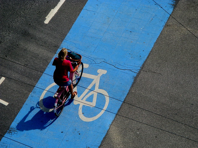
Deepak, Akash and Tobias looked at what policies influenced cycling adoption in Denmark and compared these to a number of different cities across the world.

Mirela and Ioana mapped the number of cyclists in different areas of Copenhagen in order to develop a density map, which could be overlayed with other data such as where cyclists are most active at certain times of day, accident rates/locales and bikerack density.

We spent the next two hours of the expedition searching and scraping various datasets (a full list can be found in this googledoc) in order to come up with our stories to tell the Kopenlab citizen science festival attendees.

We came across a few hurdles, namely the “cleanness” and consistency of the data. Often the datasets were only available as PDFs (CSV and excel spreadsheets are much easier to work with) and data headers often didn’t have references.

“It would be nice to have it all in a bigger table,” Ioana said.

In the face of these challenges we gave each other a helping hand to find alternative exploration routes (much like a real quest, really).

Another one of the great aspects of a data expedition the focus on skill sharing. Ioana had a great understanding of Google fusion tables so she was able to show some of the other participants how to sort and analyse data using this tool. Unfortunately we didn’t get much time to explore the plethora of open source data analysis and visualization tools (some are listed on page 5 of this doc).

So after three hours traversing the wilds of Copenhagen’s bike data we had two stories to tell.

Ioana presented her team’s heat map showing that the number of cyclists was most dense in the northwest part of Copenhagen.

Deepak presented his team’s infographic showing that many factors influence cycling usage in urban centers:

infograph

We had a great time exploring these datasets, but with the short time we had available, we only really scraped the surface of Copenhagen’s bike data stories.
Luckily Matias and his bikestorming crew ran another expedition in Copenhagen two months later and were able to build on what we learnt…

Stay tuned for part two of our biking blog series written by Matias Kalwill, founder and designer of Bikestorming.

More pics .

Flattr this!

Using Data Journalism to probe economics in the West Bank

- August 27, 2014 in Data Expeditions, Data Journalism

Ramallah Cityscape

Weeks before the current conflict erupted between Israel and Hamas, twenty Palestinian journalists came together in Ramallah for three days to use data to untangle the economic reality for Palestinians.

The fourth in a series of workshops aimed at establishing economic beat reporting in the West Bank, the Data Journalism for Economic Reporting workshop immersed journalists in the raw economic data that could provide objective, analytical content on a highly politicized local and global topic and explore viable solutions.

Watch a video from one of the workshops:

For the first time, journalists took a deeper look at the data behind buzzwords such as “economic peace” and “economic packages” that form part of the negotiation process between Israel, the Palestinians and donors. Almost immediately journalists identified cases in which a better understanding of data would have served the needs of their audience.

When the World Bank issued the report Area C and the Future of the Palestinian Economy, most journalists just reported on it using a version of the official press release Palestinians Access to Area C Key to Economic Recovery and Sustainable Growth. None requested the raw data to determine what areas of the economy have the most growth potential, what policy changes would be key in negotiating for market growth and what vocational and other educational programs could be put into place to prepare the workforce for a lifting of current restrictions.

“The language of statistics and figures are stronger and more credible,” explained Abubaker Qaret from PADECO Co, an investment firm.

Participants planned to both request the data from the World Bank study and investigate audit data from the donors who keep the Palestinian Authority afloat.

Over the course of three days, journalists practiced the skills to produce the first data-driven economic reporting in the West Bank. Trainees learned to scrape data (extract data from human-readable output) using scraper extensions, identify story angles in monthly economic data releases, answer basic questions about economic growth and government spending using Excel and visualize their findings using Google Charts.

Akram Natcha, a journalist from Al-Quds TV has a financial background but had not thought to apply some of the technical skills to his journalistic work. “This is the first time I used Excel data analysis with the aim of publishing.”

During a Google Charts visualization exercise, trainees used data scraped from PDFs downloaded from the Palestinian Ministry of Finance website to calculate and visualize which sectors of the economy experienced the largest growth during 2013.

Abubaker Qurt visualized his findings:

Trainees also compared unemployment rates and demographics to other countries in the region, calculated growth and absorption rates of the Palestinian Territories’ current workforce and calculated the per capita international aid received compared with its neighbors. They then practiced translating this information into narrative storytelling that would put a human face on pressing economic issues.

The Data Expedition that concluded the workshop focused on evaluating the Palestinian Authority’s fiscal management by examining the last three years of government expenditure data. In groups, trainees proposed and honed in on three specific questions:

  • Which government departments spend the largest portion of their budget on wages and least on implementing projects and which department is responsible for spending the most overall on staff costs?
  • How did spending on neglected areas such as cultural heritage and scientific research compare to how much was allocated by regional neighbors for those activities?
  • How do trends in investment in education correlate to results on standardized tests and growth in related economic areas?

Following the workshop, several participants pursued and published investigations into the economic impact of the heightened presence of the Israeli army in the West Bank.

“I benefited from the workshop to identify story angles through the tables,” said Rabee Dweikat a press officer at the Bank of Palestine. “I discovered new information from the data.”

The training series is funded by the US Consulate in Jerusalem.

This post is cross posted from the Internews Blog

Flattr this!

The quest for air pollution data in Paris

- August 13, 2014 in Data Expeditions

#EDpollution

On June 15th 2014, during the Parisian digital festival Futur en Seine, the French Open Knowledge local group organized its first data expedition. Our theme was air pollution in Paris urban area. The expedition was hosted by the Infolab, a progOKF - logo EDpollutionramme dedicated to data analysis for the general public.

Air pollution made sense as a theme to explore. The subject hit the news some months ago with a pic of pollution in Paris, and there were some obvious datasets we wanted to investigate. The workshop was successful on the whole, but not necessarily where we expected it to be. Air pollution in Paris urban area was definitely a complex subject to explore, and little if any related data was available.


14   The number of attendees

Attendees had to position themselves on a scale going from 0 to 3 regarding several competencies: Storyteller, Explorer, Data Technician, Analyst and Designer. A quick analysis showed that some competencies were unevenly distributed, with the exception of storytelling.

average level of participants
 

3   The number of approaches

After a brainstorming to find interesting questions about air pollution in Paris (first phase), five questions were selected. The participants then split in 3 groups with each choosing one question as a starting point for exploration.

  • Group 1 : Do public transport strikes have an impact on air quality?

  • Group 2 : Has the rise in bike use helped decrease the overall level of air pollution?

  • Group 3 : Is Paris different than other international capitals in terms of air pollution? And what is behind the difference?

Notably, the question about strikes came from an OKF Twitter follower, @fcharles
 

10   The number of data providers used

Airparif, data.gouv.fr, European Environment Agency… various data providers have been combed (second phase) to find useful data for the expedition. Among the 14 datasets found, the most useful were those from Airparif. They describe the evolution of the concentration of the 4 most important pollutants (SO2, NO2, O3, PM10). One group made a call for help on Twitter to find more data about Paris’ bike sharing service, which helped two important datasets to be opened to the public.
 

0   The number of significant correlations found

It looks like a low number, but no significant result does no mean no result at all. The subject was ambitious, and the data was often incomplete, or even unavailable for analysis (third part).

Group 1: this group studied the strike of the national railway company workers that occurred on June 11th 2014.
Hypothesis: by measuring the levels of pollution during and after the strike we can highlight the impact of the strike on air pollution.
Result: comparing the during and after didn’t yield significant results.

Group 2:  this group tried to compare the evolution of bike use with the evolution of air pollutants concentration.
Hypothesis: some of the people who bike to work choose this transport solution over their car, meaning that they contribute to a reduction in air pollution.
Difficulty encountered: the raw data of Airparif was complex to manipulate, which kept the group from finishing their analysis in time.

Group 3: this group decided to create a dataset from scratch with geographic, demographic, transport and pollution data regarding several world capitals.
Hypothesis: by comparing enough variables, we can observe which characteristics are linked to air pollution.
Result: Even visualised in a bubble chart, no obvious trend was found
 

5   The number of data set created, improved or made public

From Datasets Sources
Group 2 Monthly variation of Parisian bike traffic since 2008 Observatoire des déplacements à Paris
Group 2 Geolocalised data from Airparif’s pollution sensors regarding the 4 main pollutants (this data can’t be reshared) Airparif
Group 3 Geographic, demographic, transport and pollution data for Paris, London, Berlin, Madrid, Brussels, Copenhagen, Amsterdam Earth Policy Institute
Agence européenne de l’environnement
Commission européenne
Air Quality Index
Eurostat
Etienne Côme Historical data of 20 bike sharing services from several cities in Belgium,  France, Japan, Norway, Slovenia, Spain, Sweden http://vlsstats.ifsttar.fr/rawdata/ (fr)
Mathieu Arnold Historical data of the usage of Paris bike sharing service’s parking stations. Updated every 10 minutes since 2008 http://v.mat.cc/ (fr)

Sadly, Airparif’s licence does not grant the right to share their data. This is surely something that should be investigated considering the status of Airparif, an association whose mission of providing pollution info is a public service under delegation of the French Government.
 

Some other numbers :

0 The number of data used that were really in open data. The data retrieved was either in PDF format, or wasn’t under a open data compatible licence.
15 The approximate number of hours spent studying air pollution to prepare the expedition.
5 The number of software tools used: LibreOffice, Google Spreadsheets, R, Google Charts, Open Data Soft
270 The duration of the event in minutes. From 11h30 to 16h00

Flattr this!