We recently kicked off our first local Code for South Africa School of Data workshops in Johannesburg and Cape Town for journalists and civil society respectively.
I arrived in the vibrant Maboneng district in central Johannesburg excited (and a little nervous) about helping my fellow school of Data Fellow Siyabonga facilitate our first local workshop with media organisations The Con and Media Monitoring Africa. Although I’ve attended a data workshop this was my first experience of being on the other end and it was an incredible learning experience. Siya did a fantastic job of leading the organisations in defining and conceptualising their data projects that they’ll be working on over the course of the rest of the year and I certainly borrowed and learned a lot from his workshop format.
It was great to watch more experienced facilitators, Jason from Code for South Africa and Michael from The School of Data, work their magic and share their expert knowledge on more advanced tools and techniques for working with and presenting data and see the attendees eyes light up at the possibilities and potential applications of their data.

Johannesburg sunset at the workshop venue
A few days later we found ourselves back in the thick of things giving the second workshop in Cape Town for civil society organisations Black Sash and Ndifuna Ukwazi. I adapted Siyabonga’s workshop format slightly, shifting the emphasis from journalism to advocacy and effecting social change for our civil society attendees.
We started off examining the broader goals of the organisation and worked backwards to identify where and how data can help them achieve their goals, as data for data’s sake in isolation is meaningless and our aim is to help them produce meaningful data projects that make a tangible contribution to their goals.

The team from Ndifuna Ukwazi at work
We then covered some general data principles and skills like the data pipeline and working with spreadsheets and easy-to-use tools like Datawrapper and Infogr.am, as well as some more advanced (and much needed) data cleaning using Open Refine as well as scraping data using Tabula which the teams found extremely useful, having been manually typing out information from pdfs up until this point.
Both organisations arrived with the data they wanted to work with at hand and it immediately became apparent that it needed a lot of cleaning. The understanding the organisations gained around working with data allowed them to reexamine the way they collect and source data, particularly for Black Sash who realised they need to redesign their surveys they use. This will be an interesting challenge over the next few months as the survey re-design will still need to remain compatible with the old survey formats to be useful for comparison and analysis and I hope to be able to draw on the experience and expertise of the School of Data network to come up with a viable solution.

Siya working his magic with the Black Sash team
By the end of the workshop both organisations had produced some visualisations using their data and had a clear project plan of how they want to move forward, which I think is a great achievement! I was blown away by the enthusiasm and work ethic of the attendees and I’m looking forward to working with them over the next few months and helping them produce effective data projects that will contribute to more inclusive, equitable local governance.
]]>
IPython notebooks are attracting a lot of interest in the world of data wrangling at the moment. With the pandas code library installed, you can quickly and easily get a data table loaded into the application and then work on it one analysis step at a time, checking your working at each step, keeping notes on where your analysis is taking you, and visualising your data as you need to.
If you’ve ever thought you’d like to give an IPython notebook a spin, there’s always been the problem of getting it up and running. This either means installing software on your own computer and working out how to get it running, finding a friendly web person to set up an IPython notebook server somewhere on the web that you can connect to, or signing up with a commercial provider. But now there’s another alternative – run it as a browser extension.
An exciting new project has found a way of packaging up all you need to run an IPython notebook, along with the pandas data wrangling library and the matplotlib charting tools inside an extension you can install into a Chrome browser. In addition, the extension saves notebook files to a Google Drive account – which means you can work on them collaboratively (in real time) with other people.
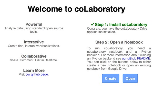
The project is called coLaboratory and you can find the extension here: coLaboratory Notebook Chrome Extension. It’s still in the early stages of development, but it’s worth giving a spin…
Once you’ve downloaded the extension, you need to run it. I found that Google had stolen a bit more access to my mac by adding a Chrome App Launcher to my dock (I don’t remember giving it permission to) but launching the extension from there is easier than hunting for the extension menu (such is the way Google works: you give it more permissions over your stuff , and it makes you think it’s made life easier for you…).
When you do launch the app, you’ll need to give the app permission to work with your Google Drive account. (You may notice that this application is built around you opening yourself up to Google…)
Once you’ve done that, you can create a new IPython notebook file (which has an .ipynb file suffix) or hunt around your Google Drive for one.
If you want to try out your own notebook, I’ve shared an example here that you can download, add to your own Google Drive, and then open in the coLaboratory extension.
Here are some choice moments from it…
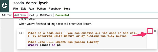
The notebooks allow us to blend text (written using markdown – so you can embed images from the web if you want to! – raw programme code and the output of executing fragments of programme code. Here’s an example of entering some text…
(Note – changing the notebook name didn’t seem to work for me – the change didn’t appear in my Google Drive account, the file just retained it’s original “Untitled” name:-(
We can also add executable python code:
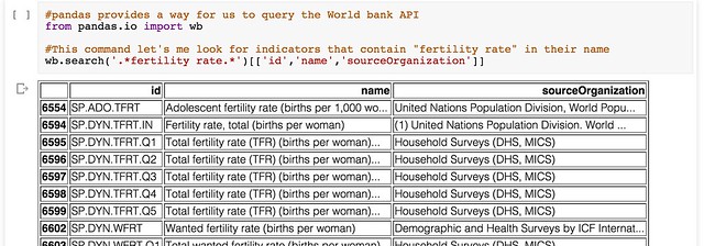
pandas is capable of importing data from a wide variety of filetypes, either in a local file directory or from a URL. It also has built in support for making requests from the World Bank indicators data API. For example, we can search for particular indicators:
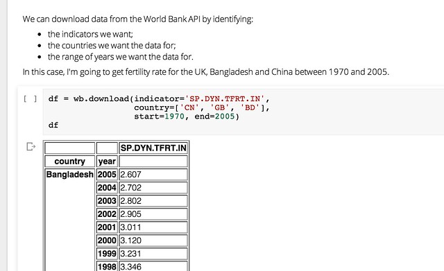
Or we can download indicator data for a range of countries and years:
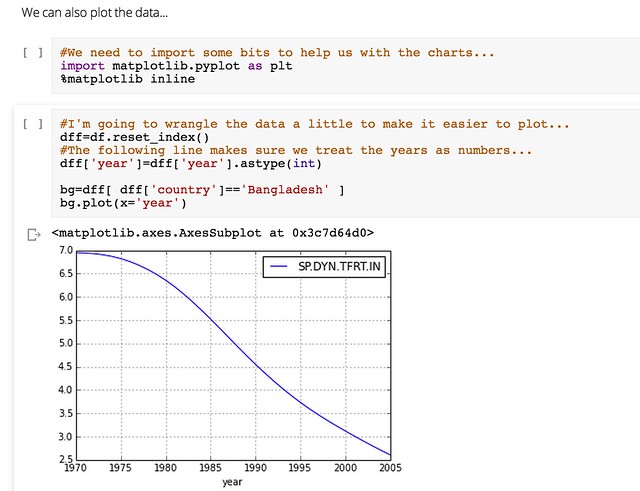
We can also generate a visualisation of the data within the notebook inside the browser using the matplotlib library:
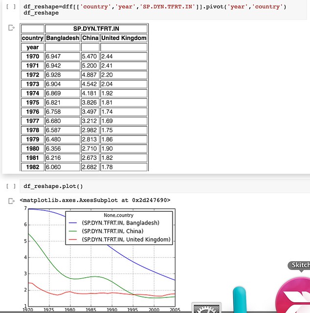
And if that’s not enough, pandas support for reshaping data so that you can get it into a from what the plotting tools can do even more work for you means that once you learn a few tricks (or make use of the tricks that others have discovered), you can really start putting your data to work… and the World Bank’s, and etc etc!
Wow!
The coLaboratory extension is a very exciting new initiative, though the requirement to engage with so many Google services may not be to everyone’s taste. We’re excited to hear about what you think of it – and whether we should start working on a set of School Of Data IPython Notebook tutorials…
]]>Do we need a register of interests for medics?
Picking up on an announcement earlier this week by GlaxoSmithKline (GSK) about their intention to “move to end the practice of paying healthcare professionals to speak on its behalf, about its products or disease areas, to audiences who can prescribe or influence prescribing …. [and to] stop providing financial support directly to individual healthcare professionals to attend medical conferences and instead will fund education for healthcare professionals through unsolicited, independent educational grant routes”, medic, popular science writer and lobbiest Dr Ben Goldacre has called for a register of UK doctors’ interests (Let’s see a register of doctors’ interests) into which doctors would have to declare payments and benefits in kind (such as ‘free’ education and training courses) received from medical companies. For as the GSK announcement further describes, “GSK will continue to provide appropriate fees for services to healthcare professionals for GSK sponsored clinical research, advisory activities and market research”.
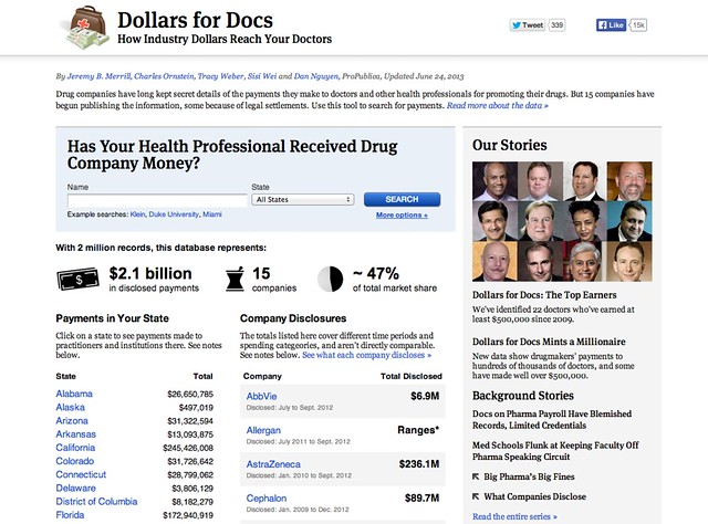
An example of what the public face of such a register might look like can be found at the ProPublica Dollars for Docs site, which details payments made by several US drug companies to US practitioners.
The call is reinforced by the results of a public consultation on a register of payments by the Ethical Standards in Health and Life Sciences Group (ESHLSG) published in October 2013 which showed “strong support in the healthcare community and across life science companies for the public disclosure of payments through a single, searchable database to drive greater transparency in the relationship between health professionals and the companies they work with.”
The call for a register also sits in the context of an announcement earlier this year (April 2013) by the Association of the British Pharmaceutical Industry that described how the pharmaceutical industry was “taking a major step … in its on-going transparency drive by beginning to publish aggregate totals of payments made last year to doctors, nurses and other healthcare professionals.” In particular:
[t]hese figures set out the details of payments made by ABPI member companies [membership list] relating to sponsorship for NHS staff to attend medical education events, support such as training and development, as well as fees for services such as speaking engagements to share good clinical practice and participation in advisory boards. Companies will also publish the number of health professionals they have worked with who have received payments
Payments from pharma into the healthcare delivery network appear to come in three major forms: payments to healthcare professionals for consultancy, participating in trials, etc; medical education payments/grants; payments to patients groups, support networks etc.
(A question that immediately arises is: should any register cover professional service payments as well as medical education payments, for example?)
The transparency releases are regulated according to the The Association of the British Pharmaceutical Industry’s (ABPI) Code of Practice. Note that other associations are available! (For example, the British Generic Manufacturers Association (BGMA).)
A quick look at a couple of pharma websites suggests that payment breakdowns are summary totals by practice (though information such as practice code is not provided – you have to try to work that out from the practice name).
- GlaxoSmithKline transparency minisite (includes links to sites relating to payments to patient groups as well as doctors); example payments to doctors data [PDF];
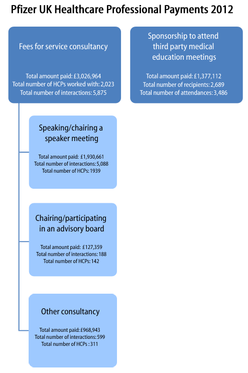
- Pfizer ‘working with healthcare professionals’ minisite (see submenus; example payments data [PDF] (about); site reveals a useful acronym – MEGS: Medical Education Grants;
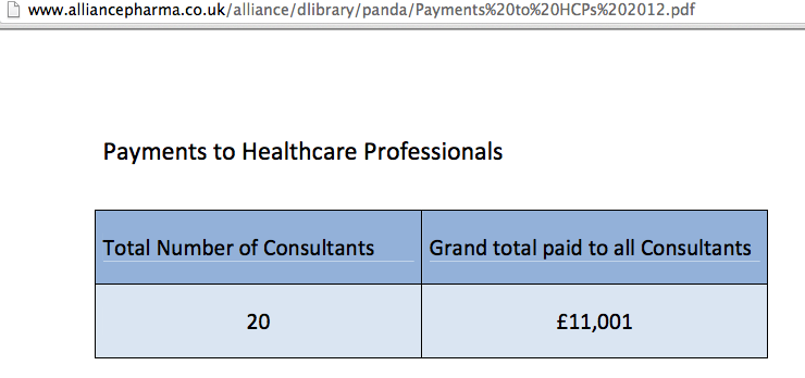
- Alliance Pharma transparency site; example payments data
As the Alliance Pharma transparency report shows, the data released does not need to be very informative at all…
Whilst the creation of a register is one thing, it is likely to be most informative when viewed in the context of a wider supply chain and when related to other datasets. For example:
- clinical trials make use of medical practices in the later stages of a drug trial. To what extent to is participation in a clinical trial complemented by speaking engagements, educational jollies and prescribing behaviour? (Prescribing data at a practice level is available from the HSCIC.);
- regulation/licensing of new products; this is a missing data hook, I think? One of the things that would help to close the loop a little in order to keep tabs on which practices are prescribing from which manufacturers would be a register or datafile that allows you to look up drugs by manufacturer or manufacturer by drug (eg the commercial electronic Medicines Compendium or Haymarket’s MIMs). In the UK, the Medicines and Healthcare Products Regulatory Agency regulates drug manufacture and issues marketing authorisations; but I don’t think there is any #opendata detailing manufacturers and the drugs they are licensed to produce?
- pricing (eg the UK Pharmaceutical Price Regulation Scheme 2014). If we look at prescribing data and find some practices prescribing branded drugs where cheaper and/or generic alternatives are available, is there any relationship with manufacturer payments? That is, can we track the marketing effectiveness of the manufacturers’ educational grants?!
- marketing of medicines to doctors, that is, things like the medical education grants;
- I’m not sure if pharmacists have any discretion in the way they issue drugs that have been prescribed by a doctor. To what extent are medicines marketed to pharmacists by pharma and to what extent do pharmacists which compounds from which manufacturers to buy in and then hand over the counter?
- organisational considerations: many GP practices are part of larger commercial groupings (eg CareUK or Virgin Care). I’m not sure if there is open data anywhere that associates GP practice codes with these wider parent corporate groupings? One question to ask might be the extent to which pharma payments map onto practices that are members of a particular corporate grouping (for example, are there ties up at a strategic level with parent companies?) Associated with this might be investigations that explore possible links with medics who have received payments from pharma and who sit on commissioning groups, and whether prescribing within those commissioning group areas unduly favours treatments from those pharma companies?
Educational payments to doctors by the drug manufacturers may be seen as one of the ways in which large corporations wield power and influence in the delivery and support of public services. In contrast to lobbying ‘at the top’, where companies lobby governments directly (for example, The Open Knowledge Foundation urges the UK Government to stop secret corporate lobbying), payments to practitioners and patient support groups can be seen as an opportunity to engage in a lower level form of grass roots lobbying.
When it comes to calls for disclosure in, and publication of, registers of interests, we should remember that this information sits within a wider context. The major benefit of having such a register may not lay solely in the ability to look up single items in it, but as a result of combing the data with other datasets to see if there are any structural patterns or correlations that jump out that may hint at a more systemic level of influence.
]]>As summer holidays are over, we are also back with the latest news from around the network.
New team members
Welcome to Milena and Neil who joined the School of Data project in this last month. Milena’s mission is to bring School of Data network to the rest of the world by supporting our community mentors and other local partners, organising events & workshops, etc. Neil joined us as writer and analyst and he is on a quest to improve project documentation and to bring the Open Knowledge Foundation work to a wider audience.
Community mentors training
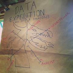
We kicked off our training for community mentors with a data expedition in which we explored the links between NSA employees and companies. Check out this blog post for more details.
If you want to become a community mentor, sign up here!
OKCon coming up
The OKCon is coming up next week! We have an amazing track on “Evidence and Stories” where we’ll examine the role of open data in evidence-based policy making, data-driven campaigns and advocacy, data journalism and visualisation.
We are also running a ScoDa workshop where we plan to teach people from our community how to run their own data expedition. Check out the details and sign up to attend here.
Interested in the whole conference? Check out the full schedule here.
Get involved
Keen to contribute to our blog? Help us write our weekly data roundup! See an example roundup post: http://bit.ly/14e3Mpv
Our usual regular contributor and hero, Anna Leach is looking for some dedicated writers to rotate with once a month. If you are interested, drop us an email at [email protected].
Ask.Schoolofdata.org
A big thanks to our regular contributors, especially Chris Spruck, Paul Antoine Chevalier and Sam Leach for providing useful answers this month!
Here is a selection of some great questions getting asked in the forum – can you help?
- No Answer! cartogram.js distortion on map
- No Answer! cartodb: cannot import csv with geojson column working with cartodb
- No answer! Pandas for Python without Internet (new question)
- Tools to extract data from a graphic ?
- What is the best tutorial to learn D3js ?
- most simple way to publish geo data information in a dataset
From the Blog
- Some lessons on how to organise a crash course in data journalism from Internews friends
- Eliot’s Higgins post about tracking weapons is Syria using social media
- Michael’s mini series on exploring IATI data:
- Part 1: Getting the data
- Part 2: Cleaning & Visualising
- Tarek’s post about validating election data in Egypt
See you soon with more from School of Data!
Want to receive these updates in your inbox? Make sure you are on the School of Data Announce List.
]]>Over the last few months, the d3.js Javascript visualisation library has seen widespread use as the powerhouse behind a wide variety of highly effective interactive data visualisations. From the Sankey diagram we used to visualise horse meat exports in the EU, to Anna Powell Smith’s funnel plots generator, to the New York Times’ 512 Paths to the Whitehouse, d3.js provides a rich framework for developing an increasingly rich panoply of data driven animated graphics.
Despite the growing number of books and tutorials that are springing up around the library, such as Data-Driven Documents, Defined on the Data Driven Journalism site, creating even the simplest charts using d3.js out of the box can prove a major challenge to those of us who aren’t fluent in writing Javascript or manipulating the DOM (whatever that means!;-)
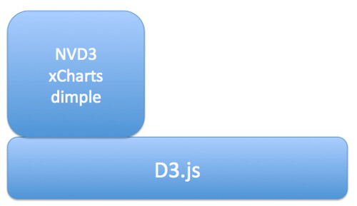
Help is at hand, though, in the form of several libraries that build on top of d3.js to provide a rather more direct path between getting your data into a web page and displaying it. Here are a few of the ones I’ve come across:
- NVD3 – one of the more mature libraries, includes line charts, scatterplots (and bubble charts), bar charts (grouped or stacked), stacked area charts
- xcharts – nicely animated line charts and bar charts
- dimple.js – “aims to give a gentle learning curve and minimal code to achieve something productive”
- Vega, “a visualization grammar, a declarative format for creating, saving and sharing visualization designs”. I think this probably sits somewhere between basic chart types and d3.js, so whilst it’s a step-up from d3.js, it’s not quite as “high level” as NVD3 and xcharts, for example.
The aim of these libraries is to wrap the lower level d3.js building blocks with function calls that allow you to call on preconfigured chart types, albeit corresponding to familiar charts.
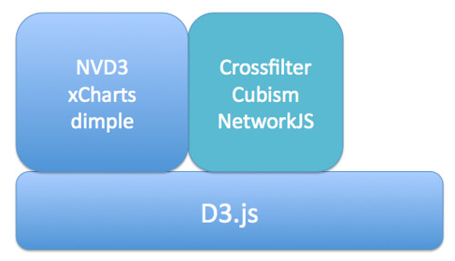
Further up the abstraction layer, we have more specialised Javascript libraries that provide support for complex or compound chart types:
- Crossfilter – explore large, cross-linked multivariate datasets in the browser
- cubism.js – produce scalable, and realtime animated, time series visualisations
- JSNetworkX – a library that builds on several other toolkits and approaches, including d3.js, to provide a library that support the construction, manipulation and display of networks in the browser.
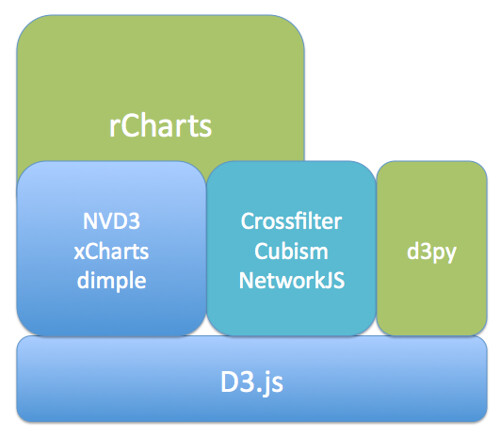
If programming in Javascript, even at these higher levels, is still not something you think you can cope with, there are several other alternatives that build on d3.js by generating templated web pages automatically that make use of your data:
- rCharts – generate a wide range of charts using d3.js helper libraries, as well as non-d3.js Javascript libraries, from within an R environment such as RStudio. (It’s extensible too.) The latest release also allows you to create dynamic visualisations using automatically populated control elements.
- d3py – generate d3.js powered webpages from Python using the Pandas library
If you want to create your own, novel visualisation types, then d3.js provides a great toolkit for doing so. If you are a confident web developer, you may still find it more convenient to use one of the abstraction libraries that offer direct axis to basic chart types built up from d3.js components. If you need access to more specialised chart types, things like Crossfilter, Cubism or NetworkJS may suit your needs. If you don’t class yourself as a web developer, but you can handle Python/Panda or are willing to give R a go, then the HTML and Javascript generating d3py and rCharts will do pretty much all the heavy lifting for you.
So – what are you waiting for…? Why not have a go at generating one of your own interactive browser based visualisations right now…:-)
]]>This post was jointly written by Jonathan Gray (@jwyg), Director of Policy and Ideas at the Open Knowledge Foundation and Tony Hirst (@psychemedia), Data Storyteller at the Open Knowledge Foundation’s School of Data project.
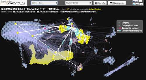
Today OpenCorporates added a new visualisation tool that enables you to explore the global corporate networks of the six biggest banks in the US.
The visualisation shows relationships between companies that are members of large corporate groups.
You can hover over a particular company within a corporate group to highlight its links with other companies that either control or are controlled by the highlighted company. It also shows which companies are located in countries commonly held to be tax havens.
As well as corporate ownership data, OpenCorporates also publishes a growing amount of information detailing company directorships. Mining this data can offer a complementary picture of corporate groupings.
The Offshore Leaks Database from The International Consortium of Investigative Journalists, released earlier this year, also contains information about “122,000 offshore companies or trusts, nearly 12,000 intermediaries …, and about 130,000 records on the people and agents who run, own, benefit from or hide behind offshore companies”.
As you may have seen, we’ve recently been thinking about how all of this publicly available information about corporate ownership networks might be used to help identify potential tax avoidance schemes.
While the visualisation that OpenCorporates released today focuses on six corporate networks, we’d be interested in seeing whether we might be able to mine bigger public data sources to detect some of the most common tax avoidance schemes.
As more and more corporate data becomes openly available, might we be able to identify patterns within corporate groupings that could be indicative of tax avoidance schemes? What might these patterns look like? To what extent might you be able to use algorithms to flag certain corporate groupings for further attention? And to what extent are others (auditors, national tax authorities, or international fraud or corruption agencies) already using algorithmic techniques to assist with the detection of such arrangements?
There are several reasons that using open data and publicly available algorithms to detect potential tax avoidance schemes could be interesting.
Firstly, as tax avoidance is a matter of public concern arguably civil society organisations, journalists and citizens should be able to explore, understand and investigate potential avoidance, not just auditors and tax authorities.
Secondly, we might get a sense of how prevalent and widespread particular tax avoidance schemes are. Not just amongst high profile companies that have been in the public spotlight, but amongst the many other tens of millions of companies and corporate groupings that are publicly listed. The combination of automated flagging and collaborative investigations around publicly available data could be a very powerful one.
If you’re interested in looking into how data on corporate groupings might be used to flag possible tax avoidance schemes, then you can join us on the School of Data discussion list.
]]>A bumper edition of the Latest from School of Data!
Travels Galore
- Data Diva Michael Bauer, and OKF’s International Community Manager Zara Rahman completed their whirlwind tour of Latin America to meet the Data Lovers of the Continent and launch the Spanish language School of Data. Read about what they got up to on the OKFN blog
-
Meanwhile, Lucy was at the InfoActivism camp, for an incredible week of learning about how activists use technology. There are tutorials (many, many tutorials), blog posts and writeups from the data expedition on mapping Key Points in South Africa at the camp (the first data expedition to involve real bloodshed ) in the pipeline.
We’ll attempt to squeeze our brains dry of everything we learned and document it for you but in the meantime, follow the #ttccamp13 hashtag and Tactical Tech (@info_activism) for tips in 140 characters from brave and brilliant folks at the camp.
Hola – Escuela De Datos!
- Escuela De Datos, the Spanish language version of School of Data, launched spectacularly at AbreLatam last week Many thanks to everyone who helped it happen, especially Social TIC, the Hacks/Hackers communities in Chile and Argentina and the organisers of AbreLatam.
Since the launch – many organisations have been in touch to ask how they can also start their own version in their country. We’ll be publishing a local groups guide soon – so watch this space!

Get Involved
Community Mentors
Our call for our pilot cohort of Community Mentors will stay open until Friday, then we’ll get rolling on kitting them out to ghostbust data trouble around the globe.
Haven’t had chance to sign up yet? Here’s your opportunity.
Data Roundups
We’re looking for a new volunteer (or a team to take it in turns) to take over the weekly Data Roundups from Neil Ashton, as he manages with small baby!. If you are interested – please let us know on schoolofdata [at] okfn.org.
Ask.SchoolofData.org
A very busy week for Ask.SchoolofData.Org – here’s just a few of the questions which have been asked and need your help!
- UNANSWERED Open Refine – is there a difference between a starred and a flagged row?
- Is it possible to make interactive data visualisation using HTML5 ?
- Is there any difference between a SVG and an AI file?
Thanks to new faces Andrew Duffy, “OpenSAS” for their help both in asking and answering!
From the blog
- Data Roundup July 3
- Slaughtering People: A Multimedia Investigation into the Global Market of Meat
- Tax Avoidance and Evasion Expedition: Looking back
- Data Roundup – June 26
- Data MOOC – Findings, Results and Recommendations
- Cursive Data: Drawing by Robots.
Ciao for now!
Want to receive these updates in your inbox? Make sure you are on the School of Data Announce List.
]]>Here’s the latest from around the School of Data:
Escuela de Datos
Data troopers Michael Bauer and Zara Rahman have been on the road in Latin America doing a series of great warmup events with the help of the fabulous network of Data Activists from around Latin America.

Credits: James Florio. Poderomedia
- See what they’ve been up to in the writeup the Hacks/Hackers meetup in Chile.
- Henceforth, they will be in Uruguay for the AbreLatam conference. Know someone they should meet there? Tweet @Schoolofdata – or email us on schoolofdata [at] okfn.org.
Stay up to date with School of Data Latin America
Spanish
- Twitter – @Escueladedatos
- Announcement mailing list (low traffic)
- Discussion mailing list: Coming soon
Portuguese
- Twitter – @Escoladedados
- OKFN Brazil Mailing List – for discussion.
Get Involved!
We’re looking for a select handful of community mentors to take place in a pilot mentoring scheme to guide learners through future data expeditions (online or offline), and/or offer training sessions on a particular topic or tool, via Google Hangout or in person.
Learn more
We will offer training, support and swag (stickers and shirts) for our pilot mentors!
Ask.SchoolofData.Org
The following questions are looking for answers, can you help?
- Extracting data from wikipedia tables
- Problem installing Gephi on Mac OS
- Is there any difference between a SVG and an AI file?
Offers of help
- Andy South has offered to run a course in mapping with R for NGOs who can cover his travel costs! See the course.
From the blog
- InfoAmazonia and Why We Should Talk About Geojournalism
- Data Roundup 19th June. By Neil Ashton.
- Data Explorer Mission from the Inside: an Agent’s Story – Want to know what happened on the data explorer mission? One of the participants explains what they got from the experience.
- On the Radar: Using Data to Save Lives – Invisible Children and the LRA crisis tracker. Invisible Children and the LRA crisis tracker.
New Tutorials
]]>Every so often I get asked the question: “so what is data journalism?” I’m still not sure I have a very good definition of it, but here are three different ways I think we can view it:
- as a particular sort of output – one of the easiest ways of responding to the question is to point to a map or graphic that someone has used to illustrate a story, or a piece of “award winning” data journalism, and say “that is”. For anyone who works with data, however, they well know that producing a graphic is often the easy part of the process, and that most of the time is spent finding the data, fighting with it to get it into a state you can start working with it, and analysing the data, or asking it questions in order to find the story within it, or illustrate a story you have already discovered. This observation in turn leads to a second way of characterising data journalism:
- as a particular set of skills – that is, data journalism is not necessarily what data journalists produce, it’s best thought about in terms of the sorts of skills that data journalists need in order to produce the maps and charts that get pointed at as examples of data journalism.
One way of identifying what these skills might be is to look at job adverts for “data journalist” (I collected a few examples here: So what is a data journalist exactly? A view from the job ads…). Looking through them, many current ads seem to require skills associated with the development of interactive data driven applications, which puts the emphasis on a range of web design and development skills, again apparently associating the practice of data journalism closely with the production of things that are used to illustrate a story. That is, data journalism is to data what radio journalism is to audio and video journalism is to, erm, video?! (It’s probably also worth mentioning that data journalism is not necessarily genre based journalism, such science journalism or sports journalism – it’s not just “about” data.)
But that doesn’t feel right, either, which suggests a third way of considering data journalism: - as a process – and in particular, as a process that involves data somehow, though not necessarily exclusively. Whilst there may be “data outputs”, it might also be the case that the data journalistic process generates a lead that develops into a story that is not best illustrated using “data”. Data might lead us to a story, for example, that one particular garment retailer tolerates poor working conditions through the discovery that they use factories blacklisted by other retailers, but that story may be best expressed in other terms. The data, in other words, may simply play the role of a source, and in this sense “data journalism” is more process oriented, in much the same was that investigative journalism is, although potentially over much shorter timescales. (We might expect a data journalism piece to be produced in a matter of hours as part of the daily news cycle, for example.)
Under this process view of data journalism, the skills required of a journalist participating in the process may take the form simply of advanced information skills, such as the ability to run powerful advanced searches using web search engines, filter down a data set using text and/or numeric facets in a tool such as OpenRefine, or run structured queries over data in a database using a query language such as SQL.
The process might equally involve using data visualisation tools to make sense of a dataset, or generate further questions from it, questions that might be additionally asked of the dataset itself, possibly in conjunction with other datasets, or alternatively used to set up a question then asked of a person.
For certain data sets, statistical tests may be required to identify whether there is something or nothing in what the data appears to be saying, or questions asked of an expert in the field to identify whether a number is actually a big number or not (hat tip to FT Undercover Economist, and More Or Less presenter, Tim Harford, for that refrain!). And then it may be time to get the interactive developers on board. Or there may be no need.
So are we any nearer to having a definition of “data journalism” that take into account these different views?
Here’s one I quite like:
The art and practice of finding stories in data…
…and then retelling them.
This captures both the notion that data journalism is about finding stories from a particular sort of source (a data source) and then communicating them, whilst not requiring that the telling of the story is done in any particular way.
Here’s another:
Journalism in which “data” is one of the sources used to get or relate a story.
In this case, we see data as playing a role either in the sourcing of a story, or the communication of a story (or maybe even both), but again, we imagine data playing a role in “human” terms.
So what’s your favorite definition of data journalism?
See also: Data Journalism Handbook
]]>Here’s the latest from this week at the School of Data.
Never miss a post: Join the School of Data announce list for this bulletin delivered directly to you in your inbox.
Data Expedition – Mapping the Garment Factories
The horrific factory collapse at Rana Plaza in Dhaka has brought the business practices of global garment brands, as well their thousands of suppliers, into the spotlight.
Starting on Thursday, and continuing for a full day on Saturday, the School of Data team led by +Anders Pedersen will be conducting a data expedition into investigating Global Garments factories.
We need storytellers, engineers, designers, data scouts and analysts all to work on getting to the bottom of what is happening in these garment factories. Sign up here: http://bit.ly/14c1WcJ
How it will work:
1. Prior to the data expedition, we’ll be working to collaboratively build a list of garment factories from around the world.
2. In advance of and during the data expedition, data wranglers from around the community will offer one-hour drop in sessions for a limited number of participants as introductions to a particular topic, such as mapping (which will be a large component here).
3. On Saturday 25th – small teams of investigators will pick a story and investigate it in a team, aiming to reach a conclusion by the end of Saturday.
More information can be found here: https://schoolofdata.org/data-expeditions/data-expedition-mapping-the-garment-factories/
Know someone from an NGO or advocacy campaign working on ethical fashion that would be interested in joining? Please put them in touch on [email protected].
Next Week – 30th May – One day Expedition on Tax Evasion
Welcome – Liliana Bounegru
The latest from the School of Data ask service
From the blog
Special thanks to John Murtagh this week who has volunteered to write the School of Data roundup posts while Neil Ashton is away. Look forward to that tomorrow!
- When A Government Minister’s Data Laundry is Hung Out to Dry…https://schoolofdata.org/2013/05/17/when-a-government-ministers-data-laundry-is-hung-out-to-dry/
- Data roundup – May 15 by Neil Ashton: https://schoolofdata.org/2013/05/15/data-roundup-may-15/

