Online Data Expeditions: A Wrapup

A special thank you to all of those who took part in the first round of experimental online data expeditions. An even bigger thank you to those who took part in the retrospectives at the end of the sessions to let us know your thoughts.
After the success of the offline data expeditions, (see more here and here), we wanted to see how they worked online.
It’s fair to say that online presented its own challenges but we’re very happy with how they turned out overall. We’ve learned a huge amount about how people prefer to organise themselves online, what roles people should play in a team and how much support is needed to guide groups through these expeditions online. We’ve tried to encapsulate these as fully as possible in our revamped Data Expeditions page and our new fangled Guide for Guides.
In this blog post, we highlight some of the highlights from the various groups in the data expeditions – read on to learn how the groups fared!
Hard Working Aunts Dunk some Donuts
The second of our data expedition groups to touch home with a report was the “Hard Working Aunts”. Certainly living up to their name, they produced not only a detailed, day by day log of their activities, but also several fantastic outputs…
The contributors of this largest expedition group are too numerous to mention and although we show mainly the visible outputs here, careful consideration went equally into formulating the question of obesity and how it could be framed and investigated. “Maybe we should research clothing sizes around the world,” says one aunt “Poorer [US] states tend to have proportionally more fast food restaurants and proportionally higher BMIs” while others wished to look into other countries, Brazil, Scotland, India, China. 3 weeks of speccing and debating later…
5 February: Aunt Michael H. creates some Fusion Table maps which show the BMI in a number of countries (Brazil, Bulgaria, Czech Republic, Finland, France, Germany, India, Italy, Poland, United Kingdom, USA) for 1990 till 2009. The data is taken from the FAO (food), WHO (BMI and inactivity), income/capita and Gini index (World Bank + EU).
1990: HWA Fusion Table 1
1995: HWA Fusion Table 2
2000: HWA Fusion Table 3
2005: HWA Fusion Table 4
2009: HWA Fusion Table 5
An additional view (Fusion Table) of the 2009 data shows the daily energy supply in calories (4 calorie ranges: 2000-2500, 2500-3000, 3000-3500 and 3500+:)

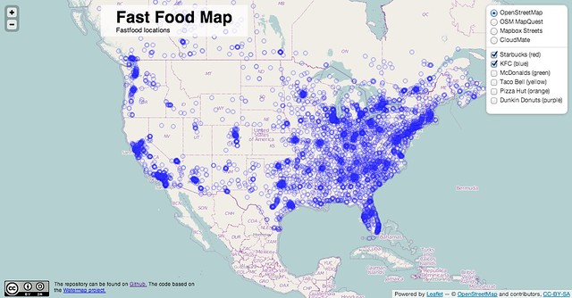
6 February: Patrick Hausmann finalises his project of a very elaborate map on fast food outlets in the USA. It can be found at http://www.covimo.de/hwa/. He imported the food chain data James Bulmer and further processed it in order to be able to plot the outlet locations of six different fast food chains.
Conclusions: The fast food map of America speaks for itself in some senses – that’s a lot of outlets – and may help to explain some of America’s obesity statistics. It would be great to see some comparisons with other countries – or some explanation on why fast food outlets are so heavily concentrated towards the eastern states, but this is great work from the aunts!
The Resourceful Puffins Pick Up the Pointers
The Resourceful Puffins came up with lots of interesting ways to organise themselves online, from Google Plus groups, Google Hangouts to Concept Boards.

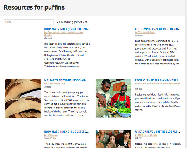
The Puffins were the Scouts of Data Land and have come up with a fantastic list of resources for anyone researching obesity and came up with a similarly impressive list of research and articles for how others had tackled and explored the problem. (Remember – the output of a data expedition does not have to be a flashy app – it can be anything one desires, such as a well-curated list such as this). Feel free to use and build on these resources!
See the data in Listify. Get the data.
A couple of team members were keen to keep the expedition running and produce something with these resources. Even though the main expedition period is over – any explorer should feel free to carry on an expedition with the bravest of souls to help to get to the top. If we can be any help in expediting this process, let us know!
The Versatile Calculators
Optimum group size was one of the most interesting observations of the data expeditions. At around 20 people – the Calculators were the smallest group. Where the larger groups were somewhat overwhelmed by enthusiasm, the poor Calculators unfortunately failed to get activation energy and really take off. The introduction round showed a large number of coders, some team members wishing to learn concrete skills such as D3 or other presentation skills, but in the end, voices were merely shouting across the tundra, looking for soulmates…
The rescue mission for their bodies reveals some promising starts in terms of question generation. This team definitely wins the prize for the most innovative approach to the question, we loved some of the ones people came up with!:
Does a correlation exists between a nation’s internet use and obesity levels. Data that showed weight distributions across world populations versus their internet use (% of population digitally enabled, or hours of computer use per day) might prove/disprove the hypothesis. Or put another way, is famously wired South Korea growing more plump?
What other time series might shed light on the thesis? Revenues of public companies selling outdoor recreational goods. Or public spending on athletic facilities versus spending on digital infrastructure. Maybe even percentage of retail floor space at ToysRUs devoted to sedentary activities (DVDs, music, board games, computer games) versus sporty pursuits (soccer balls, sweat bands, swimming goggles). – Conrad Walters…
(Someone should follow up on these – I’d be fascinated to see what comes out of them!)
Listening to the feedback from the group, it sounds like everyone was waiting for a clear leader to step forward, but sadly-none emerged in this particular instance. For future expeditions, we’re looking into ways to help people to jump from inactive groups into other groups who need their help and we’ll keep experimenting with what the best combination of grouping people online for learning is.
Data about Data Expeditions
- A special shoutout to people called Sus(z)anna(e) – the name appears to make natural-born leaders and proactive scouters! The Sues sent over 50 encouraging and helpful messages to their groups across the expeditions.
- Initial participation was very high, (much higher than expected) of those that signed up, about 80% in most groups completed the introduction round. After that when real tasks set in, participation dropped significantly (as we expected it would!). We’ve woven in some tricks to combat attrition into the guide for guides and we’d love to hear from you if you have any tips you think could help for keeping people motivated online.
- Over 160 people signed up for this first round of experimental data expeditions and we grouped them into 4 groups.
Want to know when the next data expeditions are out?
Join the School of Data Announce List and we’ll keep you posted with the latest from the world of data expeditions.
Image Credits: “Expedition” by XKCD. CC-BY-NC-ND


Leave a Reply